Nursery inspiration

Last week and this weekend were the worst! I got all over excited at the beginning of the week about changing my blog theme and not being the most patient of people decided to change it at 9pm one evening. Jules warned me to do a back-up of my blog content before I made any changes and so I installed a new back-up plug-in and annoyingly it wanted to run all night. So I went to bed and woke up to no blog. Nothing. Nada. We tried over the next 48 hours to retrieve it and eventually managed to wade through the corrupt files (still not sure exactly what happened) and reinstate the blog. However, as it turns out I have lost three years’ worth of images (from pretty much all my posts before the start of 2016). It was my birthday on Saturday and I had to cancel my party and we worked solidly throughout the weekend to try to piece together what is left but I have days and days of work left to do to upload the photos that are missing – luckily, I’ve always been quite good about filing my photos.

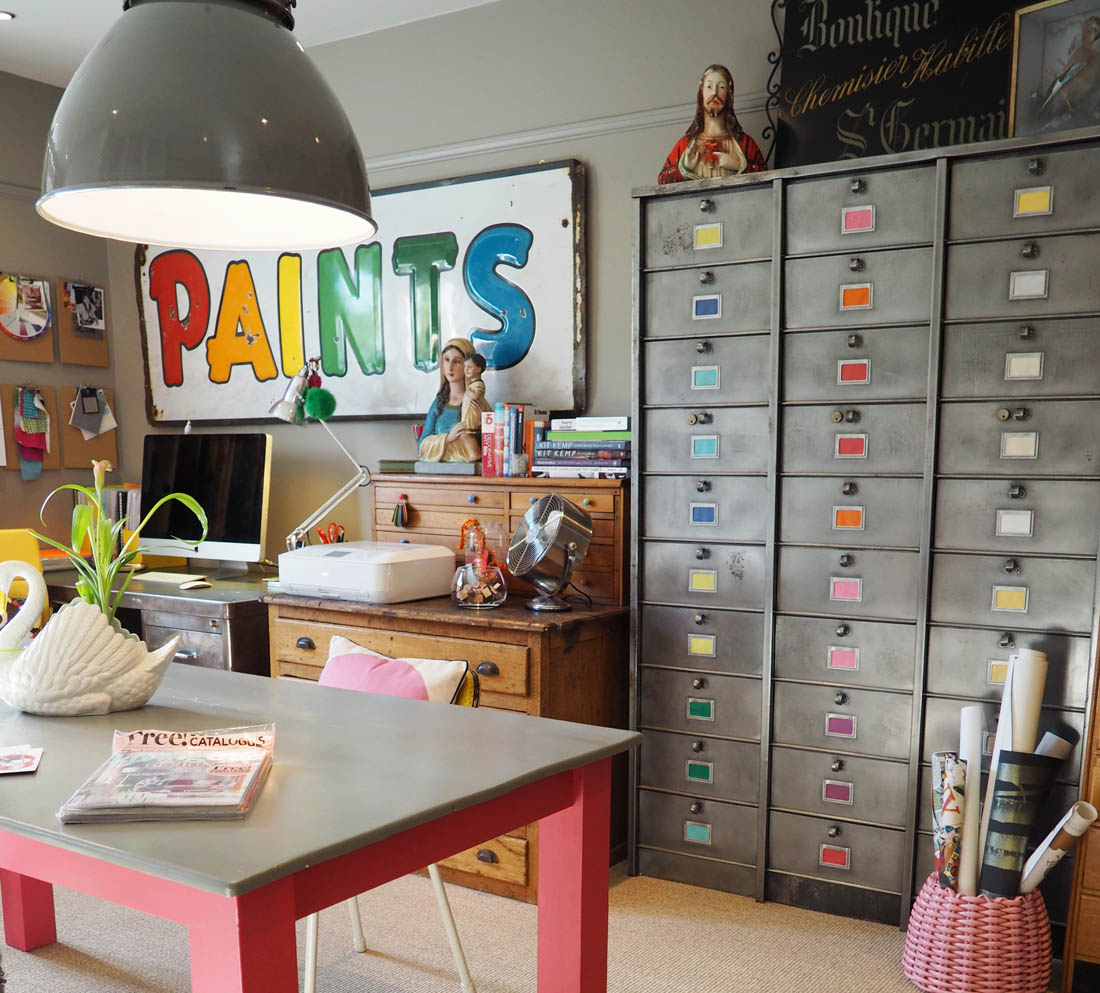
I’m trying to escape for a couple of hours from the hell that is technical issues and so I thought it would be nice to share a bit of nursery inspiration with you – I’m floating into my happy place and blocking out the last few days 😉 I have made a good job of clearing out our home office and selling the furniture and accessories from the room so we are ready to start painting and then choosing a few new pieces of furniture and finally bringing it all together. So, here is a taste of the look I’m going for: simple, light, calm colours, lots of natural wood and baskets against white, texture from textiles and a few vintage touches. I think it will be a room more for me to begin with whilst the baby is teeny tiny and then as she gets older we can add to it to make it more about her.

Lovely inspiration from these simple spaces…

Vintage Scandi style nursery inspiration | Apartment Apothecary

I love the white backdrop and how the toys are the main focal point. Image via: Ukkonooa

Calm accent colours and texture introduced through textiles. Left image: A Merry Mishap Blog Right image: Avenue Lifestyle

Vintage Scandi style nursery inspiration | Apartment Apothecary

We definitely want a daybed in the nursery and I think it will be a good way to introduce some colour with quilts and cushions. Image via: Bolig

Vintage Scandi style nursery inspiration | Apartment Apothecary

Light, bright and airy with dots of colour – I don’t want this room to stick out like a sore thumb…yet! Image via: Petit and Small

I really love the way these dark greys have been used. Left image: Hartendief Right image: Emsloo

Vintage Scandi style nursery inspiration | Apartment Apothecary

Vintage touches will hopefully give the room a bit of character and the raw wood creates great contrast against the white backdrop. Image via: Bloesum

Vintage Scandi style nursery inspiration | Apartment Apothecary

Pin me!

Right, I should probably get back to re-instating three years of work that’s vanished into the ether – sob. If anyone is looking for a specific post drop me a line and I can put it to the top of the priority list to fix.

Katy x

P.S. At least I finally have a new theme, although still lots to tweak – do you like it? (please, please, please say yes!)

Livingetc house tours 2016

Last year I was invited by the ao.com team to tour some of the amazing houses in north west London that have been featured in LivingEtc magazine. It was such a great day and full of unique interiors so I didn’t hesitate when I was invited again this year to see some of the homes in south west London.

If I am completely honest I preferred the style of the houses on last year’s tour but there are always ideas and sparks of inspiration that fly in any home I visit so nosing around was so much fun. Here is a taster of a few of the houses…

Plough Mews

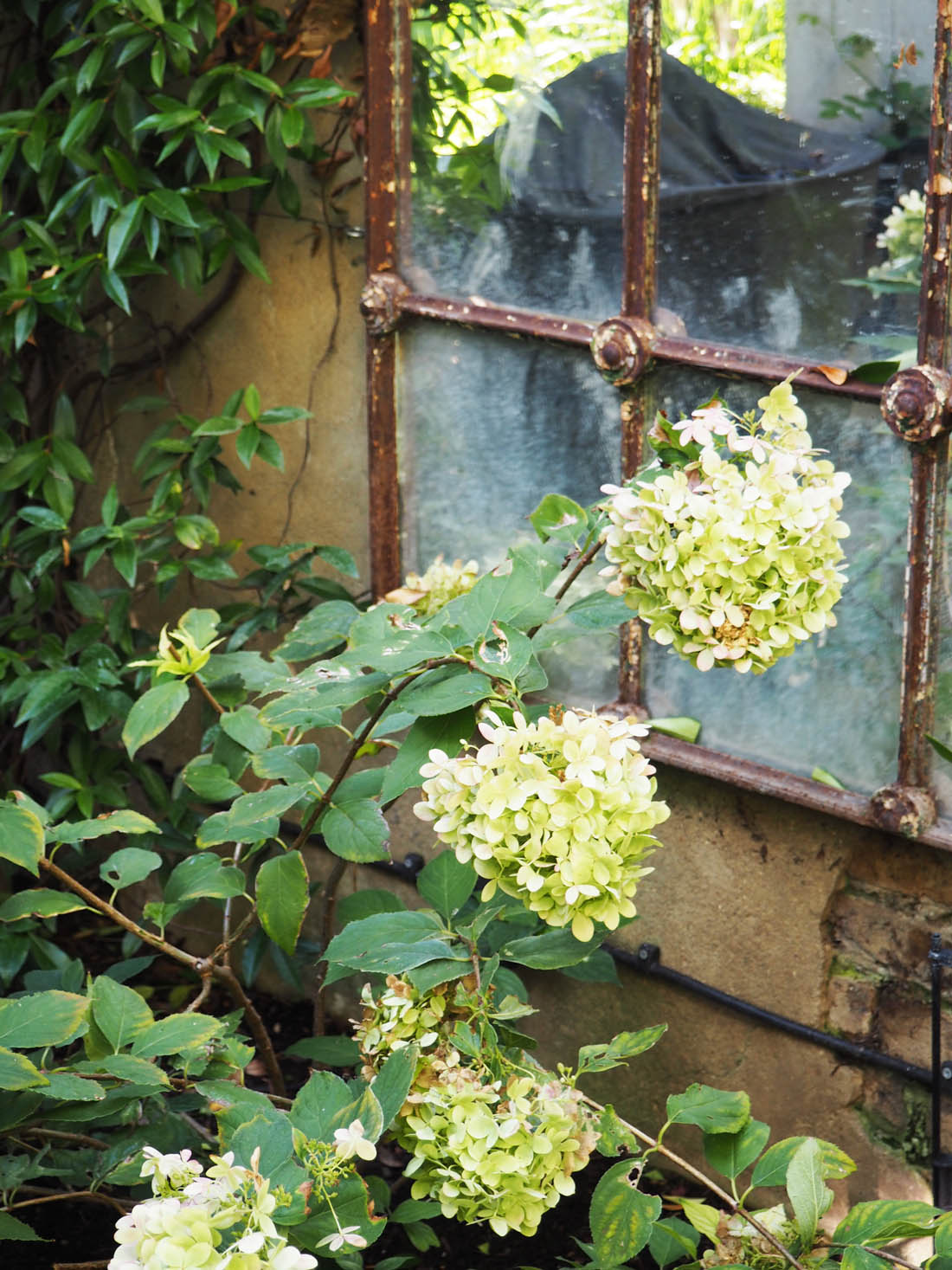
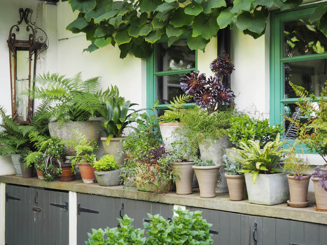
Hidden away behind mews doors you would never expect to walk into this former stables, which was far and away my favourite home of the day. This magical conversion has created a two-storey L-shaped house that wraps around the most beautiful garden and it is like stepping into the mediterranean. Every room opens out onto the garden, which makes the outdoors an integral part of this home, owned by a fabric and accessories designer, who originally lived in just one part of the mews but over time took over the whole thing. I’m afraid we couldn’t take photographs inside as this home is due to be in the next edition of Livingetc (I can’t wait to see that spread) but here are a few pics from the garden:

Living etc house tours | French style exterior | Apartment Apothecary

Living etc house tours | French style exterior | Apartment Apothecary

Living etc house tours | French style exterior | Apartment Apothecary

Living etc house tours | French style exterior | Apartment Apothecary

Living etc house tours | French style exterior | Apartment Apothecary

Heathfield Road

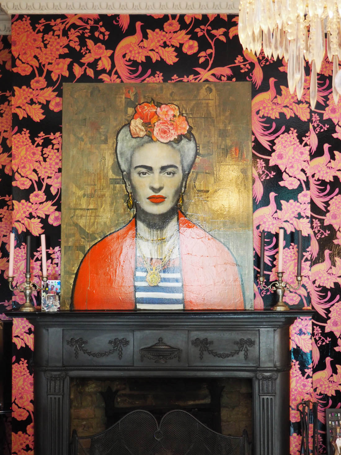
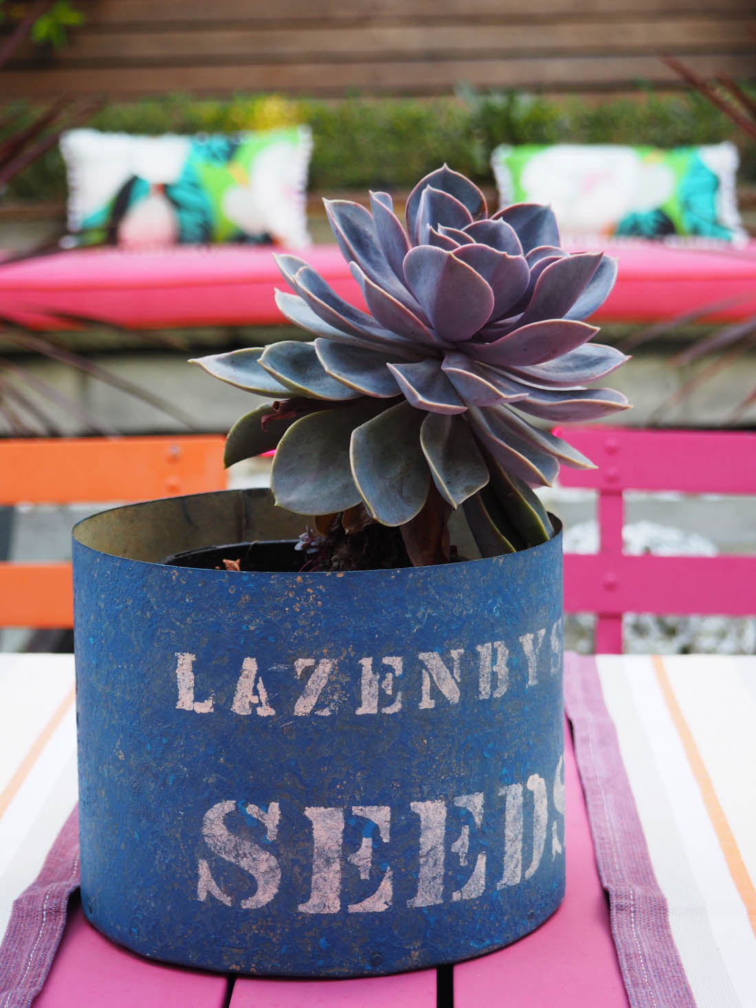
Bold, colourful and eclectic sums up this terraced house owned by an interior designer. Filled with vintage finds and huge doses of colour and pattern there was so much to look at in this home and, although not my style, the house did have loads of personality.

Living etc house tours | Colourful eclectic interior | Apartment Apothecary

Living etc house tours | Colourful eclectic interior | Apartment Apothecary

Living etc house tours | Colourful eclectic interior | Apartment Apothecary

Living etc house tours | Colourful eclectic interior | Apartment Apothecary

Burntwood Close

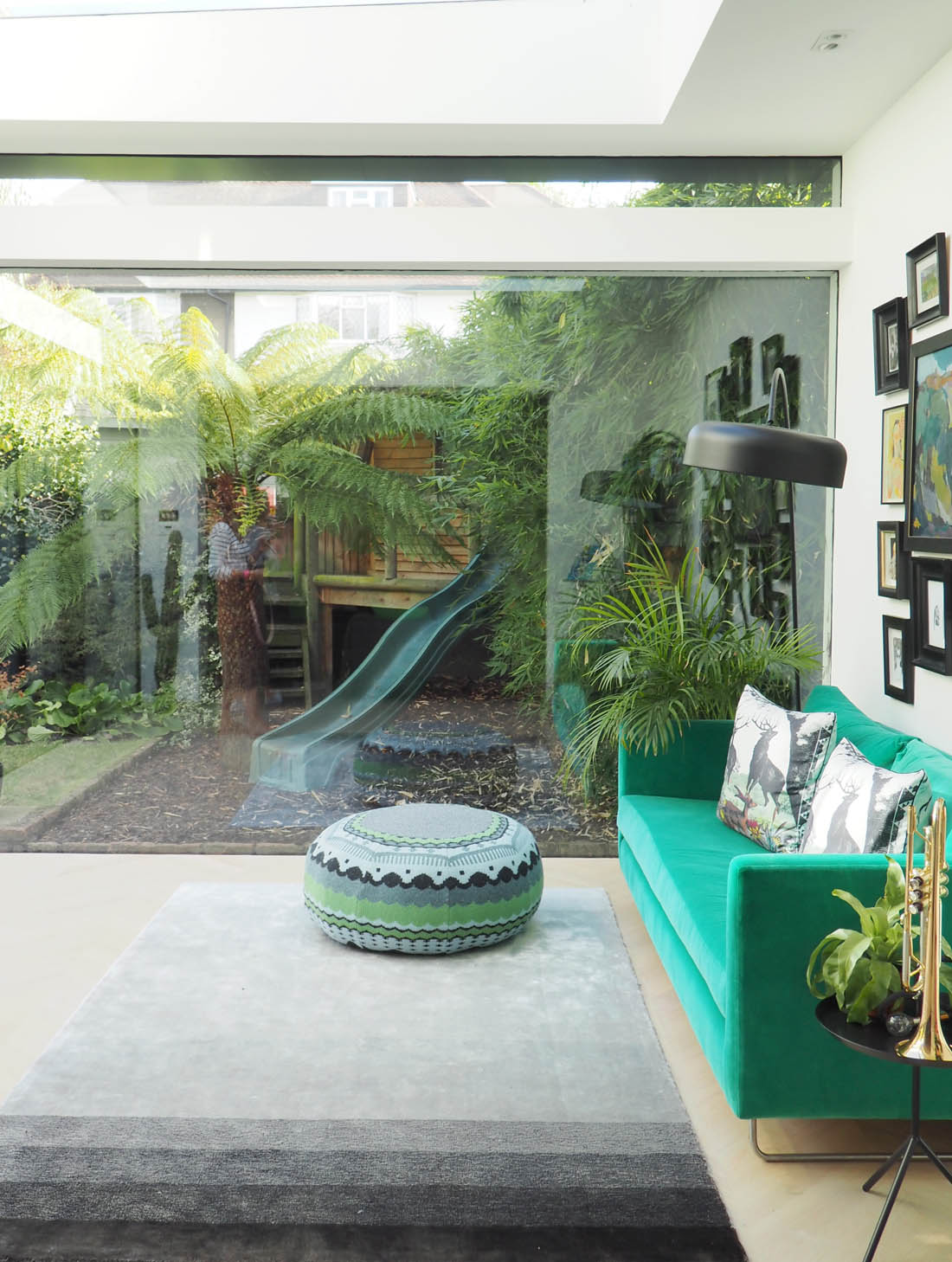
A suburban thirties house, owned by an art dealer, this family home has been fully modernised. The interior is fairly minimal with injections of colour against the white backdrop and glass extension. Lots of green and plants help to blur the boundaries between inside and outside and the artwork creates points of interest throughout the house.

Living etc house tours | Minimalist botanical style | Apartment Apothecary

Living etc house tours | Minimalist botanical style | Apartment Apothecary

Living etc house tours | Minimalist botanical style | Apartment Apothecary

Living etc house tours | Minimalist botanical style | Apartment Apothecary

If you want to see more images from the day you can search the hashtag #LivingEtcHouseTours on Instagram or maybe book yourself a ticket for next year’s tour? Thank you so much to ao for my invite and the lovely lunch we had with the LivingEtc team – such a great day.

Katy x

Affordable Scandi style with Harley and Lola

I dream one day of living in a large, open space with tons of natural light and minimal furniture – living the Scandi dream, if you like. There are two teeny tiny problems with this dream: 1) How on earth does one find said space in London?  2) Scandi furniture can be insanely expensive so how can I have the space and the stylish look without being on Britain’s rich list?

Well, I have found a solution to the second problem in the form of Harley & Lola’s modern vintage collection that they’ve launched this season. The collection is full of really beautiful Scandinavian furniture that is surprisingly affordable but looks very, very expensive (and perfect for my dream home!). Gorgeous light grains, elegant legs – it is ALL about the legs, people! – simple design and neutral colours all combine to create a spacious, bright, modern look but one with character and style. Dreamy. The thing I love most about Scandi design is the way each piece is designed to make the most of the natural light; it can flow around the room under and through the pieces as nothing is too ‘blocky’, or has filled in sides or backs and everything has legs. This is what makes all the difference. Take a look at these beautiful pieces to see what I mean…

Scandi style interiors | Scandi furniture | Preparing for Autumn with Harley and Lola | Apartment Apothecary

Wycombe bed – this would look amazing in any room and even though it is a very large piece it would never dominate or feel heavy due to the light grain of the wood, simple base and beautifully designed headboard.

Scandi style interiors | Scandi furniture | Preparing for Autumn with Harley and Lola | Apartment Apothecary

Dining table and dining bench – I love dining benches as they are so much more versatile compared to dining chairs and the informality appeals to me.

Scandi style interiors | Scandi furniture | Preparing for Autumn with Harley and Lola | Apartment Apothecary

Stockholm sofa – vintage Danish sofas cost a fortune so this model is such a brilliant discovery as it has all the style but not the price tag of the originals. Obviously, you wouldn’t want this as your only sofa but as an additional seat it would work so, so well alongside a bigger, squishier sofa like this one. It would add extra seating to a living room as well as a dose of character. There is also a matching vintage style armchair that is just as gorgeous.

I think one of the problems people have when faced with this minimal look is that they feel it lacks warmth, colour and that cosy feeling of other styles, especially at this time of year as the weather gets colder, darker and wetter. However, there are lots of ways to remedy this so don’t be put off.

The neutral palette of these pieces is the perfect base for layering colours with textiles like cushion, throws, blankets and rugs. For example, the dining bench above would be wonderful with sheepskins on it, which would soften the hard wooden surface and make them so inviting. Similarly, adding extra throws to the bed and a wool rug, like this Moroccan rug, would instantly add warmth and don’t forget to change back to your winter duvet soon. Lots of different textures will work so well with the wooden furniture and help to create the perfect Autumnal haven at home and a sense of ‘Hygge’. Adding a knitted blanket, or a chunky knitted pouffe is the perfect way to transition from the summer months. Think of this furniture as the perfect neutrals that are waiting to be slotted into your home and made to feel as minimal or as cosy as you want them to be.

Decorative accessories like books, magazines, flowers and plants all help to fill a room with character. At this time of year dried flowers work really well as well as lots of baskets full of extra throws for evenings on the sofa or weekend lie-ins. Adding touches of black, whether in a lamp, mirror or picture frames also helps to add contrast with the light, bright nature of the Scandi style as well as helping to make a space feel more Autumnal. Candles and soft lighting are really important at this time of year, too, and will really help to create a mellow and welcoming tone in any room. I don’t think a home should be the same throughout the year so spend a bit of time preparing for the change of seasons.

Scandi style interiors | Scandi furniture | Preparing for Autumn with Harley and Lola | Apartment Apothecary

Wycombe coffee table – don’t make the mistake of getting a huge block of a coffee table just because it has loads of storage. This will stop the light flowing in your living room and make it feel heavy. Instead choose a table like this one that has lovely legs and a light surface and think about using the walls for storage.

Scandi style interiors | Scandi furniture | Preparing for Autumn with Harley and Lola | Apartment Apothecary

Open display shelving unit – a display unit like this one is the perfect way to add character to a room as it allows you to show off your favourite things, which will make it a point of interest in the room and help to soften the minimalist look if that scares you a bit!

There are lots more lovely pieces over at Harley & Lola so do check them out and I hope some of these tips are helpful and that you like my best picks! Enjoy getting cosy this Autumn and maybe picking a few new additions for your home.

Katy x

*This post was written in collaboration with Harley & Lola.


Living with a dog: tips for keeping your house clean

My flat used to be immaculate. We moved in when it was brand new and the walls, floors, skirting boards were all perfect and the flat smelled fresh and clean. I’ve always been a clean and tidy person so it remained that way for the first three years. Today, with our beautiful, wonderful three year old golden retriever in tow things are looking a bit rough around the edges. When Otto first arrived it completely freaked me out how much we had to change in the flat to accommodate him and how much mess he made – I suddenly lost all control!
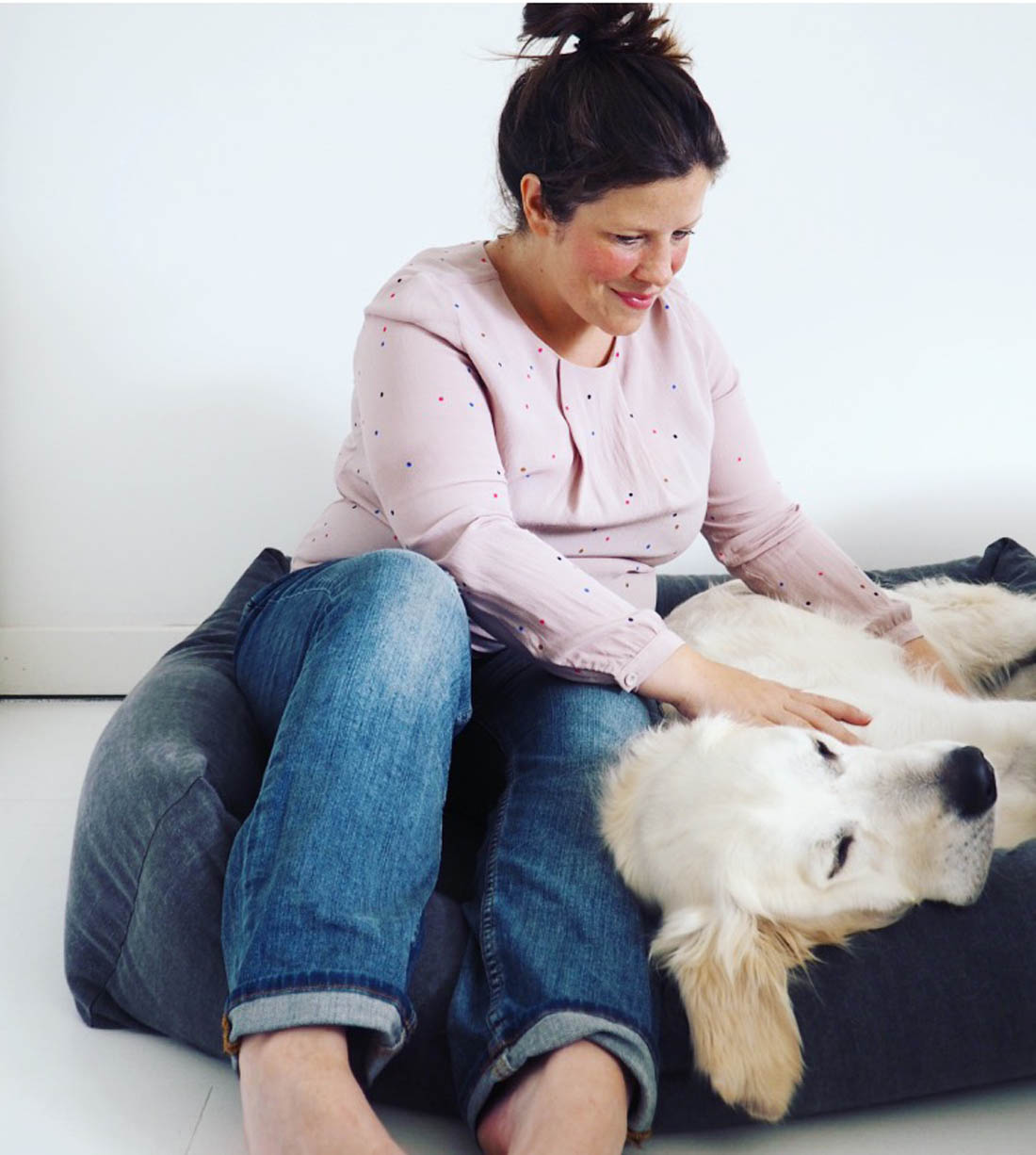
Living with dogs | Tips for keeping your home clean with dogs | Beautiful dog bed | Apartment Apothecary

I had to wake him up to try to take photos – he was not having any of it.

Over the last three years I have gradually picked up tips and methods to keep our flat looking (and smelling) pretty dog-free despite the ginormous 40kg dog that lives here and gets treated like a prince – ha! So, if you are struggling with maintaining the look and feel of your home due to too much dogginess, hopefully these tips will help you too…

1. Match your decor to the colour of the dog

You might think me mad but this is an important consideration. Our dog is white and therefore, if everything in our house was dark coloured the hair would show up really badly. Having a white floor and white bedlinen, for instance, means that the hair is far less noticeable. When my mum’s black dog used to come and stay it was the complete opposite and the floor and bed looked a state!

2. Brush your dog everyday

The best way to limit dog hair in your home is to brush them everyday, which I usually do in the park. This will really help to keep your home dog hair free as possible (with a golden retriever this is our main battle).

Living with dogs | Tips for keeping your home clean with dogs | Beautiful dog bed | Apartment Apothecary

Dog bed from Kind For Dogs.

3. Dog towels

Otto is a puddle seeker and a mud lover. During the wetter months of the year the battle to keep him out of mud holes is a futile one. He’ll roll and bathe in that mud until he is completely black from head to toe. Therefore, it is essential to have a steady supply of dog towels that we store in a box in the hallway cupboard. If we don’t put him in the bath immediately after our walks, we’ve trained him to lie down on one of the towels and sleep after his walk until the mud has dried. We can then brush it out.

4. Dog bed

We think it’s a good idea to invest in a really good bed that not only looks good in your home but can be easily washed. We also don’t encourage Otto to use his bed until bedtime. It’s much better if he lies on a dog towel during the day as this way he doesn’t get his bed all mucky and it stays as fresh as possible. After all, it’s much easier to chuck a towel in the wash than the whole bed. Try to get a bed that fits with the decor in your home and won’t stand out like a sore thumb.

I love this bed that was kindly sent to us by Finnish company, Kind For Dogs, who specialise in Nordic inspired design for dogs – right up my street. The bed is made of 100% thick cotton and the Anthracite colour of the bed I chose works perfectly in our flat (they have beds made in other stylish fabrics too – I really like this one). The cover is washable and the whole bed feels extremely sturdy and well made and won’t fall apart in seconds like that last one we bought. Otto loves it! Never before have we found a bed that is big enough for him to stretch out in whilst having a bumper cushion all the way round to help make him feel snug and cosy.

Living with dogs | Tips for keeping your home clean with dogs | Beautiful dog bed | Apartment Apothecary

Otto absolutely loves a big bed as he likes to stretch out completely when he sleeps.

5. Sofa

If, like us, you allow your dog on the sofa I would always recommend a wool sofa. The wool repels dirt and grease and covers up stains so well and it won’t snag if it gets caught by claws. It is the best! It’s also a good idea to have a basket of dog throws next to the sofa and bed for those times that the dog is a bit mucky so that they can still come up but you have something to protect the furniture.

6. Rubber gloves

Our wool sofa is amazing in terms of not showing up dog dirt and wear and tear but it does attract dog hair. A really simple way to get rid of it if you can’t be bothered to hoover is to use a rubber glove – it works like magic.

7. Lint roller

We have a lint roller sitting on our hallway table next to the front door. It’s always useful to be able to grab it at the last minute before you walk out of the door, especially if you are wearing black (and guests appreciate it too).

fullsizerender-2-4

A dog bed with sides is a must for this boy as he has to have his chin propped up at all times – do other people’s dog do this too?

8. Swiffer

We have a swiffer to help keep on top of collecting dog hair off the floor. It can be more effective (and less hassle) than a hoover as it doesn’t blow hair around the room. I’m also very tempted by a cordless hoover but I have no idea whether these are worth it – anyone have one?

9. Jute rugs

Jute rugs are amazing; they are so hard wearing under big paws and long claws and they show up no dirt and don’t attract hair. You need them everywhere!

10. Toy basket

Choose a lovely basket to store dog toys so they are not strewn around the place the whole time. We have a very aesthetically pleasing fair trade basket and it does its job perfectly and isn’t an eyesore.

Living with dogs | Tips for keeping your home clean with dogs | Beautiful dog bed | Apartment Apothecary

11. Neckerchief

So, you will only need one of these if your dog is a complete slobber chops like ours. It comes in very handy to wipe away slobber, especially when guests come who don’t want a big drooling chin planted on their best frock the moment they sit down. Oh, Otto.

So, there you go. These are the things I have picked up over the last few years to keep my home looking as nice as possible whilst allowing Otto every freedom – trust me, he is one spoilt dog and my decor has never come first.

Katy & Otto x

P.S. Lots of chicken was used in the taking of these photographs. However, as you can see from his face, he was not best impressed that his afternoon nap was disturbed by me and a camera.

P.P.S. Do check out Kind For Dogs for more Nordic inspired dog accessories – it’s rare to find stylish dog stuff so it’s been a real treat discovering this company.

Living with dogs | Tips for keeping your home clean with dogs | Beautiful dog bed | Apartment Apothecary

And this is what happens when I stop pestering him to pose for photos!

Technology that you don’t have to hide

Cables, wires, big black screens, enormous TV’s – the stuff of nightmares. Ugly technology just spoils a room: it looks horrible, takes up huge amounts of space, not to mention the miles of cables that seem to snake around the place in a menacing way. But we can’t do without it, right? Most people, in fact, want their whole living room to be designed around the placement of the TV.

The exciting news is that tech is changing and products are becoming smaller, wireless and designed with form in mind, not just function. Hurrah! Finally a tech revolution that I can get behind. At this year’s London Design Festival, Sony launched two such pieces and I’d like to tell you a bit about them as I’ve been trying out one of them at home and I saw the other in action at Design Junction last week.

7

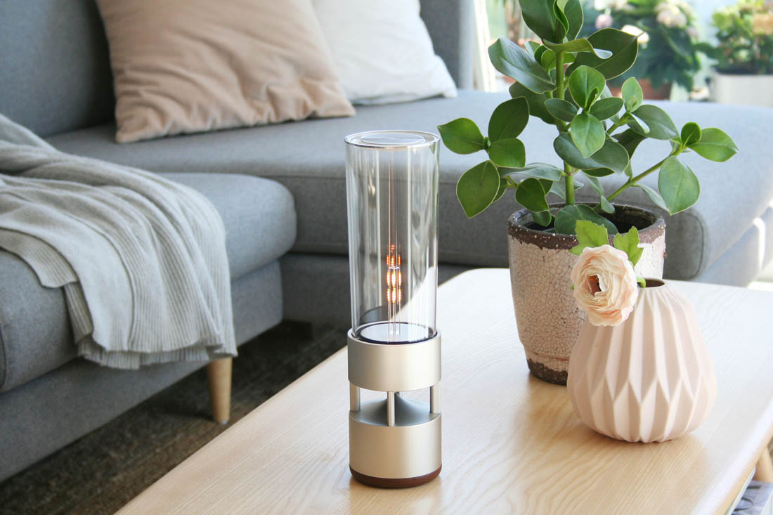
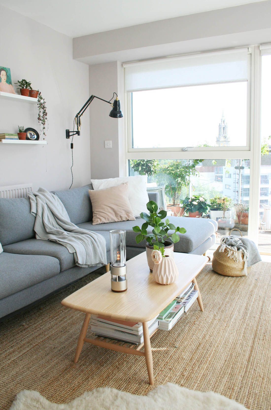
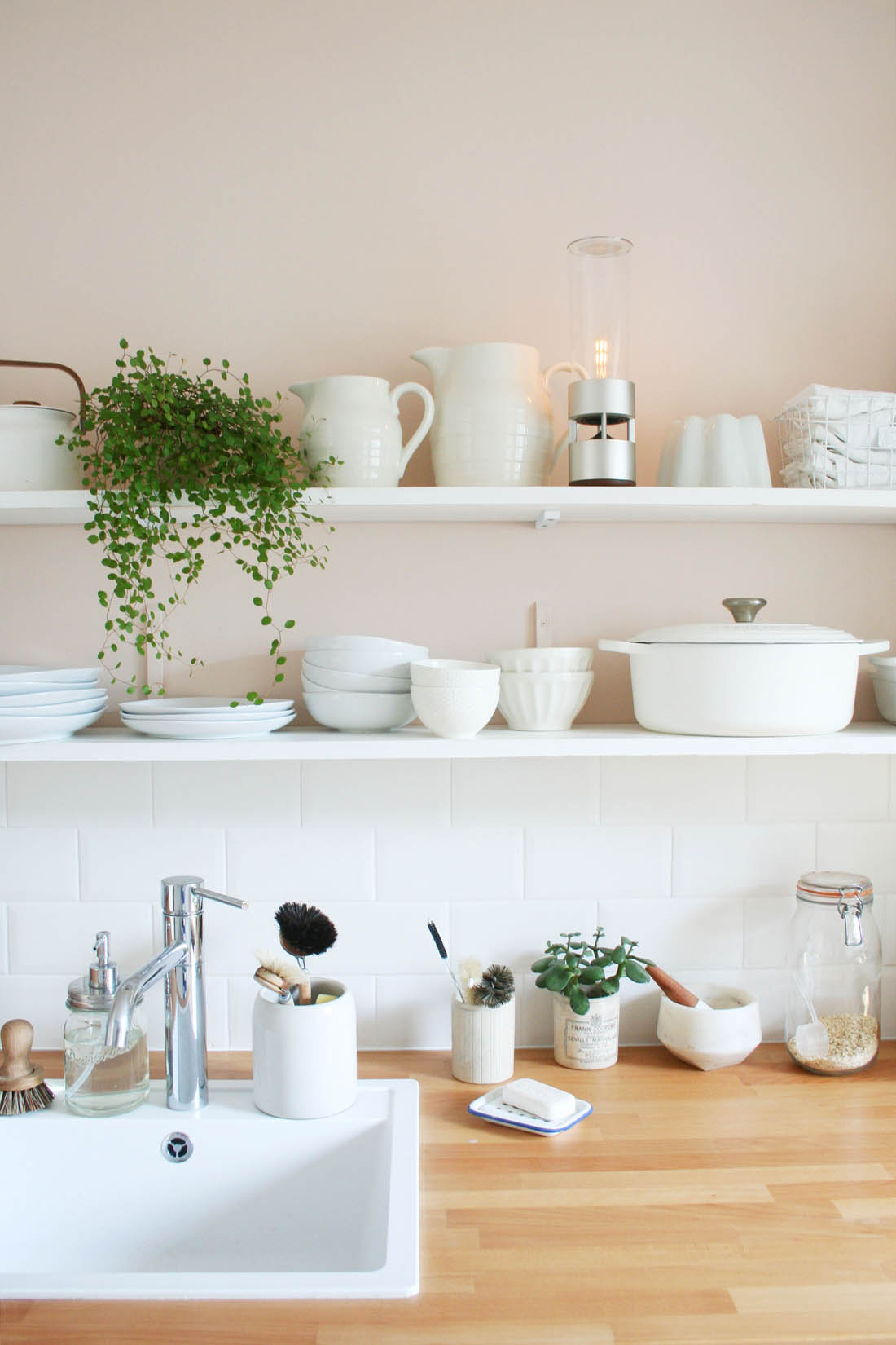
I have told you before about the ongoing argument Jules and I have had since we moved in together based on the fact that he thinks it’s acceptable to have four foot high laminate wooden speakers that are basically the same size as two young children and because you have to place them in different parts of the room there are cables trailing all over the shop. Not ok, Jules, not ok. After six years I have finally won the war and the speakers have left the building and I am delighted to have replaced them with Sony’s new glass sound speaker. It is portable and wireless to connect from my smart phone very easily using Bluetooth, it is very small and sleek and made of organic glass that gives it great sound quality.

The speaker can follow us around the house as and when we need it and doesn’t look out of place whether in my living room, on the kitchen shelves or on my bedside table. It feels like I’ve been released from cables and it’s so nice to be able to listen to music with great sound quality in any room of the house, not just the living room.

10

The speaker has a soft glowing light that you can turn on or off.

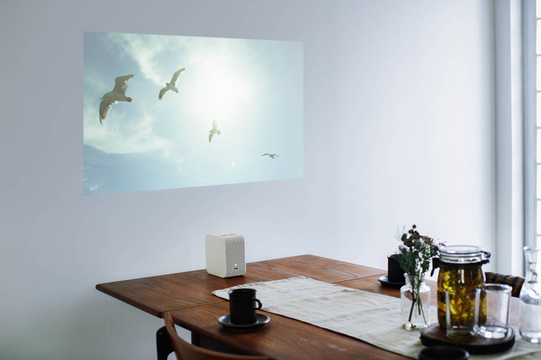
The second product launched by Sony is their portable ultra short throw projector. I haven’t been lucky enough to try this in my own home but I did see it in full action at Design Junction and it is UH-mazing! I honestly would get rid of our big ugly TV and replace it with this projector if I had my own.

Sony portable ultra short throw projector | Beautiful technology for the home | Apartment Apothecary

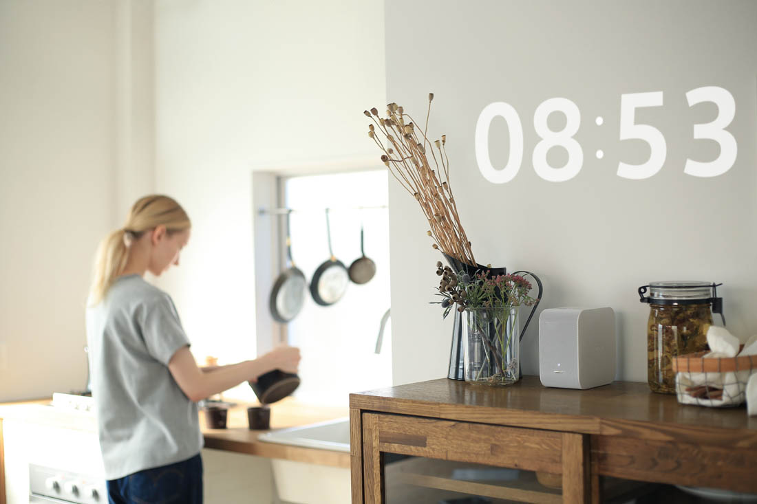
The projector is portable, wireless, teeny tiny and it can display anything you like, wherever you like. The most amazing thing about this design is it’s ultra short throw; it can be positioned right next to the surface you want to project on to so none of the faffing around with clearing a direct line of sight to the surface or mounting it from the ceiling etc. It can project a 22 to 80 inch image onto walls, tables or even a pad of paper and the image can be anything from a clock to one of your favourite views, a moving image, a TV show or a movie. The possibilities are endless. I WANT ONE!

Sony portable ultra short throw projector | Beautiful technology for the home | Apartment Apothecary

Design Junction 2016 | Sony glass sound speaker and ultra short throw projector | Beautiful technology for the home | Apartment Apothecary

It’s rare that technology can launch at a design show and not stick out like a sore thumb but Sony have struck the perfect balance between form and function and I hope this marks the beginning of more beautifully designed products that I won’t need to hide. Let’s hope the six year long argument with Jules about ugly tech is our last.

Katy x

*This post was written in collaboration with Sony.