Together Mutual Insurance and John Lewis giveaway

When I bought my first flat I was 25 years old and on a modest salary. I remember my dad and I went to visit the flat, which was right next to Borough Market, and we went for a drink afterwards and drew up a list of pros and cons. It was a brand new studio flat and the fact that it was a new build was very much on the pros list; I couldn’t afford any unforeseen maintenance issues or to do any work to the flat. Luckily for me in the three years that I lived there I never did experience any issues or unexpected costs.

Fast forward to buying my second flat, where I currently live, despite a larger salary I was still very much aware of the fact that I was single at the time and I was pouring my savings into buying the flat so I still couldn’t risk buying somewhere with hidden problems or a boiler that was going to internally combust within the year.

However, what I didn’t bank on was shoddy work by the developers of my new build flat that led to a couple of home disasters within our block. Firstly, our balcony that looks out to brilliant views of London six floors up has large glass panels. A couple of years after we moved in the glass panels started to shift, which we didn’t even notice at first. It wasn’t until the summer, once we started to sit out on the balcony, that we really noticed that something wasn’t quite right because all of the panels were at different heights but we could see that it wasn’t possible for them to slip down completely because the decking overlapped the panels. It was only when we heard a huge smash one day and saw one of the glass panels from our neighbour’s balcony had slipped out of its brackets entirely and fallen down onto the street (thankfully no one was down on the street at the time!) that we really understood the extent of the problem. Thank goodness our buildings insurance covered the work necessary to make our balcony completely safe, as well as unsuspecting passersby.

A Bermondsey balcony | Insurance and John Lewis giveaway | Apartment Apothecary

Our little Bermondsey balcony – walk under it at your own risk 😉

The second home disaster we experienced within the first year of moving into the flat was in our bathroom (the one you never see on here because it has no window so I can’t take pictures in there;)). There is a huge mirror on one wall in the bathroom that reaches up to the ceiling. I love having the mirror as it makes the room look bigger and it’s always useful to have a good mirror somewhere in your house. However, what we didn’t know was that the developers had used the wrong clips to hang the mirror. Thankfully, we weren’t in the room at the time as this enormous mirror fell off the wall and smashed into a million pieces. Luckily, this happened within the first year of living in the flat so it was covered by the builders’ guarantee and they came and repaired the damage – we will never be able to remove that mirror now after the amount of extra adhesive they used to ensure it never falls down again.

We are currently experiencing our third, and hopefully last, home disaster. Our flat roof, which allows for our amazing terrace, has started to leak – eeek! The leak first became apparent on the fifth floor of the building but water has now started flooding into our neighbours’ flat to the point that they gave us a key this weekend when they went away so that we could change the buckets if it rained. We are keeping our fingers and toes crossed that the water doesn’t work its way into our flat, especially as we have only just finished redecorating, but at least we are safe in the knowledge that we have both buildings and contents insurance.

A Bermondsey balcony | Insurance and John Lewis giveaway | Apartment Apothecary

Our roof terrace has amazing 360 degree views of London but it has sprung a leak. I am praying it does not make its way into our flat as it is currently pouring into our neighbours’ home.

Have you ever experienced any home disasters? To help us all the lovely folks over at Together Mutual Insurance would like to offer one reader a year’s worth of insurance and £200 of John Lewis vouchers. If you would like to enter all you have to do is complete the form below. Good luck!

Katy x

P.S. Keep your fingers crossed the leak doesn’t make its way into our flat or you may never see my kitchen and living room makeover!

P.P.S. This is Otto with his confused face on trying to work out how on earth I went from standing next to him on the balcony to waving at him from the bedroom window, which is where I took the pics from.

A Bermondsey balcony | Insurance and John Lewis giveaway | Apartment Apothecary

*I teamed up with Together Mutual Insurance (@TogetherIns) to tell the story of my home disasters and they are currently offering 40% off home insurance.

Styling at Dwell

Today I’d like to share a fun shoot that I did a few weeks ago at one of the brand new Dwell stores. The brief I was given was quite a challenge as I was asked to set up three home scenes in my own style. Considering Dwell sells very modern furniture and I like lots of vintage pieces and have quite an eclectic style, I had my work cut out for me. However, I really enjoyed the task as I think there is always a way of making a piece of furniture or accessories your own by the way you style them.

I was styling the sets in the store so I brought a bag of knick knacks from home as well as some flowers, plants and food to bring it all to life. Sarah Lou Francis photographed each set for me as there was no way I would have had time to do both. There was no natural light in the store at all so try to imagine how much nicer it would all look in an actual house without the harsh shop spot lights!

Dining scene

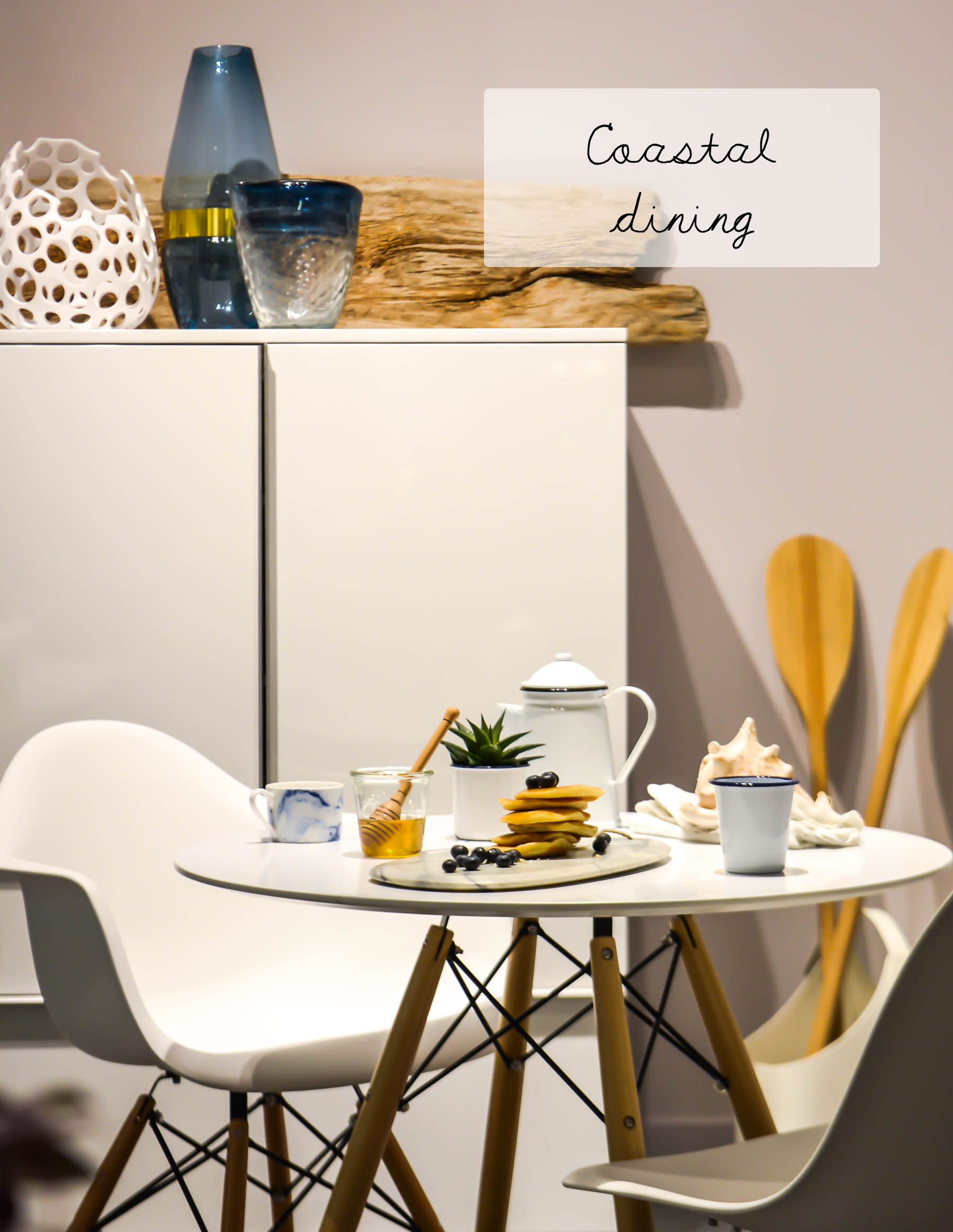
I wanted to keep the dining scene light and bright with a blue and white theme based on the vases and tableware from Dwell. Sarah-Louise offered to bring the driftwood and oars, which work perfectly to bring a bit of texture and add contrast to the white and work perfectly with the coastal theme. A slice of New England in Slough 😉

Styling at Dwell | Coastal dining | Photograph by Sarah-Louise Francis | Apartment Apothecary

Styling at Dwell | Coastal dining | Photograph by Sarah-Louise Francis | Apartment Apothecary

Styling at Dwell | Coastal dining | Photograph by Sarah-Louise Francis | Apartment Apothecary

I love the simplicity of the Eiffel dining table and chairs and I picked out the blue and white vases from around the store and added my own enamelware. The marble chopping board from Dwell’s dining accessories range was perfect for a New England pancake breakfast.

1. Eiffel dining table 2. Eiffel armchair 3. Eiffel dining chair with metal legs 4. Porous sculptural vase 5. Wave vase 6. Emotion coffee cup 7. Marble serving board

Home office scene

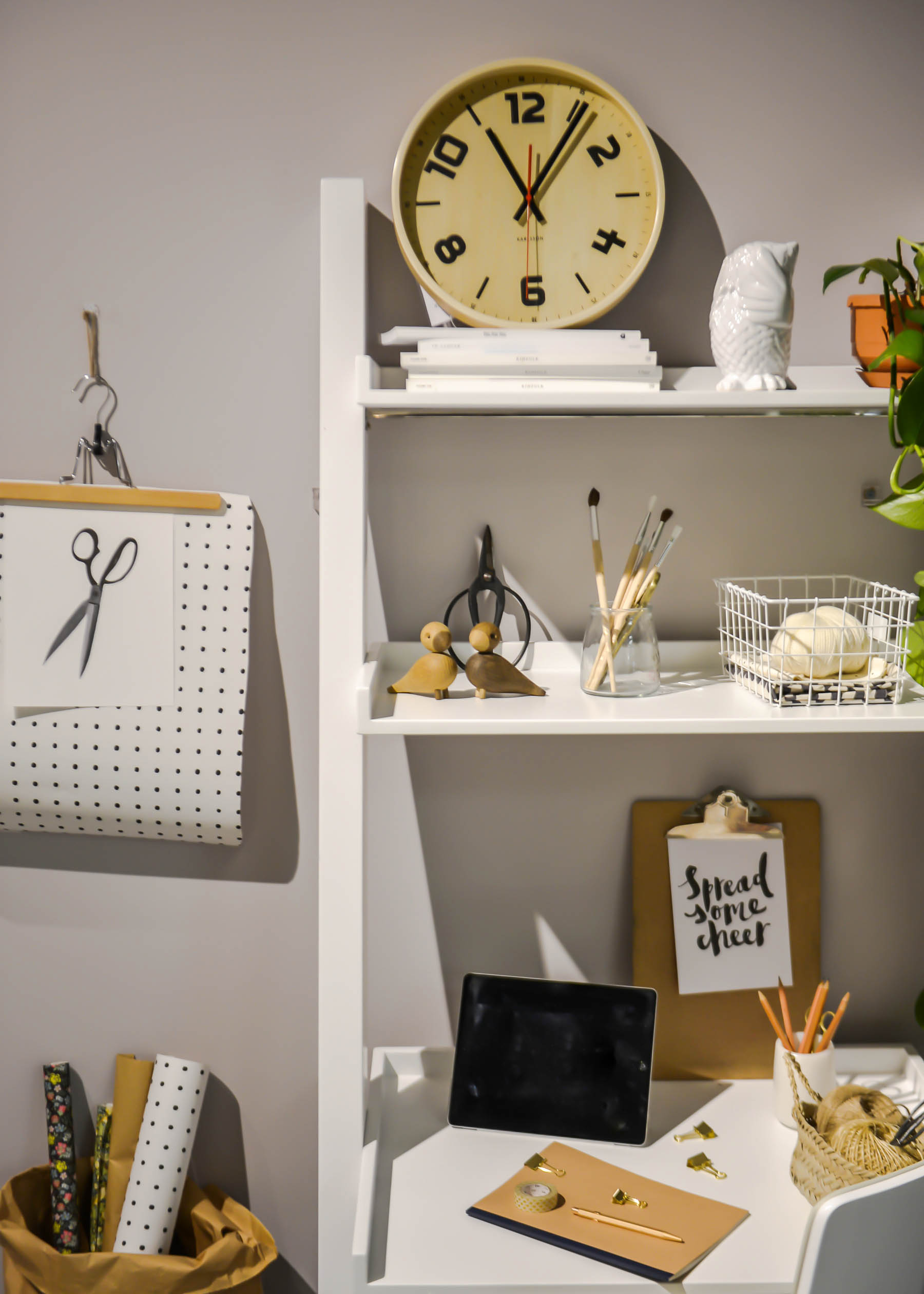
I love my own home office so I wanted to choose a desk that was quite close in style to my own Scandi-inspired workspace. I love the clean lines of these ladder desks and they are so practical, especially if space is an issue. I brought a few bits from my own desk, sticking with a very neutral monochromatic scheme to keep it modern and fresh. A big trailing plant adds a bit of colour and life.

Styling at Dwell | Scandi workspace | Ladder desk | Photograph by Sarah-Louise Francis | Apartment Apothecary

Styling at Dwell | Scandi workspace | Ladder desk | Photograph by Sarah-Louise Francis | Apartment Apothecary

Styling at Dwell | Scandi workspace | Ladder desk | Photograph by Sarah-Louise Francis | Apartment Apothecary

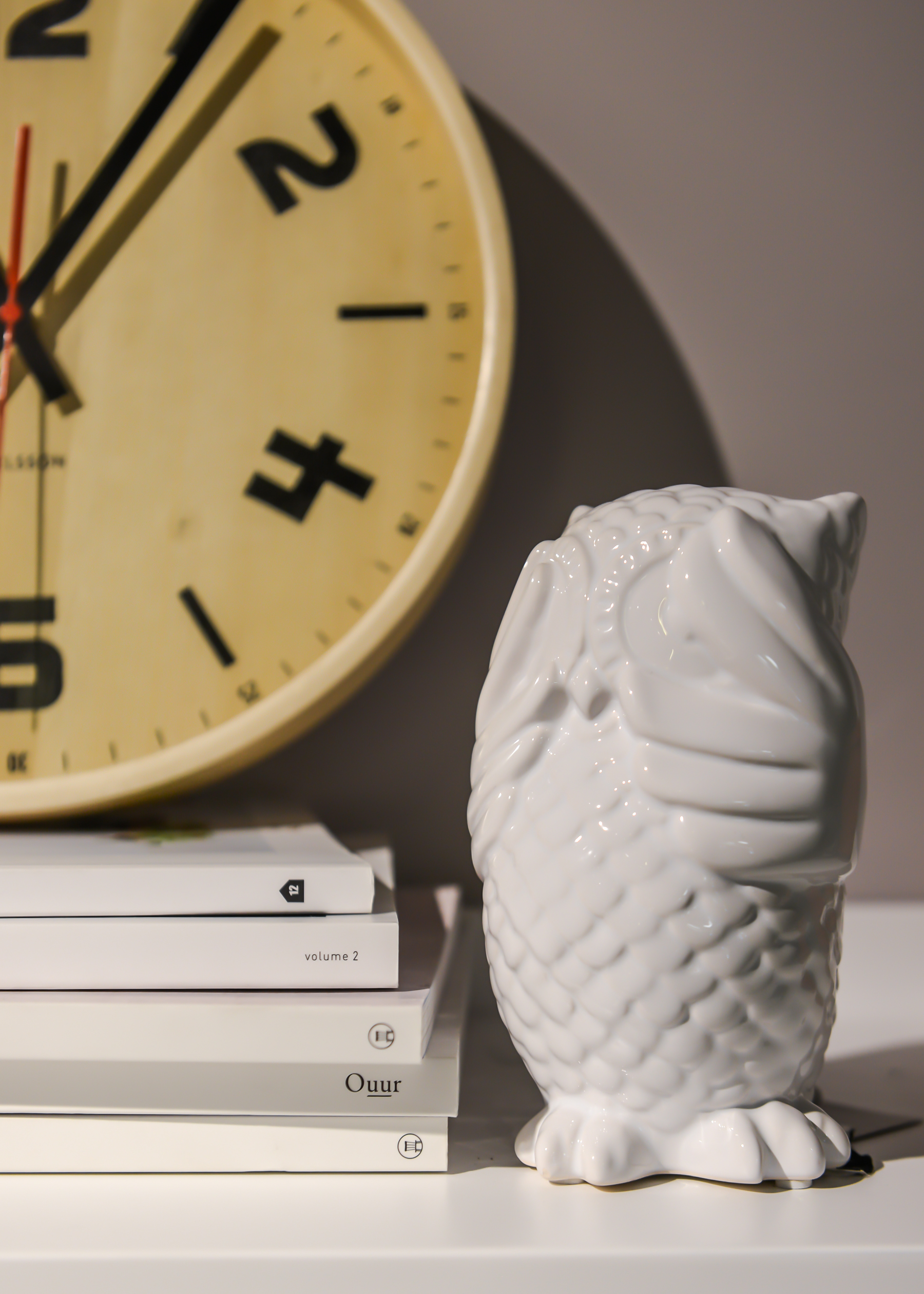
As luck would have it Dwell sell exactly the same clock as I have in my own office and I had to sneak in one of the three ‘hear no evil, see no evil, speak no evil’ owls from the store. I love them!

1. Escala desk 2. Straight back gloss home office chair 3. Timber wall clock 4. See no evil owl money bank

Bedroom scene

The only bed that I could style in the store was against a big black wall and it all felt quite hard and masculine. Therefore, I wanted to add a few florals and some blush pinks to soften the space and make it feel a bit more me. I hung a beautiful gown from Verry Kerry on the wall along with some pretty pink blooms in an alabaster pot from Dwell’s bathroom accessories. A sumptuous bedspread and breakfast in bed with a warm copper lamp on the other side of the bed helped to make the space feel more welcoming.

Styling at Dwell | Photograph by Sarah-Louise Francis | Apartment Apothecary

Styling at Dwell | Photograph by Sarah-Louise Francis | Apartment Apothecary

The bedspread was one of my favourite pieces in the store and I feel the need to add it to my own bedroom.

1. Monza bed with drawers 2. S side table 3. Wire cage table lamp copper 4. Lexington bedspread 5. Button cushion dark grey 6. Alabaster toothbrush holder (I used it as a vase) 7. Hear no evil owl money bank 8. Owl tealight holder

Thank you so much to Sarah Lou for photographing my styling on the day and all the staff at the new Slough Dwell store who were so lovely and didn’t complain at all even though we had pancakes, plants and pots strewn around the store all day! To get more styling inspiration head over to Dwell’s blog.

Katy x

*This post was written in collaboration with Dwell. All images by Sarah Lou Francis.

My Houseology

Sharing a bit of linen cushion love with you today. These beauties are actually destined for my new sofa when it arrives but at the moment they are sitting pretty on my bed. I chose linen pillows as I love the texture and they always look so welcoming to me, especially good for a bit of sofa lounging (also these cushions have a ruffled frill that make me swoon!).

The cushions are from Houseology who have recently set up a new platform that allows customers to share photos of their purchases once they are in their new homes. My Houseology will give useful interior inspiration and the images will also feature on the individual product pages, which I think is really helpful as I don’t know about you, but when I am choosing a product to buy online I want to see as many photos of it as possible, especially in the context of a real home. On top of that a panel of Houseologists will choose a winning image each month and the winner will receive £500 to spend with them!

My Houseology | Linen pillows | Apartment Apothecary

House In Style HS Bari cushions in anthracite and white.

My Houseology | Linen pillows | Apartment Apothecary

I think I am a bit obsessed with soft pinks and greys at the moment.

My Houseology | Linen pillows | Apartment Apothecary

Love the pretty ruffled edge of these cushions that give them a feminine touch.

I’m off to upload my pics onto My Houseology – hope to see you over there!

Katy x


*This post is written in collaboration with Houseology.

Crafting with mason jars

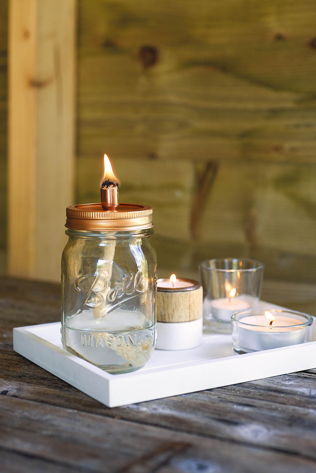
Everyone loves a mason jar, don’t they? I bought a set of them a while ago with grand plans for many DIY projects. I’m now even more inspired to get started after reading Hester van Overbeek‘s new book Crafting with Mason Jars. I’m pleased to be kicking off the blog tour for the new book today and I have picked out a few of my favourite projects to show you.

There are loads of simple but effective projects in the book, all beautifully illustrated with photographs and graphics and clear step by step instructions. Filled with inspiration and clever ideas for gifts, homewares, decorations and storage solutions; some are perfect for crafting novices and others are a little more complex.

Here are my favourite ideas…

Crafting with mason jars | Book tour | A apartment Apothecary

Crafting with Mason Jars by Hester van Overbeek, photography by James Gardiner, published by CICO Books, all images © CICO Books

These drinks dispensers are brilliant for summer parties and well worth investing an afternoon into making one of these.

Crafting with mason jars | Book tour | A apartment Apothecary

Crafting with Mason Jars by Hester van Overbeek, photography by James Gardiner, published by CICO Books, all images © CICO Books

Another perfect project for the warmer evenings – they still seem so far away but I can’t wait for them!

Crafting with mason jars | Book tour | A apartment Apothecary

Crafting with Mason Jars by Hester van Overbeek, photography by James Gardiner, published by CICO Books, all images © CICO Books

I’m kicking myself for having bought one of these soap dispensers recently when I could have made it with Hester’s tutorial.

Crafting with mason jars | Book tour | A apartment Apothecary

Crafting with Mason Jars by Hester van Overbeek, photography by James Gardiner, published by CICO Books, all images © CICO Books

Crafting with mason jars | Book tour | A apartment Apothecary

Crafting with Mason Jars by Hester van Overbeek, photography by James Gardiner, published by CICO Books, all images © CICO Books

I hope you enjoy the rest of the blog tour and I look forward to seeing lots of mason jar upcycling projects!

Katy x


Besta Ikea hacks

Yesterday evening I begged Jules to drive me to Ikea (I’ve never learnt to drive – shameful, I know) to buy a set of BESTA cupboards. I managed to persuade him with the promise of meatballs followed by a hotdog (seriously, that’s all it takes with him) so off we went at 7pm to miss rush hour and the crowds and we were home by 10pm because there is no browsing time allowed with my husband-type in toe.

Between us we really don’t have that much stuff but we also only have one built in storage cupboard in the whole flat so we are quite desperate for some extra ‘hidden’ storage i.e. a cupboard that I can stuff full of crap that no one can see. I always try to avoid large pieces of furniture that take up a lot of floor space and could potentially make our rooms feel cramped so I’m constantly on the lookout for wall cupboards that are not too deep, as this can eat into the space too. In short, I don’t want cupboards that touch the floor or stick out from the wall too much but I do want to store quite a lot of stuff – kinda tricky.

I’m pretty sure BESTA is the answer to my prayers (for now, until I find a beautiful vintage version – obvs). They come in a range of depths, can be wall mounted and they are white so they fade into the background. Perfect. The other great thing is that lots of clever people have come up with creative hacks to make these plain cabinets a bit more interesting. What do you think?

BESTA Ikea hacks | Apartment Apothecary

For a window seat just add a mattress and cushions. Yes, please. Image via Elizabeth Heier

BESTA Ikea hacks | Apartment Apothecary

Wall mount slim cabinets with a DIY concrete top for a smart hallway table. Very clever. Image via Plantete Deco

BESTA Ikea hacks | Apartment Apothecary

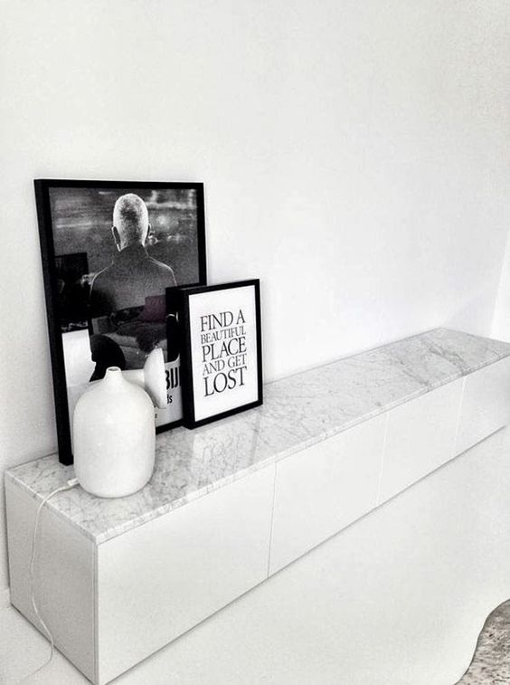
If I could afford a marble top I would do this in a flash! Image via Designville

BESTA Ikea hacks | Apartment Apothecary

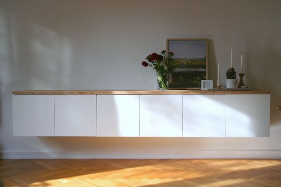
By adding a single wooden top to this collection of cabinets it unifies the look and gives it a bit more character. I’d like to do this with mine with some old scaffolding planks perhaps. Image via Vidanullvier

BESTA Ikea hacks | Apartment Apothecary

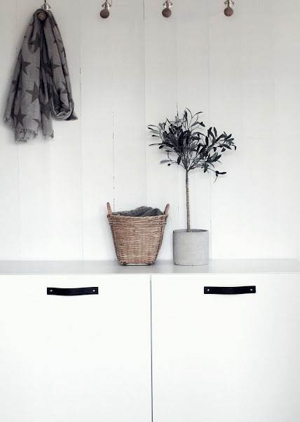
Try my leather handle tutorial to give a plain piece of furniture a completely new look. Image via Apartment Diet

I have chosen three cabinets this size and I will mount them slightly raised off the floor, which will help to keep the room feeling spacious. I like the idea of hanging a light over it too.

I will bring you a little storage cupboard update once it is installed and stuffed to the brim!

Katy x