Modern Victorian home

I long for a period home. I was brought up in a Victorian house and this has influenced my love of Victorian architecture and period features: fireplaces, cornicing, ceiling roses, original floorboards, sash windows, tiled hallway, brass door knobs, free-standing bath, the list goes on. In my childhood home there was even an original spiral staircase that led from the first floor down to the garden – absolutely beautiful. In fact, it got to the point where my university friends secretly nick-named me Victorian Katy. Seriously.

If you are lucky enough to live in a home with original period features, for some it can be difficult to resist the urge to renovate to try to make everything look and feel ‘new’ again. However, this can remove a lot of the character of a house. I would like to show you a very sympathetic and careful renovation of a London Victorian house that has been brought back to life in such a way that none of the character has been lost, yet it has gained clean, simple lines and a fresh feel…

Victorian house with original period features and tiled hallway

Typically, Victorian houses have narrow, awkward hallways. By painting everything white and removing carpet from the stairs, the owners have made this hallway feel as spacious as possible.

Victorian house with original period features and period built-in dresser

They have retained the original built-in dresser, which usually gets ripped out in favour of a fitted kitchen. However, it adds such character and is the perfect place to show off vintage kitchen finds.

Victorian house with original period features and vintage kitchen

In the kitchen the floorboards have been painted white, which always gives a feeling of light and space. They have lost none of the charm of a typical free-standing kitchen by using fabric instead of cupboard doors. This makes you think it is not a fitted kitchen, when actually it is. The addition of the vintage trolley and weighing scales adds character.

Victorian house with original period features and conservatory

The addition of a conservatory gives much needed space but they have retained the original garden doors and used wood cladding on the on the wall to add character.

Victorian house with original period features and painted floorboards in hallway

Painted floorboards and white walls run throughout the house, which gives it a more modern feel.

Victorian house with orignal period features and vintage bedroom

In the bedroom all of the character is maintained but it has none of the dark, heavy colours associated with Victoriana. Removing heavy curtains from the windows adds to the fresh, clean lines.

Victorian house with orignal period features and vintage bathroom

I love this pretty bathroom. It is completely practical, clean and simple, yet clever touches add a vintage feel: the mirrors, lace panel, light shade and the wood cladding bath panel. The sink is also a clever addition; a modern sink has been installed on a vintage table with a fabric curtain. This adds style, yet remains practical.

Victorian home with original period features and vintage nursery

More painted floorboards, no heavy curtains and another clever sink unit make this a Victorian room with all the practicalities a child needs.

Victorian home with original period features and vintage nursery and hooks

All this home needs is a cosy sitting room. I love it: modern, clutter-free and all the clean lines you could want, combined with orignal period features and a load of Victorian charm. What’s your favourite architectural style? x


Lisa Stickley’s home

When I arrived and caught a peek of the house and Lisa’s beaming smile, I just knew I was in for a treat. Basically, it was my idea of heaven: a hugely talented designer, amazing decor, incredible vintage finds and proper film photography by Katharine Peachey. Dee-lightful.

Lisa Stickley is a designer that I came across because my parents live in South West London, where Lisa had her first shop/studio. It was my introduction to modern, nostalgic prints and vintage-styled ceramics for the home that were hugely popular and stocked in the likes of Liberty of London and Heal’s. Since then, Lisa has moved on to create two new brands, which are inspired by her great grandmothers, Ada Rose, and  her Aunty and Uncle, Betty & Walter.

When I got the opportunity to snoop around Lisa’s new home I immediately knew it was going to be right up my street. And I wasn’t disappointed. All of the care and attention to detail Lisa puts into her designs and styling was evident in her home. Heaven, I tell you.

How did you go about planning your recent renovation? Did you collect ideas and plan each room meticulously or was it more organic than that?

“The bare bones and main décor were pretty well planned ahead with the accessories and bits and pieces for each room collected and gradually added as and when. We were waiting for quite some time to move so I had a lot of months for ‘planning’. Meticulous is probably quite accurate… I downloaded the floor plan from Right Move and started with the flat as a whole in my mind so as to create a complementary eclectic theme throughout. I then worked on planning room by room with individual folders of colour, floor detail, furniture thoughts etc for each. I’m a bit of a planner… don’t do last minute!”

Lisa Levis (nee Stickley) Heal's sofa

Instead of having a wedding list, Lisa and her husband asked for this Heal’s sofa.

Lisa Levis (nee Stickley) original artwork

These pictures were hung in a pop-up shop in Westbourne Grove for the launch of Ada Rose . They are the original line drawings used for the collection.

How has your work as a designer influenced your home?

“It’s all pretty much one and the same, work blurs into the rest of life automatically in everything I do. I’m very lucky to be doing what I love, and I don’t ever really switch off. As a designer I like to surround myself with things that inspire me and my home is no exception. It’s a great place to showcase things I have collected, and experiment with colour, furniture and interesting objects, paintings, bits and pieces that inevitably go on to inspire my work one way or another, be it in a print, a bag shape or styling a shoot.

My husband is a designer too and we love collecting pieces of furniture from our travels, so it has been great moving from a one bedroom flat to a three bed, having to decide what will go where and finally have a home for everything. I think things seem to take on a different lease of life moved around and placed in different environments.”

Lisa Levis (nee Stickley) fireplace

The wall paint is ‘French Grey’ by Little GreeneThe floorboards have been painted with “Chocolate’ and then varnished.

Lisa Levis (nee Stickley) retro chairs

Lisa Levis (nee Stickley) interior design retro armchairs

These chairs were part of Lisa’s parents’ first three piece suite. They went out to buy a loaf of bread and ended up buying these instead – brilliant. They have been re-upholstered many times since.

Lisa Levis (nee Stickley) chair

This chair was one of the pieces designed by Lisa as part of her degree at the Royal College of Art. It’s covered in a vintage table cloth with a copy of a 1970’s Cordon Bleu menu – inspired by the ‘Menu of the week’ in one her mum’s magazines. The framed photograph is by Ben Anders – a porta-loo in Helsinki apparently!

Lisa Levis (nee Stickley) Art Deco vintage chairs

These chairs are waiting to be upholstered although I love them as they are. The artwork is by Lisa’s husband.

How has your style and taste changed over time? 

“It’s hard to say really as I constantly refer back to sketchbooks and things I have collected for years for reference and still find these things incredibly inspiring, I just think you see things with fresh eyes as time goes by. I feel as though my style is a little more grown up these days, as one would expect I suppose. I still love to be surrounded by beautiful things but I am more edited than I used to be, less cluttered. I have noticed that I am becoming more and more attracted to a more pink/ochre/peach colour palette of late too, which is quite a shift for me. Love of particular colours tend to stay with me for quite some time, shifting and adjusting only slightly, so I do feel like I’m entering a bit of a new colour chapter! It’s exciting!”

Lisa Levis (nee Stickley) interior design and styling

Lisa Levis (nee Stickley) interior styling

One of the things I admire the most about Lisa’s overall style is her attention to detail and her ability to style her home so beautifully, yet it looks so organic – there wasn’t a whiff of staging anywhere throughout the house.

Lisa Levis (nee Stickley) hall

Lisa Levis (nee Stickley) interior design vintage kitchen hooks

Lisa Levis (nee Stickley) vintage glass kitchen cabinet

Lisa Levis (nee Stickley) kitchen with decoupaged cupboards

They intend to re-haul their kitchen but in the mean time Lisa has decoupaged the kitchen cupboards with copies of knitwear magazine pages (her husband is a knitwear designer). She used carpet tape and varnish.

Lisa Levis (nee Stickley) kitchen with Ercol dining table and chairs

Lisa Levis (nee Stickley) painted stairway

Lisa Levis (nee Stickley) interior design and styling

Lisa Levis (nee Stickley) interior design and styling

Lisa Levis (nee Stickley) interior design vintage bedroom

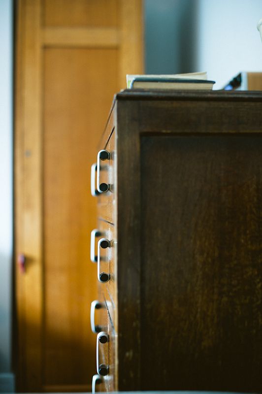
The main bedroom has a set of lockers instead of conventional wardrobe, that Lisa bought in Dorset (it quickly became apparent that she is very good at sourcing beautiful pieces from all over the place).

The chest is Lisa’s grandmother’s and above is a Vernon Ward painting, that Lisa has been collecting, unknowingly, for years. The enamel topped table is from Rye’s McCully and Crane. The bag sitting on the chest is part of the new Ada Rose collection.

Lisa Levis (nee Stickley) bedroom retro chest of drawers

Lisa Levis (nee Stickley) bedroom retro locker wardrobe

Lisa Levis (nee Stickley) vintage bathroom cabinet

The bathroom cabinet was sourced from Kempton antiques market. The toiletry bags are part of the new Ada Rose collection.

What inspired the new Ada Rose and Betty & Walter designs?

“Ada Rose is named after my great grandmothers who lived in a time where style was simply elegant with a blend of common sense and ingenuity. Prints incorporate multi layers of painterly blooms in chic colour palettes, which are unfussy and ladylike with a feminine depth and delicacy, and for me are reminiscent of what they might have worn, then given a fresh modern twist.

Common sense and ingenuity leads on to a level of functionality, which is key to everything I do. I don’t like the thought of designing a beautiful print and simply making in into ‘a bag’. Every detail from the closure pockets, linings and quality leather have been meticulously considered and designed with purpose. Bespoke dyed leather trims frame the prints and snap closures are finished with bold, specially made made acrylic blocks which add an additional dimension to the print. Inspired by traditional shapes, the bags and accessories are brought up to date and designed for modern day use everyday through to evening. All with a well turned out finish, for ladylike style with sophisticated charm.

Betty & Walter is inspired by my Aunty and Uncle who lived in The Bungalow on 5 Elms Road, Oxford. Being mid century cattle dealers for the local farm, most working days were spent at cattle markets and the rest of their time was filled with cooking steak and kidney pie, tending to honeysuckle and harvesting raspberries, going to parties to play matchbottle and newmarket and drinking Camp Coffee!

Uncle Walter often wore chestnut coloured trousers and enjoyed watching the horse racing on a Saturday in his armchair. Aunty Betty had a fondness for marble cake, which she would eat whilst wearing her flowery apron. What better muse(s) could one ask for?!”

Lisa Levis (nee Stickley) vintage luggage doorstop

Quirky details like vintage luggage used as door stops make this home unique.

Lisa Levis (nee Stickley) vintage fireplace

The wallpaper is Designers Guild’s Seraphina graphite print.

Lisa Levis (nee Stickley) vintage fireplace

They got this fireplace for 99p (yes, 99p) from eBay. Jealous.

Lisa Levis (nee Stickley) bedroom retro sideboard

Lisa Levis (nee Stickley) Designer's Guild wallpaper

Lisa Levis (nee Stickley) 1930's wardrobe and magazines

What a beautiful home, caught on beautiful film, courtesy of the beautiful Katharine Peachey.

As I paw my way through the new Ada Rose and Betty & Walter collections, ogling new prints and patterns, coveting elegant handbags and glamorous scarves, I have a suspicion that exciting times are ahead for Lisa Stickley…(oh, and I want to come back if you ever get your hands on the bottom half of the house!)

The Wapping Project

The Wapping Project is one of my favourite places. We discovered it a couple of years ago on a walk down the River Thames. I love exploring Wapping and Rotherhithe as the streets are lined with converted warehouses and factories that are now beautifully restored apartments (so jealous!). When we came across this building it caught my attention immediately as it is so imposing. There’s a lovely garden with chairs growing on trees and a very sweet greenhouse that is a community bookshop and meeting house. As we walked inside I was rendered speechless. The space is enormous and the interior architecture is stunning: exposed brick, utilitarian tiles, vast hooks dangling from the ceiling, concrete floors, lead windows. It’s a space that I dream about owning and renovating into a home. The combination of soaring ceilings and abandoned machinery with iconic modernist furniture would inspire anyone. The space has now been converted into a restaurant and art gallery. In the evenings, the machinery is covered in candles and it is really rather magical.

So, before you have a look for yourselves, a quick history lesson – do you know that I’m a History teacher? Oh, yes. The Wapping Project was a hydraulic pump house. A network of water pipes used to run underneath the ground across London (marked in red on the map below). Wapping pump house would pump water through these pipes to power a vast range of things, including the lift at Selfridges. Good fact.

Now, have a look for yourself…

The Wapping Project industrial factory style architecture

The Wapping Project factory industrial architecture

The building has retained its ceiling height throughout with no additional internal walls so the space is immense.

The Wapping Project factory industrial architecture

The sleek, modern Vitra furniture contrasts with the old industrial building (I’ve got no idea who those weirdos with their thumbs up are…).

The Wapping Project factory industrial architecture

The pump house machinery still stands proud, albeit functionless.

The Wapping Project factory industrial architecture

The Wapping Project factory industrial architecture

The Wapping Project green house with deck chairs

In the gardens lies a little bookshop greenhouse.

The Wapping Project art installation

There are also art installations in the garden, which grab your attention as you walk by.

The Wapping Project art installation

The Wapping Project green house

Inside the bookshop greenhouse.

Crates used as shelves

The Wapping Project factory industrial architecture


Pale and interesting

The first thing I want to ask about the house I am featuring today is: Why is it not mine? No, seriously, why?

This Victorian terraced house is in Brixton, South West London, and it is used for photoshoots and filming. I love so much about this house: the colour palette, the interesting furniture, the period features and the simplicity of it all. If I lived here I would want to inject a bit more personality and, of course, there would be more ‘stuff’. However, what I think the owners have achieved is to show that neutral does not have to be boring, if you follow a few rules…

Pastel interior of London Victorian terrace

The house has stripped and painted floorboards throughout, which creates a fresh, clean feel. It also means the neutral blue palette used in this room stands out. By painting the chairs a different tone of blue adds a layer of interest and colour. The blue is also picked up in the antique Burleigh platters and the ticking stripe of the armchairs. None of these pieces are ‘matching’ so even though they are the same colour it does not look generic. This is an important rule in my book: don’t ‘match’ but combine pieces from different periods and eras with a similar colour palette. This way your colour scheme can remain neutral, yet it becomes interesting.

Pastel interior of London Victorian terrace

By making the most of all the period features in this home they have retained a lot of character even though they have minimal furniture and belongings.

Pastel interior of London Victorian terrace

They have used a different tone of blue/green in another reception room, which adds interest even though it is still very neutral. Another trick for adding character to such a simple interior is by personalising furniture and not buying generic pieces. For example, this sofa has different coloured seat cushions with a variety of scatter cushions, none matching but all sticking with a subtle colour scheme. They tie in with a customised lamp.

Pastel interior of London Victorian terrace

These colourless antique apothecary bottles stand out in such a simple room and add character as they are unique pieces. A mass produced vase in this room would make no such statement.

Pastel interior of London Victorian terrace

This chair has been chosen carefully; if it were brand new and perfectly upholstered it would look bland against the neutral wall colour.

Pastel interior of London Victorian terrace

This piano and chair strike a contrast against the white, blues and greens. A few statements like this add a focus to a room, which is needed when using such a simple scheme otherwise there is nothing to provoke curiosity.

Pastel interior of London Victorian terrace

Painting the wood-work the same colour as the walls creates an unusual effect.

Pastel interior of London Victorian terrace

In this room they have made the lovely bay window and fireplace the focus by keeping everything else neutral. However, the mat and baskets add contrast to the stark white so it does not become too dull. Although, if it were my house, I would definitely want some artwork up on those walls and more personal touches.

Pastel interior of London Victorian terrace

Accessories, like the mirror, lamp, jugs and tray, added to this room are all white but they are different shapes, sizes and textures so they add interest.

Pastel interior of London Victorian terrace

A hint of the colours used in the other reception rooms.

Pastel interior of London Victorian terrace

This Ercol sofa is very simple and plain but by adding a blanket and mis-matched cushions it softens the stark white of the walls and floor.

Pastel interior of London Victorian terrace

The kitchen builds on the colours used elsewhere in the house and the hard, clean lines are softened by using open-shelving and warm wood.

Pastel interior of London Victorian terrace

Pastel interior of London Victorian terrace

Although sparse, every piece of furniture and accessory they have chosen to use is from a different era so it does not look boring.

Pastel interior of London Victorian terrace

Here the fireplace, alcoves, window and dimensions of this period house can speak for themselves, rather than colour.

Pastel interior of London Victorian terrace

Again, they have chosen an old sofa and covered it themselves so it adds charm to this bright, white room.

Pastel interior of London Victorian terrace

Such a pretty fireplace and carefully chosen ornaments are the focal point here against the neutral colour scheme.


What do you think? White and boring or pale and interesting? I think the neutral, minimal style has allowed beautiful period features and lovely furniture speak for themselves. I’m totally jealous.


Photographs courtesy of Shoot Factory.


Double Merrick

On a road trip round France last summer we caught up with a friend in La Croisille-sur-Briance, a tiny village nestled deep in the Limousin region. Merrick Angle is an illustrator and designer who is both halves of Double Merrick (the name was coined by his daughter, Flora, who, when asked what could be better than Merrick, replied “double Merrick!”). My next post will showcase some of his beautiful prints, canvases and homewares, but first I want to show you his stunning, ivy-covered, family home. Having arrived at the house during the hottest part of the day, – we stepped out of the glaring sun and into cool shade provided by the house’s two-foot-thick stone walls. A unique home opened up before us: filled with vintage finds, antique furniture and an organic feel that can only evolve in a real home. One of the things I love most about the design of the house is that it doesn’t follow any rules; Merrick and his wife Alice have combined furniture from different periods with colours and fabrics, photographs, knick knacks and a lobster on a piano. This is what he told me:

“In 2004 we bought a wreck. The house hadn’t been lived in for 30 plus years, had no hot water and one socket for the whole house. It was February! On top of this we had no money, so work was a slow business. This in someways has been a blessing, as it forced us to live with the house and really think about how we used it before we could do any major work.  Mainly, we have just decorated and done very little structural work (just rewired the house and put in a kitchen and a bathroom). Most of our furniture are things Alice has come across in her work as an estate agent or finds from brocantes and car boot sales.”

I asked Merrick, from a designer’s point of view, what advice he has about using colour, as this is something that I always struggle with:

“Push your boundaries. We all start off from a small space of what we consider ‘right’ and acceptable. And it is a small space! I started out wanting to paint every room in our house a bold, strong colour but through Alice’s (my wife) influence I have learnt a lot about nuance and tone. I think you have to be receptive to new ideas.”

Delight in these pictures of Merrick’s and Alice’s home and their unique style. I will introduce you to Merrick’s work in my next post…

Home of Double Merrick | French house | Apartment Apothecary

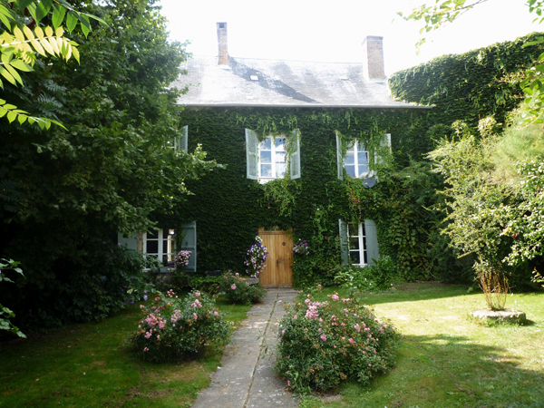
The pretty and traditional style of the outside belies the unique interior style of this home.

Home of Double Merrick | French house | Apartment Apothecary

Home of Double Merrick | French house | Apartment Apothecary

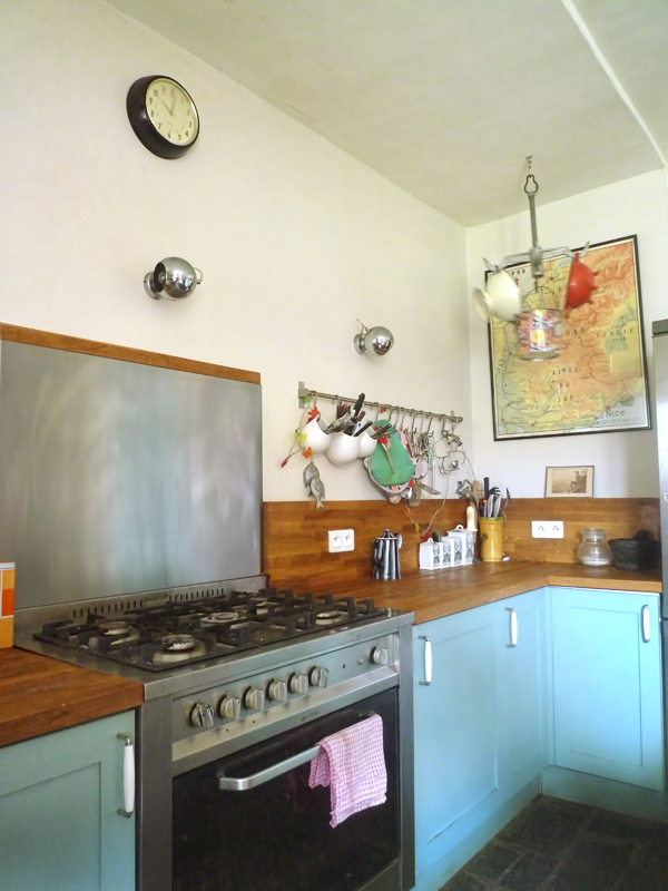
Kitchens can too often feel clinical and characterless but here the simple addition of the photographs give another dimension to this space.

Home of Double Merrick | French house | Apartment Apothecary

I’m just not sure what to say about this stove other than give it to me! Love the French signage too.

Home of Double Merrick | French house | Apartment Apothecary

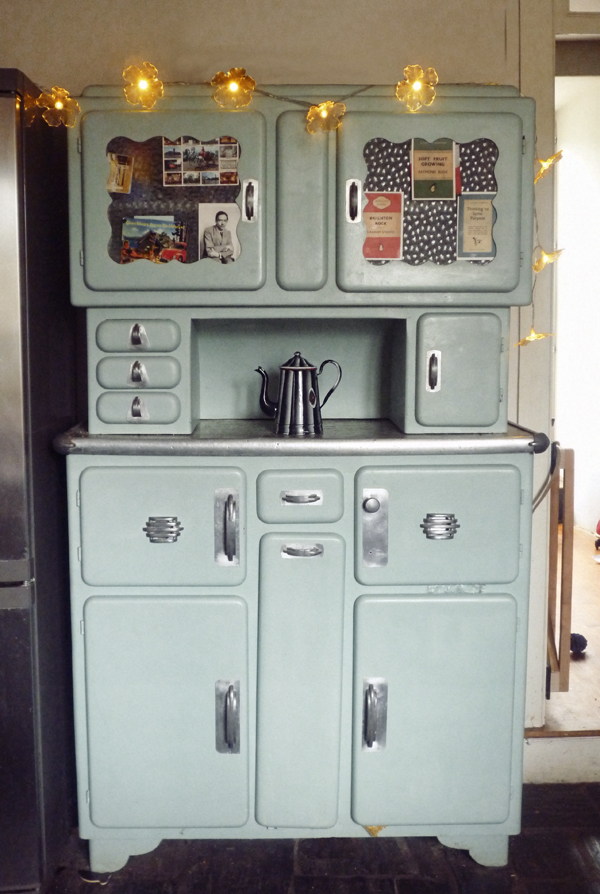
A 1950s cabinet adds another layer of interest to this kitchen. The mix of old, really old and new makes this room interesting and exciting.

Home of Double Merrick | French house | Apartment Apothecary

A gorgeous, traditional window seat is a reminder of the age of the building and shows off the incredibly thick walls.

Home of Double Merrick | French house | Apartment Apothecary

Original wallpaper that they were able to save on one wall of the bedroom.

Home of Double Merrick | French house | Apartment Apothecary

Home of Double Merrick | French house | Apartment Apothecary

Home of Double Merrick | French house | Apartment Apothecary

Home of Double Merrick | French house | Apartment Apothecary

I told you there was a lobster and piano.

Home of Double Merrick | French house | Apartment Apothecary

Home of Double Merrick | French house | Apartment Apothecary

Home of Double Merrick | French house | Apartment Apothecary

All of the period fireplaces are strong and simple and give structure to each room.

Home of Double Merrick | French house | Apartment Apothecary

Home of Double Merrick | French house | Apartment Apothecary

Home of Double Merrick | French house | Apartment Apothecary

I love bathrooms that are a feature and point of interest rather than being purely functional.

Home of Double Merrick | French house | Apartment Apothecary

Amazing vintage barber’s chair in the bathroom.

Home of Double Merrick | French house | Apartment Apothecary

Home of Double Merrick | French house | Apartment Apothecary

What I would do for a shutter or two in my life!

Jealous much?

Katy x

Photographs taken by Merrick Angle.