I really wanted to get the baby’s room ready before Christmas and I’ve just about made it. I have to say it has been the most difficult room that I have decorated to date and if I’m totally honest I’m not delighted with it because it has to serve as a nursery, guest room and work room so I never felt that I could create exactly what I wanted as there had to be so many compromises in terms of space and practical furniture choices, except the cot that I absolutely love. However, the most important thing is that it feels so lovely to spend time in this room as it’s warm, cosy and welcoming and it’s very, very practical with loads of storage and the space works well for the purpose.
I’m sure it will change loads once the baby is here and it begins to fill up with toys and baby stuff – I don’t even know what that stuff will be yet! There are lots of empty shelves and drawers waiting to be filled and a little baby’s character to discover so I will definitely keep you up to date on how the space evolves in the next few weeks and months. I thought it would also be nice to get some proper photos done once baby is here so we can show her off at the same time.
But for now, these pics will have to do…dark, dark days, a huge tummy and extreme tiredness are not conducive to good photos, I’m afraid! By the way, I have compiled a list of everything in the room so pop down to the end of the post to find out where everything is from.

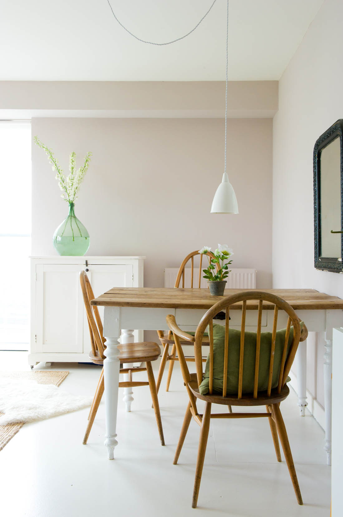
As you come into the room we have put my desk tucked into the corner, a day bed on the right, the cot under the window as this was the only spot it would fit but I reckon we will move it once the baby starts sleeping in here in a few months time, and a large set of drawers running down the left side of the room. I have also added a rug to make the room feel cosy.
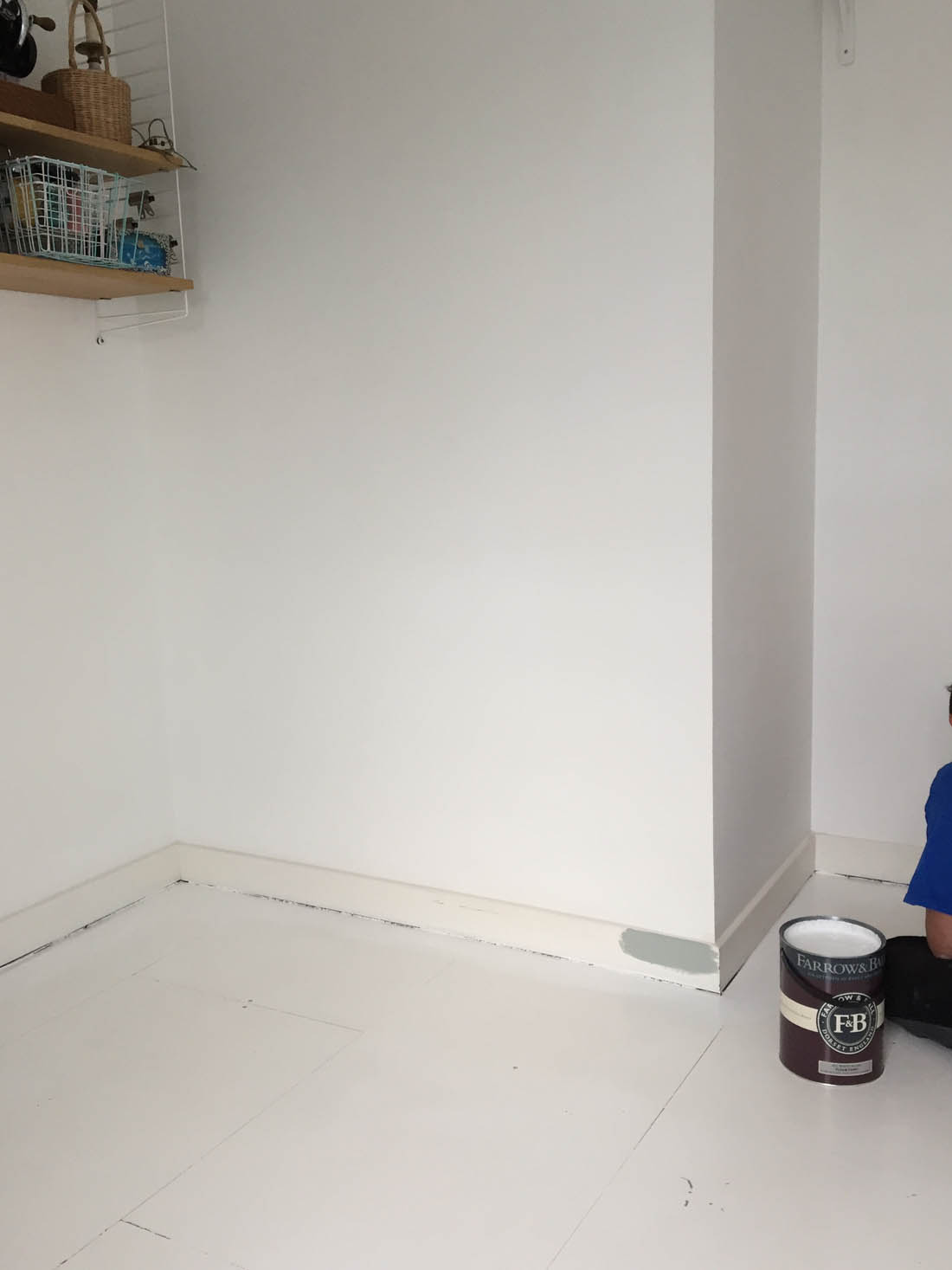
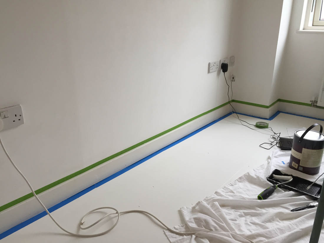
The only thing we have done to the room is re-paint the floor and touch up the walls (see that process in this post). We then painted all the woodwork including the skirting boards, window frame and ledge and the door in Farrow & Ball’s Light Blue. I used that colour as a basis for the other muted colours including blue, green and pink.
-

- The Sebra Kili cot bed is the first thing anyone mentions when they see the room for the first time. I love the Danish design.
-

- I decided to buy the baby a few toys before she arrives as it felt a bit sad to have a nursery with no toys or sweet things to look at.
-
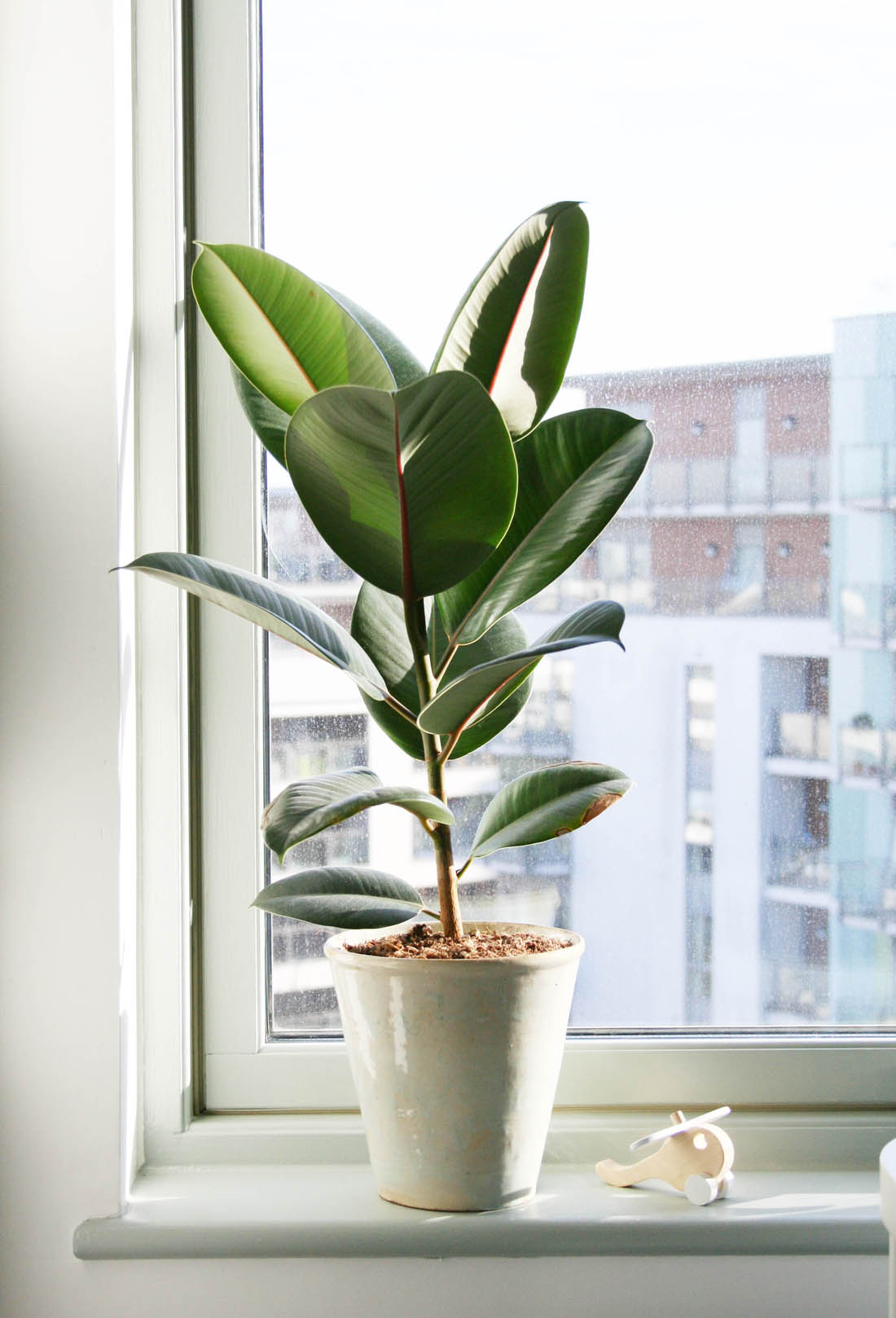
- A big plant on the window sill helps to bring a bit of freshness.
-
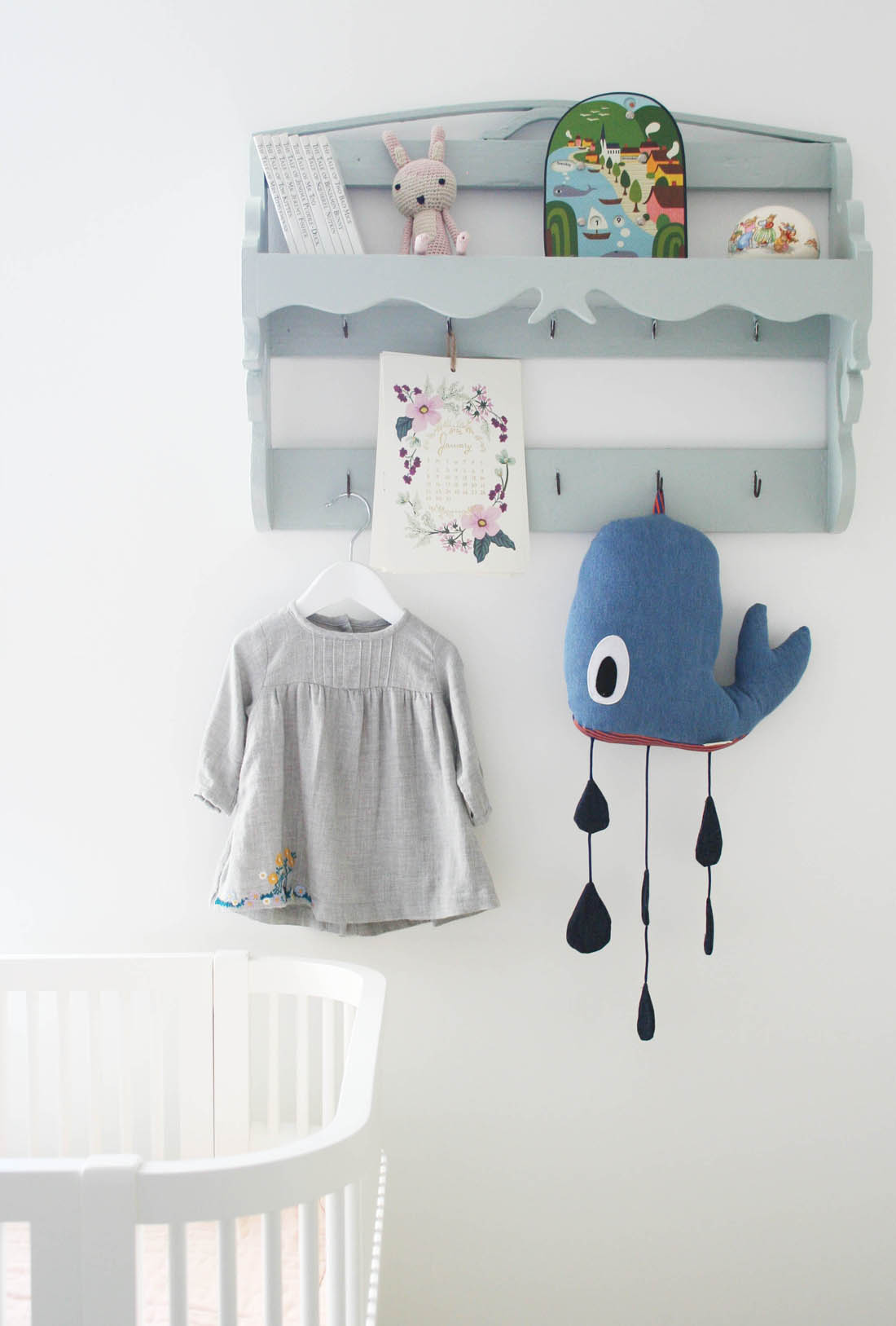
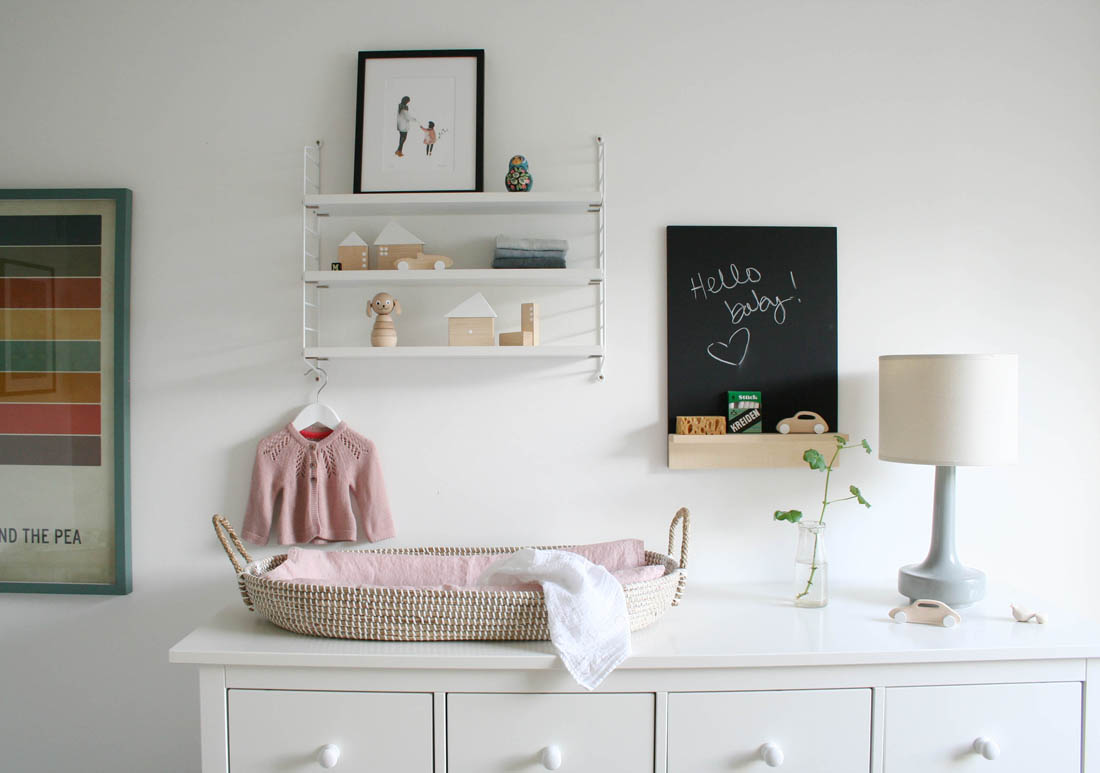
- I painted the little vintage shelf unit that used to hang over our kitchen sink and it works perfectly in this room.
I needed a large chest of drawers in this room as there was no space for a wardrobe. I changed the knobs to white porcelain ones.
The large IKEA chest of drawers was a must for storage purposes. We did have the option of a beautiful vintage pine cupboard and I was soooo tempted but it just wasn’t practical. Jules, who doesn’t usually get very involved in choosing furniture, was adamant that I did two things in this room: add colour and choose practical furniture. Therefore, he won on the cupboard front and actually these drawers are ridiculously good for fitting loads in them. The top of the unit is perfect for a changing spot, too.

Drawer dividers are perfect for lots of cute little baby clothes.
-

- I love this changing basket that I have lined with a vinyl changing mat and popped a lovely muslin over it. I moved my pocket String shelf over to this side of the room.
-

- I wanted the lighting in this room to be really soft so I have kept this lamp that used to be in the home office.
I was going to try to do without any desk space but I quickly realised that whilst I could it would be silly not to take advantage of this corner of the room where the vintage school desk from our hallway fits perfectly. It’s actually a really nice spot to work from.

The wall facing the window was the perfect spot for a desk as it fits perfectly here. This vintage school desk used to be our hallway table. Again, we used Light Blue for the door and its frame.
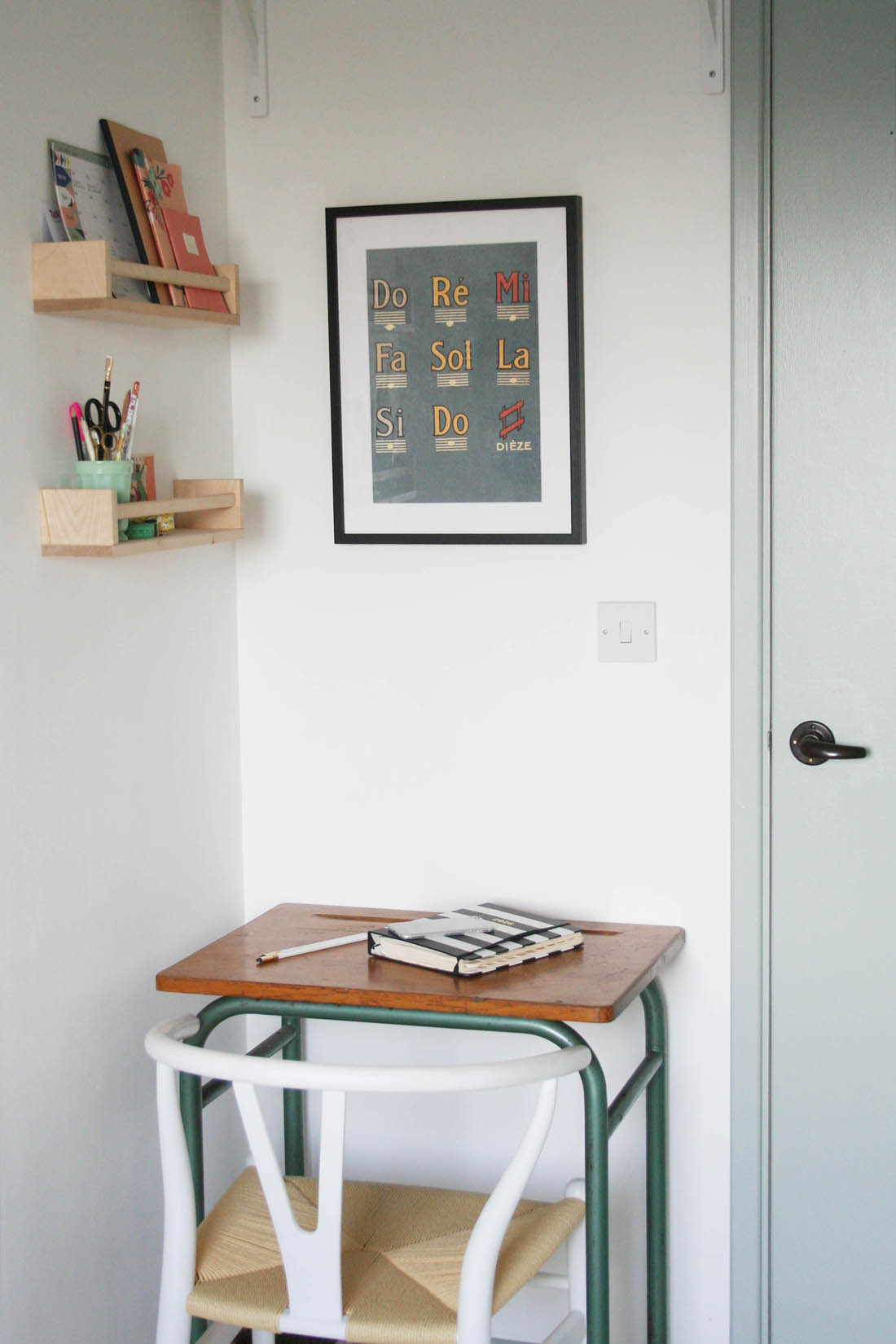
I used a couple of spice racks for my stationery as the desk is so small and hung my favourite Double Merrick print over the desk.
It’s not ideal to have the cot under the window so we will probably have a shift around once the baby starts actually sleeping in this room. For now though the day bed takes priority as I’m pretty sure there are going to be nights where either I need to feed the baby in here or Jules needs to escape for a full night’s sleep. It’s also great to have space for family to come and stay.

The rug brings so much warmth to this room and it fits the space perfectly. Another favourite addition is the hot air balloon lampshade that diffuses the overhead light so beautifully.
-

- I wanted to make the daybed as cosy as possible so I covered it in a quilt and lots of pillows and cushions.
-

- On the right of the daybed there was a blank bit of wall and I thought it would be nice to have this string of lights here for night time feeds in a few months so I wouldn’t need to put on the main light.

The Muuto Dot coat hooks are perfect for hanging the lights on.

I have bought a few toys, books and decorative objects for the baby that she won’t be able to play with for AGES but nice to have a bit of visual stimulation, I thought. But, as you can see, there is lots of space for more!


The cot is my absolute favourite thing about the room. I will tell you more about it when the baby starts using it but it cleverly extends to a toddler bed and a child’s bed that will last until she is 7 years old.
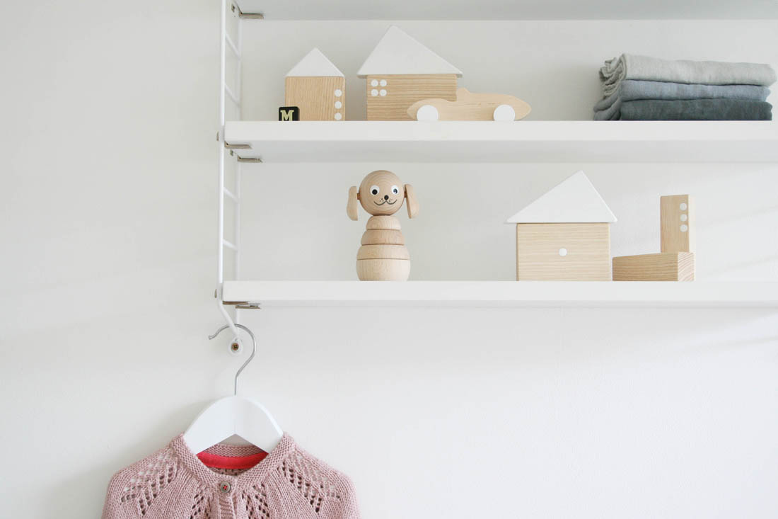
I’m sure these shelves above the changing basket will fill up with cotton wool and nappies in no time at all and the pretty wooden toys will be banished to a drawer somewhere!
-

- Love some of the soft toys I have found like this bunny.
-

- And this Sebra elephant on wheels is my fave.

And that’s it!
So, nursery is done, baby’s clothes are washed and folded, pram and car seat have been bought and we have a crib ready in our bedroom. All that remains is for this baby to arrive in three weeks – we can not wait to meet her!
Katy x
Source list:
Furniture and paint
Paint – Light Blue estate eggshell on all wood work and All White floor paint, both c/o Farrow & Ball
Cot – Sebra Kili cot bed c/o Houseology
Day bed – Hemnes day bed from IKEA (with white porcelain knobs from John Lewis)
Drawers – Hemnes chest of 8 drawers from IKEA (with white porcelain knobs from John Lewis)
Large shelving unit – String shelving from Haus London
Small shelving unit – Pocket string from Haus London
Textiles
Rug – Kolong rug c/o Urbanara
Quilt – Chambray blue single hand quilted blanket from Camomile London
Grey throw in basket – Star throw c/o Baby Mori
Cushions – House cushions from Camomile London
Pillowcases – Ticking stripe pillowcases from Toast
Muslins in changing basket – Pre-washed muslins in blush pink, white and grey c/o Baby Mori
Accessories
Changing basket – Reva oval changing basket from The Tipi
Lampshade – Hot air balloon lampshade from Modern Nursery
String of lights – Marshmallow Cable and Cotton lights from Houseology
Hooks – Muuto Dots coat hooks in oak from Houseology
Plant on windowsill – geo-fleur
Chalkboard – Blackboard with chalk and sponge from Labour and Wait
Toys
Elephant – Sebra elephant on wheels c/o Smallable
Soft bunny – Isla cuddle toy from Scandiborn
Sausage dog toy – Lazy puppy cushion from Scandiborn
Wooden cars and blocks – Handmade wooden toys from Pinch Toys
Doll house – White paper doll house from Sarah and Bendrix Kids
Whale – Ferm Living whale mobile c/o Smallable
Wall art
Print on small String shelf – Mother and Daughter illustration by Saar Manche from Tea and Kate
Print above desk – Screen print by Double Merrick (this particular print no longer available, I’m afraid)
Print next to drawers – Princess and the pea by Christian Jackson from Image Kind
*Do let me know if there is anything else that I haven’t mentioned that you would like to find out more about.