Firstly, I want to say a big hello and I’m sorry that I’ve been away from the blog for so long. Unfortunately, the blog was hacked back in May and it took a long time to restore it (there are still a lot of images missing) and then I took the summer off whilst Mimi was on holiday before she started primary school a couple of weeks ago. I’m not quite sure how we have got to the primary school stage but there you go! Anyhoo, I hope you are all well and I look forward to updating you on what we have been up to in our house and some of the projects I have been working on for clients.
We struggled with Mimi’s room throughout the pandemic as we had planned to update it for her changing needs from toddler to child just before the first lockdown but then got stuck with everything closed etc etc so it became a real mish mash over the last eighteen months. We finally got it together to sort it out, minus the high bed she really wants but I reckon that will make a good Christmas present.
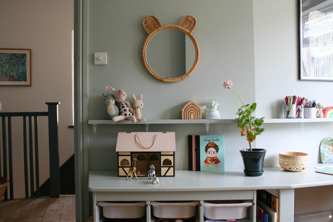
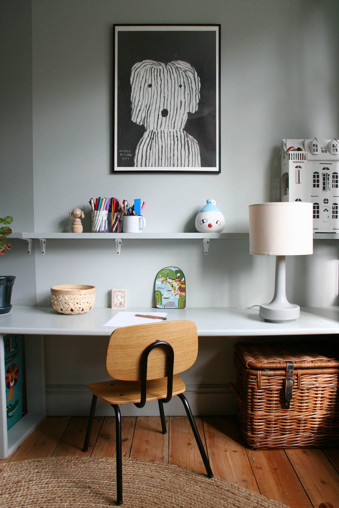
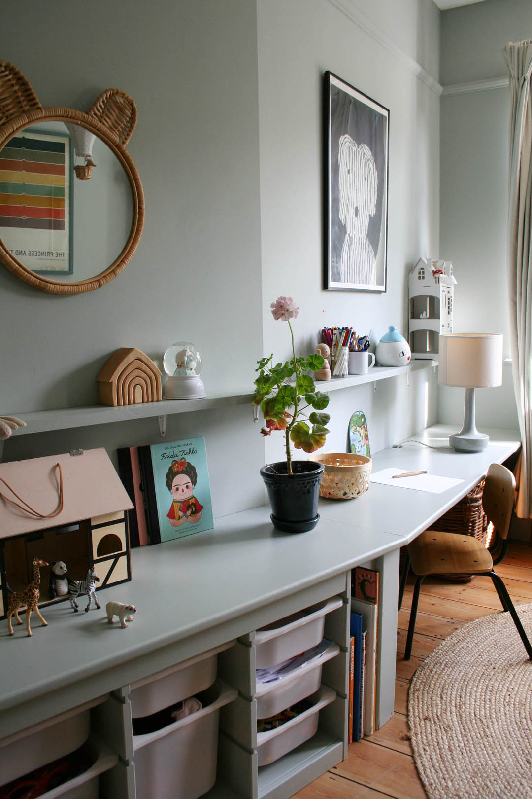
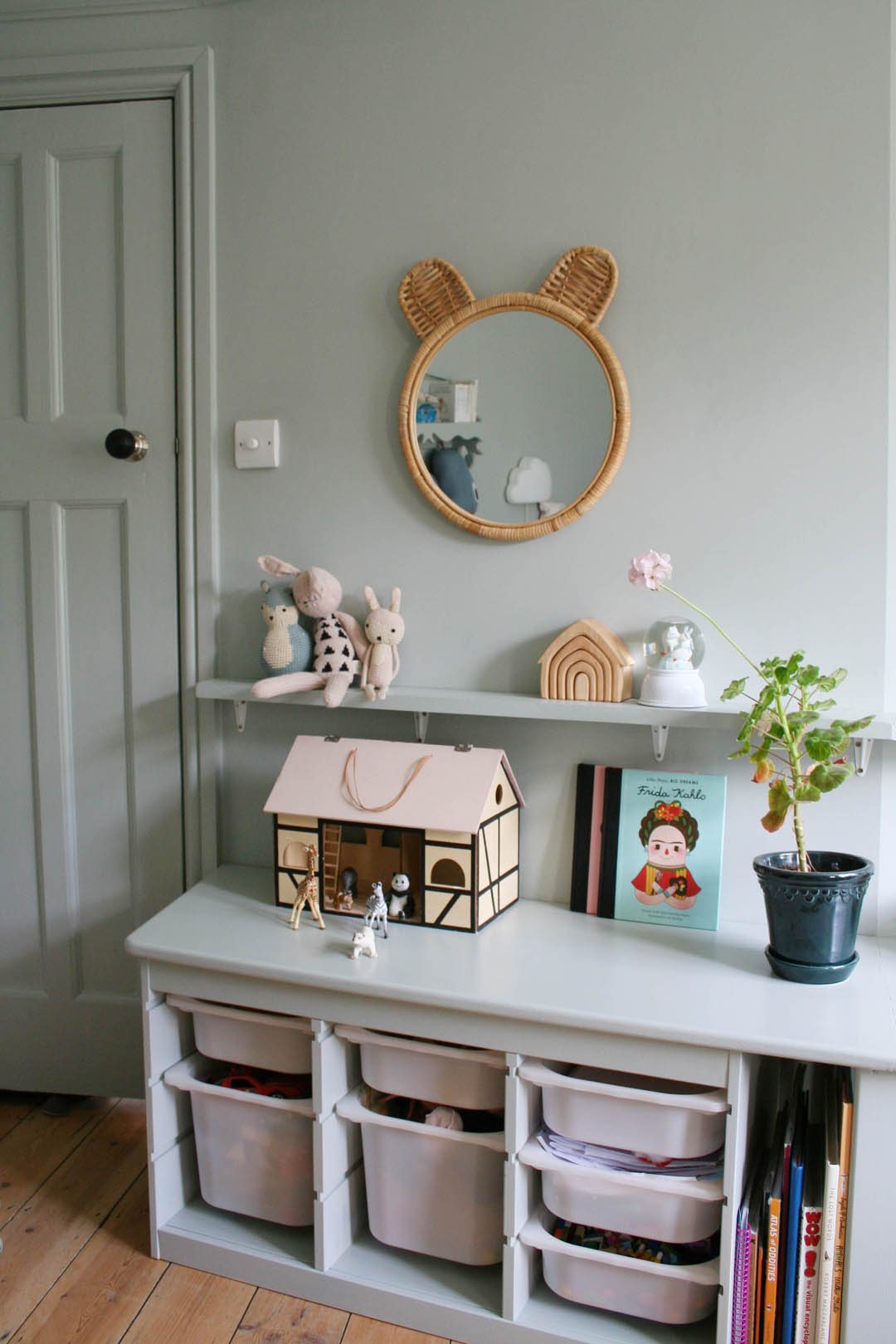
The biggest issues were needing somewhere to put all her trinkets, papers, toys as well as somewhere to sit and draw. I also didn’t want to spend very much and use leftover paint from our initial renovation three years ago. I designed a desk to wrap around the slightly awkward angled wall in her room from one £48 piece of MDF that provides storage and a very large surface for toys and an all important dedicated place to draw, colour and write, which are the things she loves to do most. Everything has been painted in Light Blue by Farrow & Ball – the walls are Estate Emulsion and the woodwork/desk are Estate Eggshell because we have loads of it and I love the colour! Please note that Light Blue is neither light nor is it particularly blue. In some lights it has quite a lot of green, at other times it is very grey or silvery and it never appears ‘light’. I would also not advise using it in a north facing room as it can appear rather drab without a decent dose of sun light.
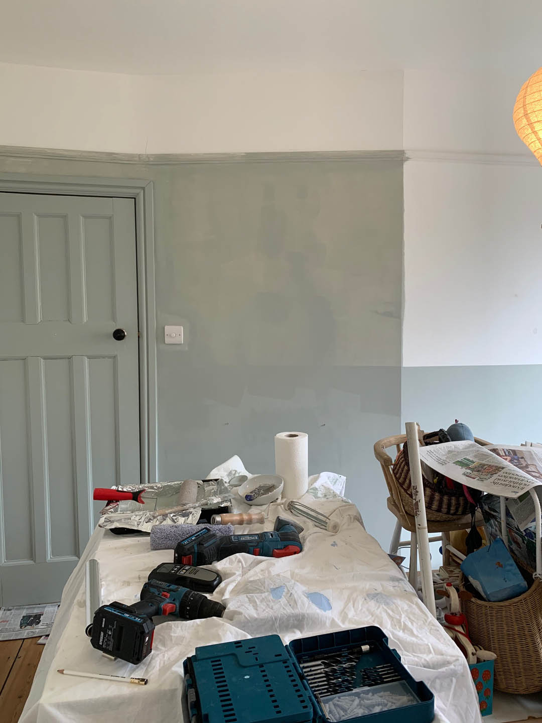
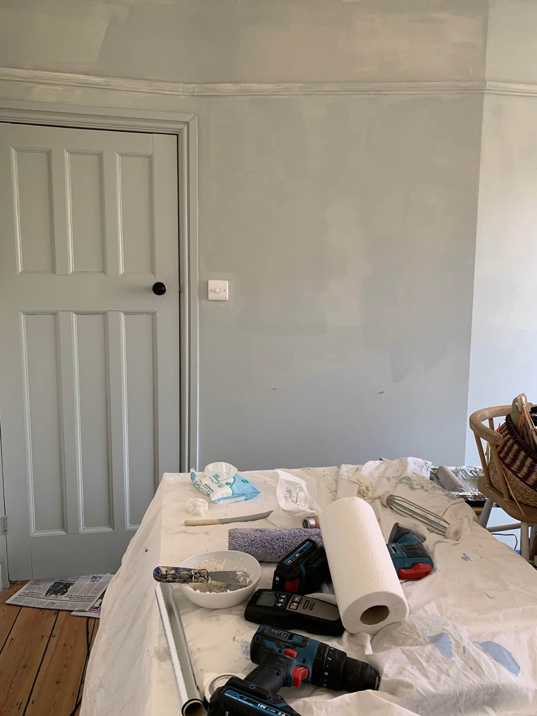
So, this is where we were at with the room by the end of the third lockdown…
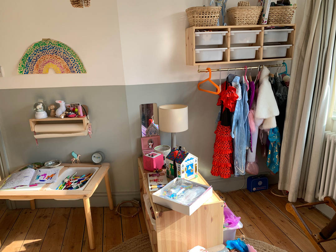
There wasn’t enough space for anything, stuff was always on the floor and she had outgrown constant dressing up so this side of the room just looked a mess and she just stopped using it altogether. No surface was big enough for her to spread herself out and everything was a jumble. I started by painting the whole room, including above the picture rail, Light Blue to make the space feel bigger.
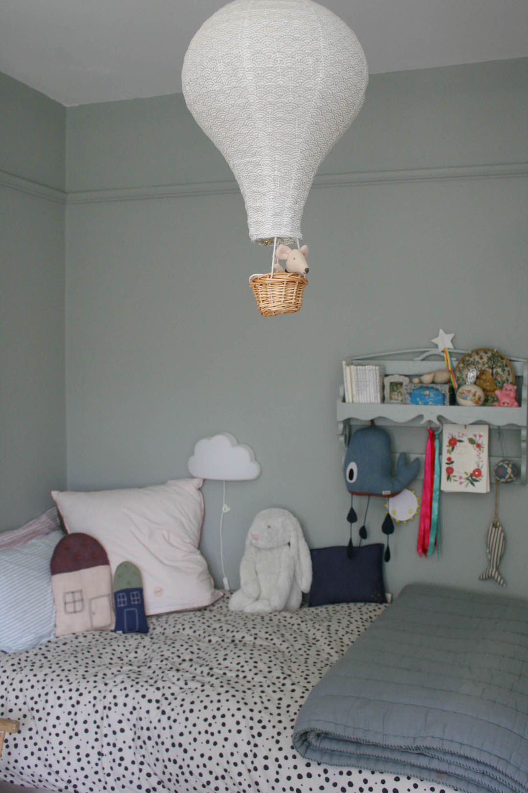
You can kind of see in the images above how taking the colour above the picture rail stretches the walls upwards and makes the room look and feel bigger. The door and woodwork was already Light Blue and I chose to keep it that colour mainly because I really, really didn’t want to re-paint all the woodwork (!) and also because the colour block effect does make a small room feel less disjointed.
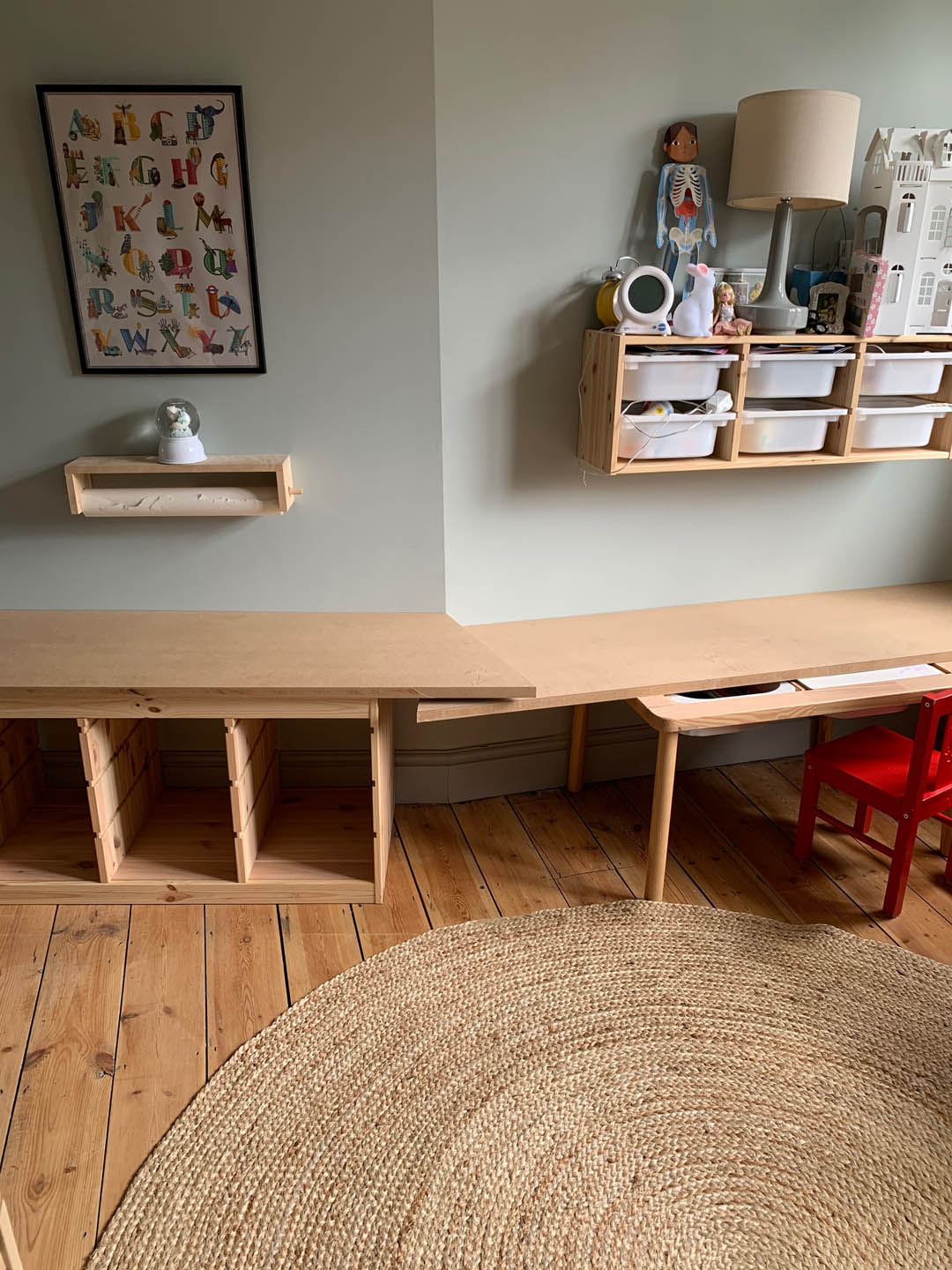
We then used one sheet of MDF to create two lengths that join in the middle where the room angles outwards. It would have been sooooo much easier had the wall angled inwards but we needed to create a support for the two lengths, which we did with some of the MDF. We also decided to integrate the exisitng IKEA Trofast unit into the desk for more storage.
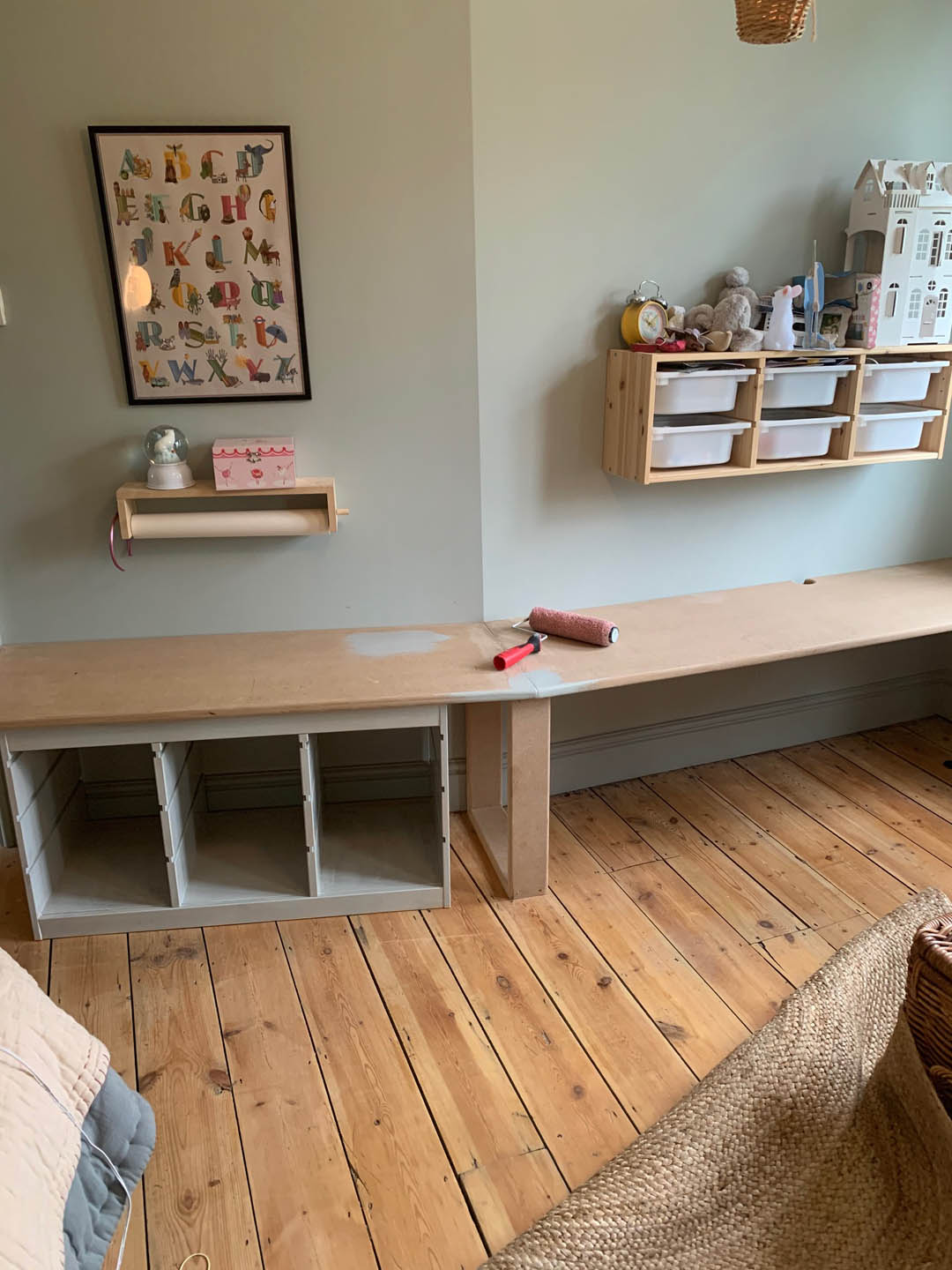
The left hand MDF surface is supported by the Trofast unit and then on the right hand side we put MDF batons on the wall at the back and on the right hand wall. We also cut a notch out of the back of the right hand length to reach the plug hole.
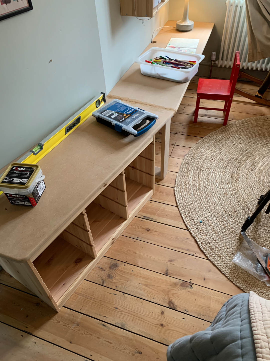
We really went to town sanding the edges and corner of the MDF, which makes all the difference. We used woodfiller to fill the gap where the two lengths of MDF meet. I then painted the lot, including the Trofast unit in Ronseal All Purpose primer and then Light Blue Estate Eggshell (I would have used Modern Eggshell but I was trying to use up old paint and the Estate Eggshell has actually worked really well).
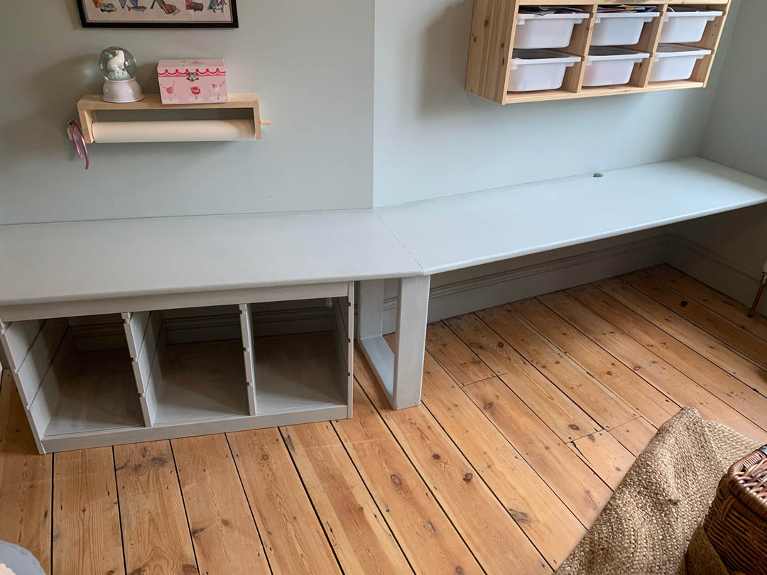
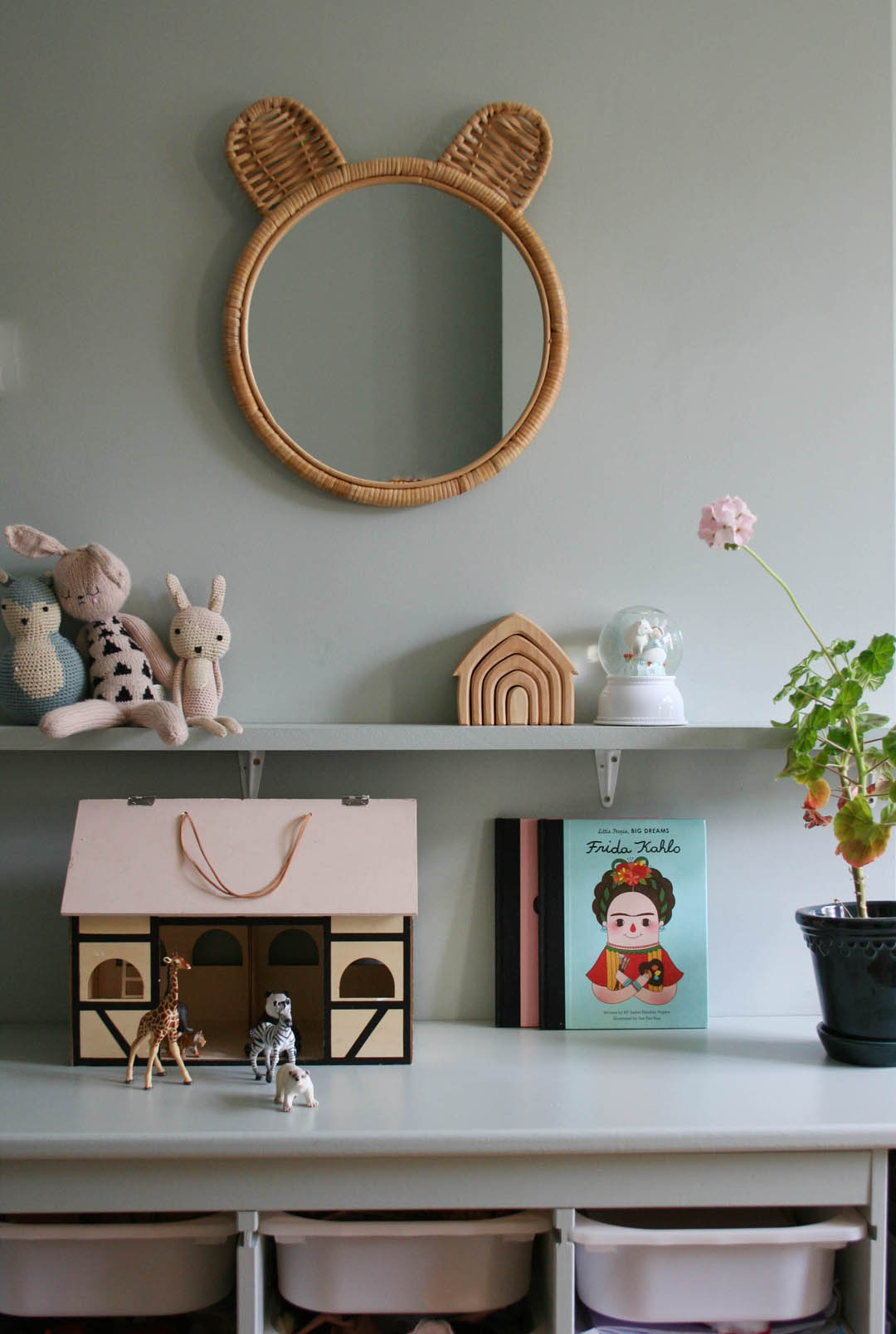
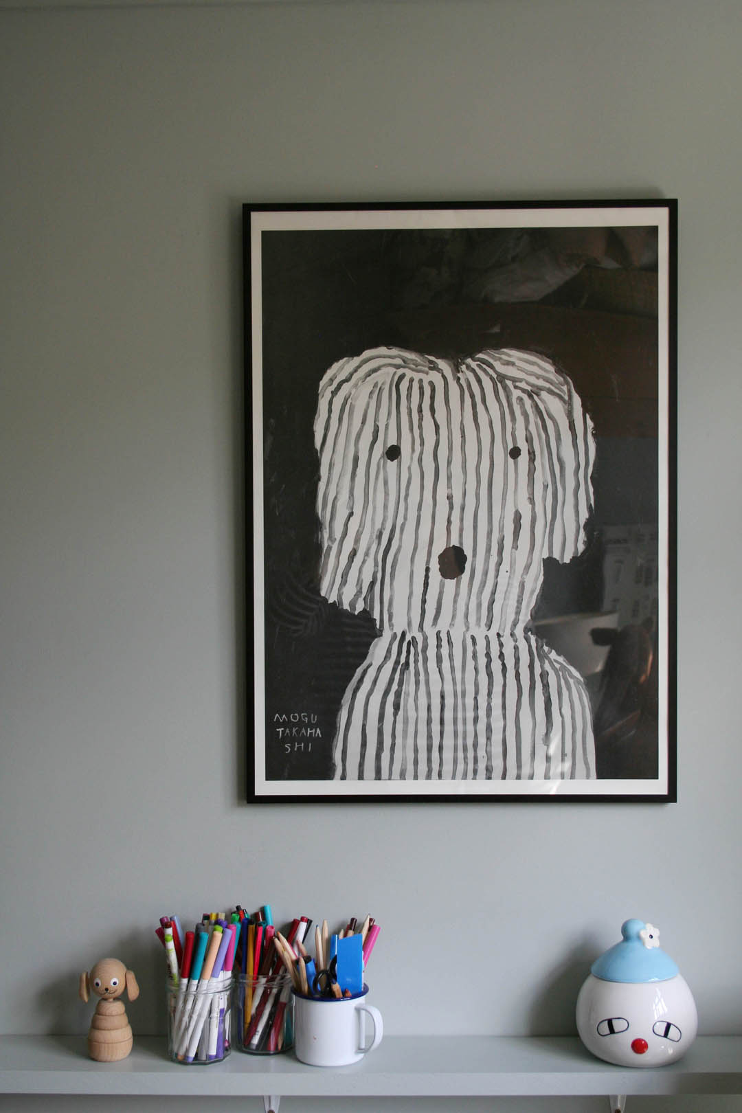
We also took down the shelves that were on the wall and used the rest of the MDF sheet to make one long shelf that runs above the desk. Mimi calls this her ‘special shelf’ and puts all of her little trinkets on it (I have to admit I moved a lot of them to take photos!!).

I didn’t originally like the support we made for the centre of the desk where the wall angles outwards but I realised we could use the nook it created for all of the oversized books that Mimi has, which is perfect! I bought a new chair for the desk as her old IKEA one that we got from a neighbour was too small and she was complaining of a sore neck.
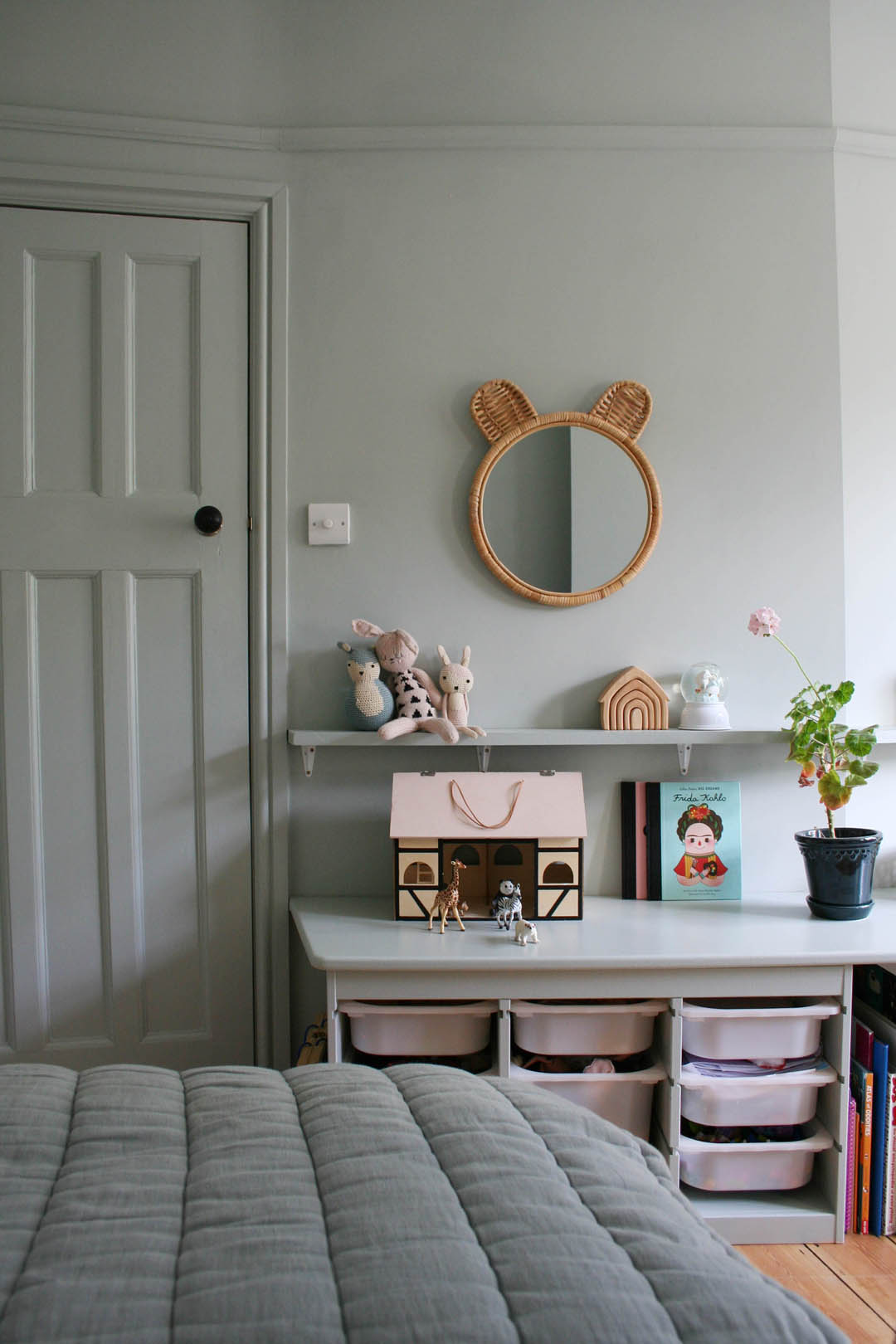
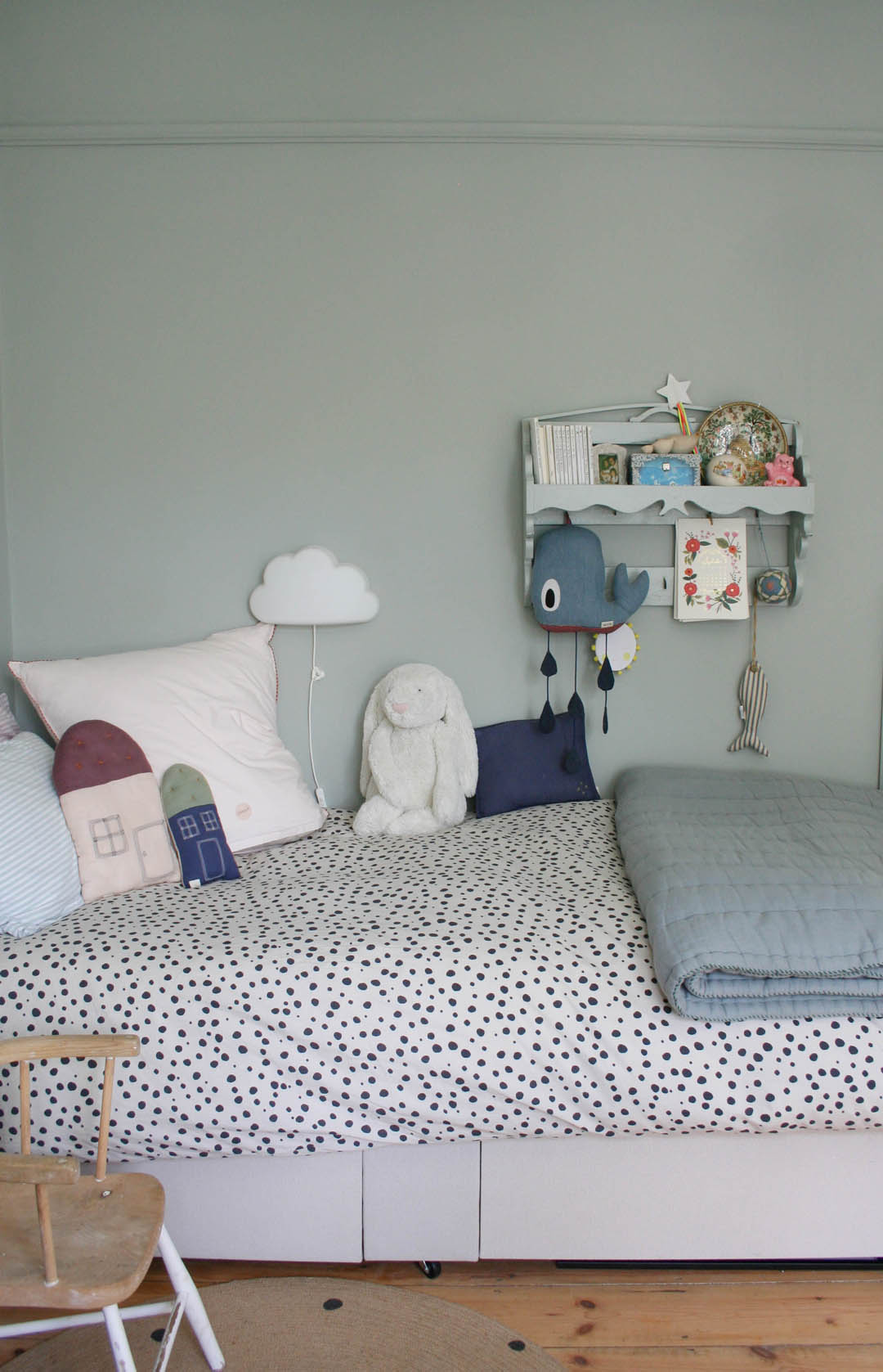
I also bought a new duvet cover and poster to add a bit of contrast and to ground all of the blue. On the most part though we have kept things from her original nursery including the quilt, pillows, cushions, toys.

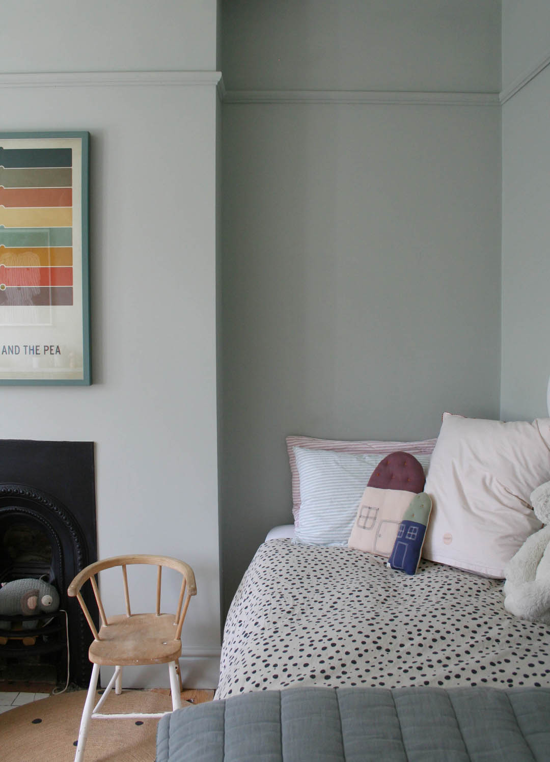
We haven’t done much on this side of the room as this is where we plan to put the high bed – for now Mimi has the old single divan that used to be in what is now our home office.
The great thing about the new desk set up is that the floor is no longer absolutely covered in stuff and it will definitely grow with her even if we have to raise it slightly. And for now it’s just right for our big school kid!
Katy x
Source list:
Walls – Light Blue Farrow and Ball Estate Emulsion
Woodwork, desk and shelf – Light Blue Estate Eggshell
Trofast drawer unit – IKEA
MDF sheet – A standard sheet 2440mm x 1220mm but it needs to be 25mm thick. We got it from a local wood merchant delivered.
Desk chair – Sebra
Cane mirror – Kidly
Fine Little Day Jaxx poster – Tea and Kate (I used an old IKEA black metal 50x70cm frame)
Monochrome spot duvet cover – H&M
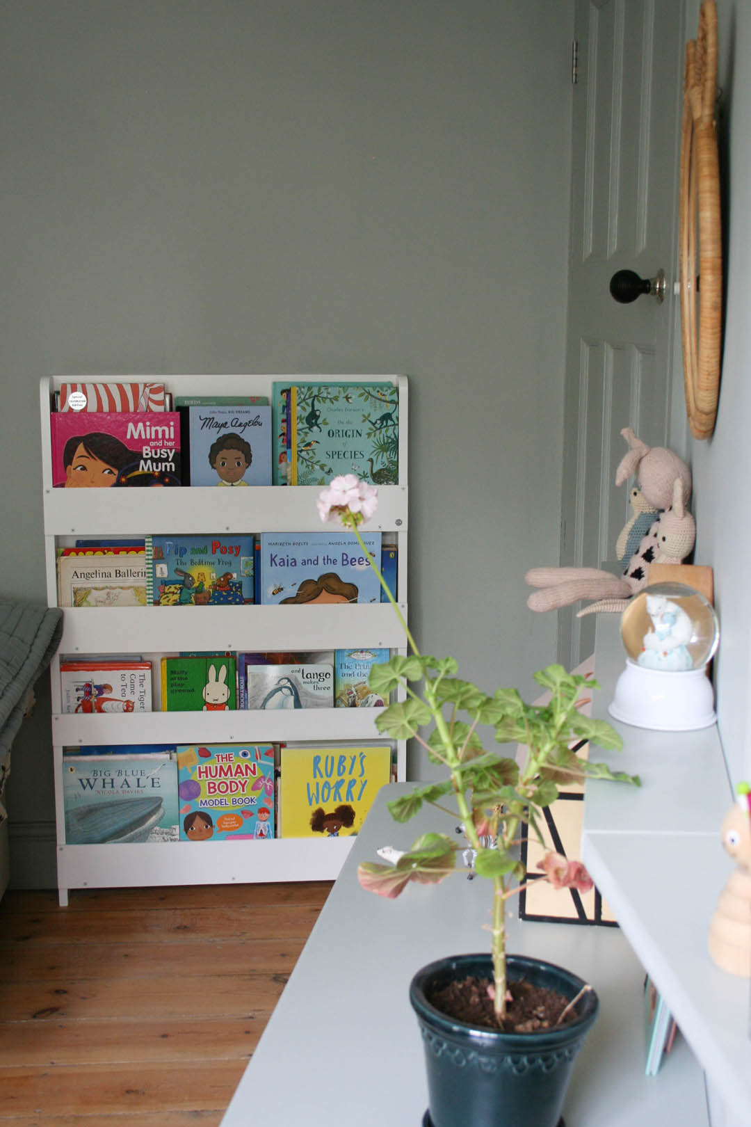
Bookshelf – Tidy Books
I love this make over. Also helped me decide on painting past picture rail. It makes such a difference here will definitely be doing it! I liked it before too but really love the one colour everywhere. Welcome back!!
I would have loved to have a room like this when I was a child!