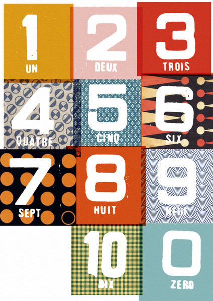
I have always struggled to find interesting, yet affordable, art work. When people ask me for help decorating their homes, one of the things they always say is that they don’t know what to put on their walls. If you get this right it can totally transform a room. In my last post we visited illustrator and designer Merrick in his beautiful, family home in rural France. Now, I would like to introduce you to his unique and thoughtful work; his prints are both interesting and affordable and inspired by old classroom wall charts, films, children’s building blocks, even a Magic 8 ball! When shops are filled with so many generic products, it is a breath of fresh air to come across very good value limited edition prints. Perhaps one of these prints might suit your walls…
How did Double Merrick come about?
“In 2009 I was working as a freelance illustrator mainly working in magazine editorials. I had a number of ideas that didn’t sit well with my freelance work, but they just wouldn’t go away. Eventually they morphed into prints and the response was phenomenal! Thus Double Merrick was born. We currently sell through the site www.doublemerrick.com and are stocked by the likes of Pedlars, Liberty of London, and Selfridges. The business is great as it allows me to get involved in all sorts of fun stuff from designing plates and mugs, to madcap adventures rediscovering childhood friends, or swapping prints for a swanky holiday house.”
Where do you get inspiration from for your prints?
“All over really. Where we live in France is particularly interesting as not much changes, and there is a feeling that the past is just below the surface. As a consequence there is a lot of old tat around to sift through, books, posters, ephemera, etc. I spend a good deal of time going round trocs and brocantes. Some things just strike a chord with you, most of the time you don’t know why, and the print is often the by product of trying to work out ‘why?’.”
Do you have any advice on where or how to hang art?
1) Go with your gut – The stuff you hang on your walls should either be fascinating to you or hold sentimental meaning. Don’t bend to fashion, or it will just look really dated in twelve months time. Building up a collection should be a gradual, organic process and not about achieving this season’s look, it’s about personal history and your story.
2) Don’t balk at spending money on framing – Good framing can completely make an image, it can make a really cheap print look expensive.
3) It isn’t welded to the wall – Not sure if that print works in that place, move it around until you can find it a better home. Things should evolve.
4) Taste is about confidence. It’s just having the belief that one thing will look good with another, that a print would look great on a pink wall, or that fruit crate label looks amazing and is important enough to be framed.
Thank you Double Merrick! x


These prints are so original and I love the colours. Also, really appreciate the hanging tips!
i’m feeling a mixture of pride and jealousy
I like the retro/vinatge feel of these prints, but they still look modern. The building blocks one is my favourite.
Lovely prints.
Great to see Merrick’s work getting out there more and more. He has a great eye, and a great sense of humor… Exhibition!!!!???? 🙂 I’m free for the tunes.
Ooooh, now that’s an idea. I would worry it would be too much fun though, do you know what I mean?!