Last month I was very excited to be invited to a secret preview of the nine new Farrow & Ball colours with Joa Studholme, their International Colour Consultant. I arrived to the beautiful Albany apartments in Piccadilly having always admired F&B colours from afar, told others to use them but only gone as far as using their All White floor paint in my own home – because why would anyone ever need anything more than white walls? However, I left that evening determined to paint both my sitting room and kitchen in pretty bold colours and hatching plans for how I was going to persuade Jules that that was an excellent idea. What on earth happened?! It definitely wasn’t the bubbles being served because I stuck to dry January that evening *smug face*.
Well, I think it was a combination of two things. Firstly, Joa is simply brilliant and I could have listened to her all night; who was I to argue when she suggested I use Peignoir in my sitting room and told me that her own sitting room is painted in that colour? Secondly, I genuinely fell in love with the colours and the stories behind their names alone were enough to seduce me away from my beloved white walls.
And so the day after the preview I put my order in and as you can see in my Styling the Seasons post my sitting room is now Peignoir and proud.
New colours
All nine of the new colours were launched this week and just in case you missed it here is a brief run down of my favourite in the the collection and how Joa introduced them to us.
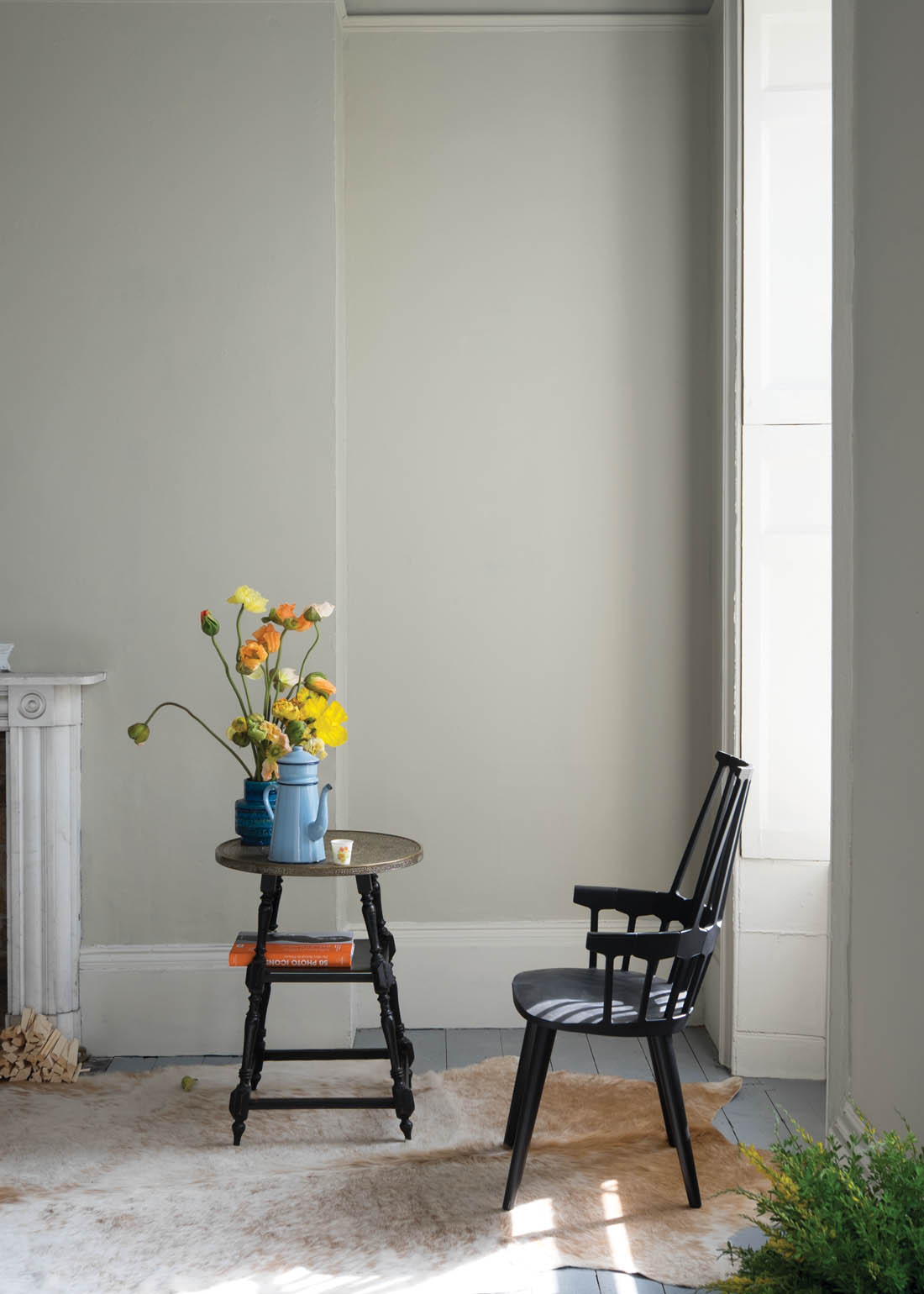
First up was Shadow White, predicted by Joa to be incredibly popular as it is a very “safe pair of hands”. A muted shade, a true neutral without the yellow of Slipper Satin, perfect for any style of home.
Next came Drop Cloth, a name that I love taken from the decorator’s dust sheet and Joa told me that her decorator had suggested it. This colour is not too yellow, nor too grey and works beautifully with Shadow White and Shaded White for those looking for a neutral colour scheme with understated sophistication.
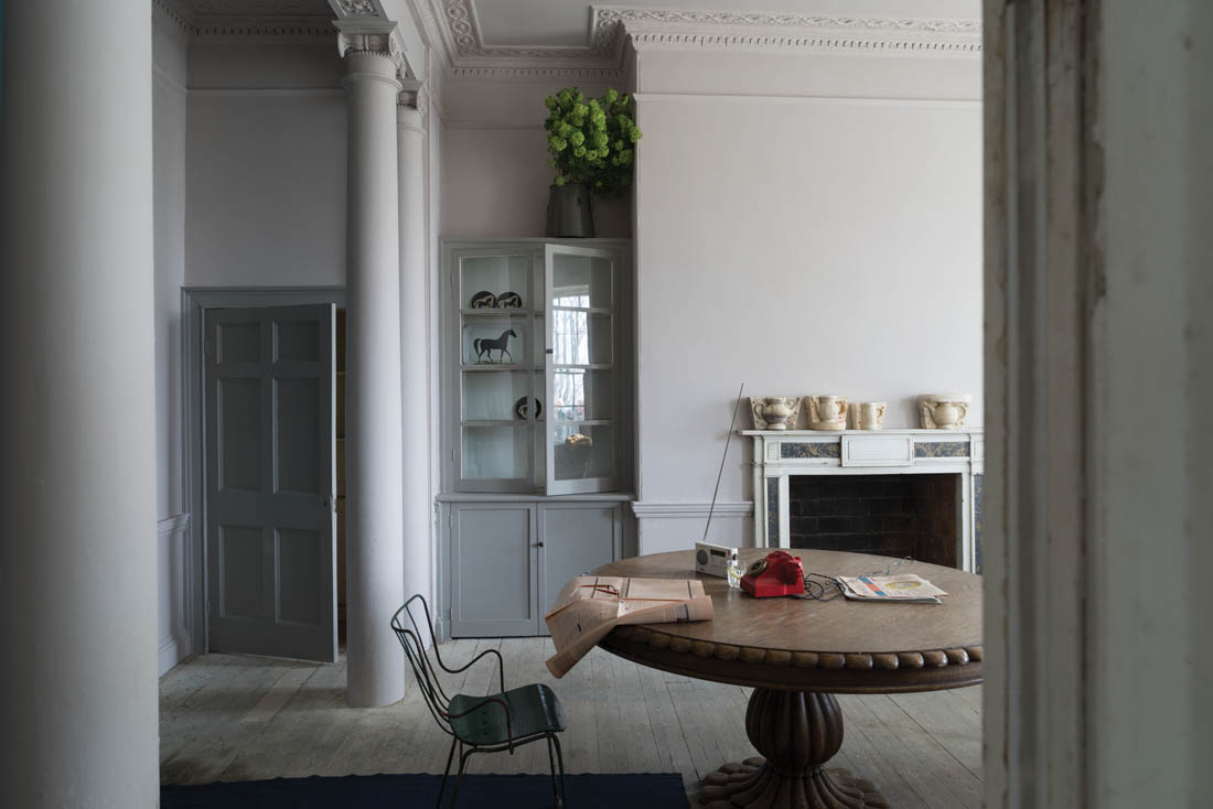
And here’s my favourite. As soon as Joa pulled up the board painted in this colour I whispered to Kate, who I was sitting next to and who has tipped it as being one of the most popular of the new colours: “I think that’s my colour”. Inspired by the chiffon gowns in which ladies traditionally brushed their hair in boudoirs (that description clinched it for me!) it is a very soft pink with a huge amount of grey. As I said in my post this week, Jules thinks this colour is grey, which goes to show how different in looks in different lights. As I sit here typing with the sun streaming in it is the blushest of pinks. I love it. “Pink for boys,” as Joa put it.
I also fell quite hard for Cromarty, which piqued my interest when we were told it was named after the shipping forecast – there’s something quite romantic about that, I think, conjuring up notions of swirling seas and winds. A soft muted green, lighter than Mizzle and would work beautifully with Blue Gray or Pigeon and perfect for a kitchen.
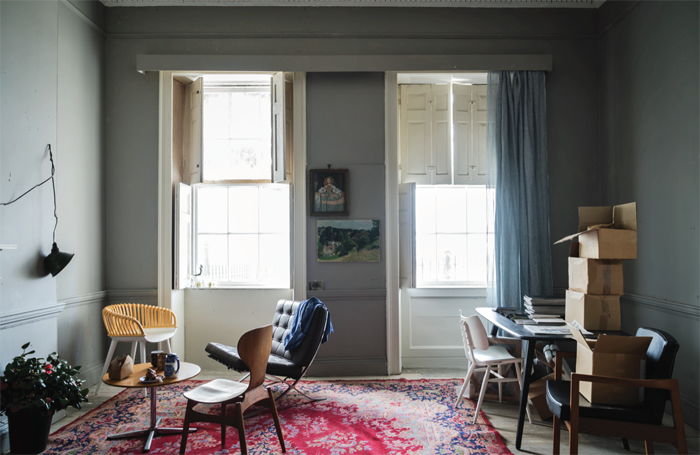
Worsted slips seamlessly between Purbeck Stone and Mole’s Breath on the colour chart. Named after the Norfolk village where the flat woven fabric used for city suits was originally woven, Joa forecast that it will be a hit as the obsession with grey looks set to run for a while longer.
To see the other new colours have a look here and I’d love to know which one is your favourite.
Katy x


I am waiting in the kitchen for the decorator to finish my bedroom, which has just been painted entirely Green Blue. I am SO excited to go upstairs!
I definitely have to get myself a tester pot of Worsted!
Was planning a mid-grey for a south facing bedroom but didn’t want anything to austre or cold (and nothing too wishy washy either)…. I think this might be it!
With white woodwork, white painted floorboards and a cast iron bed.
ooh i’m loving the drop cloth and the peignoir too! Sounds like such a good event and can’t wait to see your home after the make over x
We are in the process of painting our bedroom in Worsted and couldn’t be happier with it 🙂