Right. I’ve finally bitten the bullet and taken some snaps on my iPhone around the house to show you how it looks so far. Usually I don’t feel very comfortable sharing a room until it is finished but this house is going to be an ongoing project for us over years rather than weeks and months so even though it doesn’t look how I would like it to yet, I want to show you around now and tell you about my plans for the future. It’s certainly not a flashy or highly styled interior, mostly dictated by my simple taste but also ruled by our restricted budget. Basically all of our funds went on bringing this house back to life and up to date structurally so there wasn’t much left for furnishing the house other than what we were able to bring from our flat (well, the items that fitted as our bed and sofa didn’t!). Anyway, I’m totally happy about not being able to make it ‘perfect’ from the start as I really do think the best interiors grow organically over time and there would be no fun for me if it was all done – what would I possibly have to do if I wasn’t continuously making plans about what to add or takeaway to each room? 😉 Also, I haven’t put anything on the walls yet really so that is all to come too.
I thought it would be useful to work through one room at a time on the blog so I’m starting in the sitting room that has now been knocked through to the dining room and kitchen to make one large room downstairs but I will show you those two spaces separately as there is too much to say in one post.
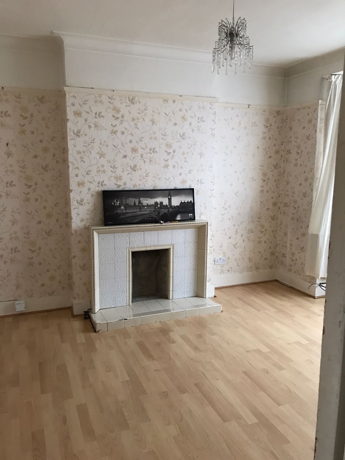
- BEFORE: This was the sitting room when we first viewed the house with he original 30s fireplace, cheap laminate sheeting on the floors and layers and layers of peeling wallpaper.
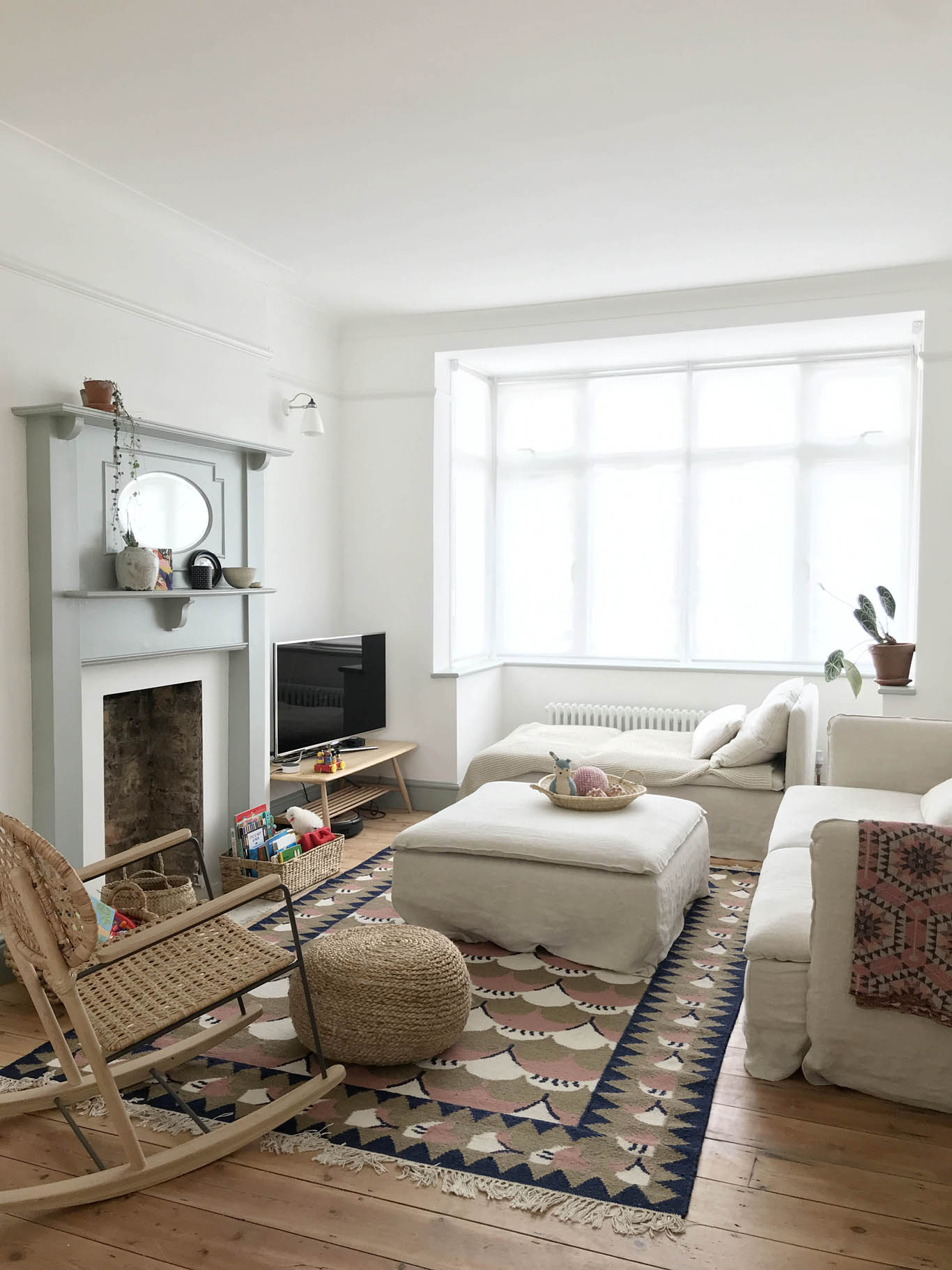
- AFTER: A new (to me) fire surround, the original floorboards and fresh plaster and paint has made the space lighter and brighter.
Throughout the house the walls and ceilings were taken back to brick, re-plastered, re-wired, re-plumbed, painted and new picture rail, skirting, architrave and coving were added (we tried to make these as close to the originals as possible). We also removed the laminate sheeting and sanded the original boards. One day I would like a new wood herringbone floor as although I like the way the original boards look the floor isn’t insulated and can’t be except at massive expense as there is a four foot chasm under the house. Also, when the uPVC windows are due to be changed I would replace them with grey/black uPVC (as we’ll never be able to afford to reinstate wooden windows).
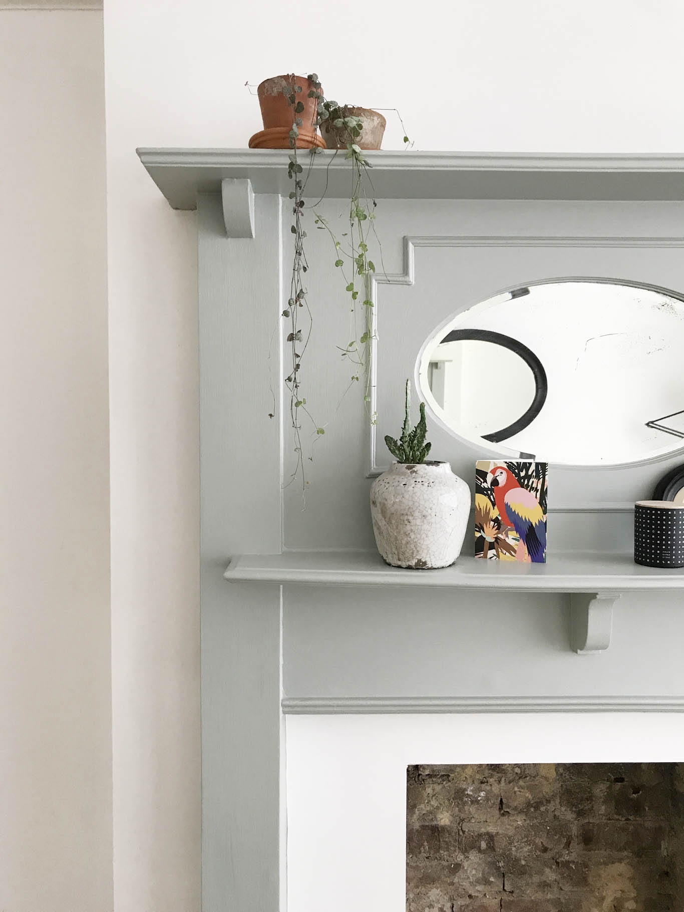
So, for now, the sitting room is quite pared back with brilliant white walls, Light Blue woodwork, an original 1920/30s fire surround that I bought from eBay for £60 and that was painted in the same colour as the woodwork. We still need to choose tiles for the hearth and I’m loving the Claybrook studio range and colours.
- The shiny laminate when we bought the house.
- AFTER: We decided to keep the window simple and hang inexpensive sheer blinds so that we can still see out but people can’t see in and the light is lovely and diffused.
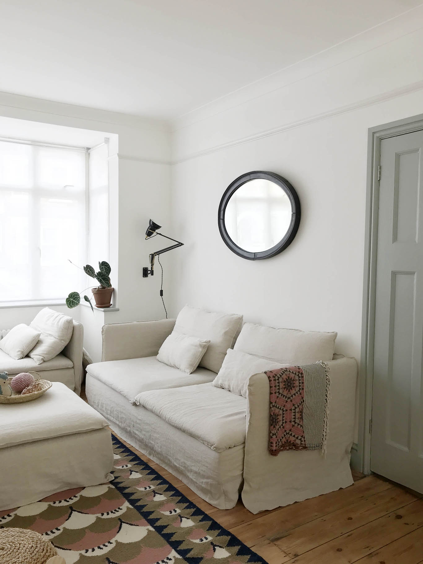
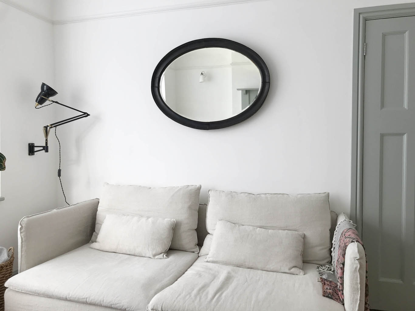
We hung sheer blinds at the windows to maximise the feeling of space and light. The radiator was moved to under the window and we chose traditional column style ones to help add to the period feel of the house. I chose not to have an overhead light in this room as I just never, ever use them and instead we have wall lights in the alcoves from Original BTC and the black angled one that you can see in the previous photo is from Anglepoise. They are all wired in so that they can be dimmed and turned on and off from the light switch on the wall by the door as you enter or leave the room. The wicker rocking chair is from Ikea and is likely to change at some point and we hope to have in built cupboards in the alcoves for the tv to sit on etc.
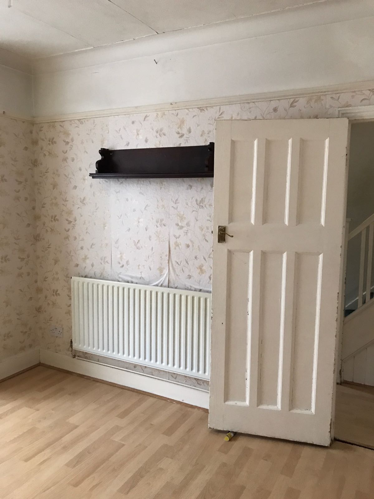
- BEFORE: We changed the position of the radiator and put one under the window and this was the obvious space for the main sofa.
- AFTER: Our Soderhamn sofas with Bemz natural linen covers.
The main decision I had to make before we moved was choosing new sofas for this room as our old sofa was 4cm too long and the shape woundn’t have worked in the space. I knew I wanted really big comfy sofas to make the room feel welcoming and cosy but we had very little to spend. I had seen the Soderhamn range of sofas from Ikea in lots of lovely houses on Instagram but I wasn’t massively keen on the covers they are sold with as the colours weren’t ideal for the room but the price was ideal. For the three seat sofa at £450 and £295 for the chaise in the window I think they’re quite a bargain (NB the matching footstool is no longer sold in Ikea in the UK so I bought it on eBay for £50 – just search for Soderhamn footstool). I came across Bemz years ago when I didn’t have an Ikea sofa and thought their business idea was a brilliant one – they make bespoke covers and legs for any Ikea furniture so that you can personalise your sofa or armchair. They were my first port of call when I decided on the Soderhamn sofas as I knew a set of their linen covers would transform the look of the sofas and in turn the room itself. Bemz very kindly sent me a set of covers to showcase on my blog but had they not I would have bought them myself. I absolutely LOVE them. Some may think I am mad choosing the natural linen covers with a dog and toddler but these covers are fully removable and wash at 40 degrees. I’ve already washed them after Mimi climbed up onto the chaise with muddy wellies on and I can confirm that they are so easy to wash (there’s very little bulk to the fabric so they fit in the machine easily) and when you put them back on it is not a tight fit like it can be when you wash Ikea sofa covers. They don’t lose their shape or colour – you would never know it’s been washed basically. I will write a full post dedicated to them and photograph them in more detail, which will helpfully answer all your questions. In the meantime, for those of you who would like to know, my covers are the Loose Fit Urban covers in Rosendal Pure Washed Linen Unbleached.
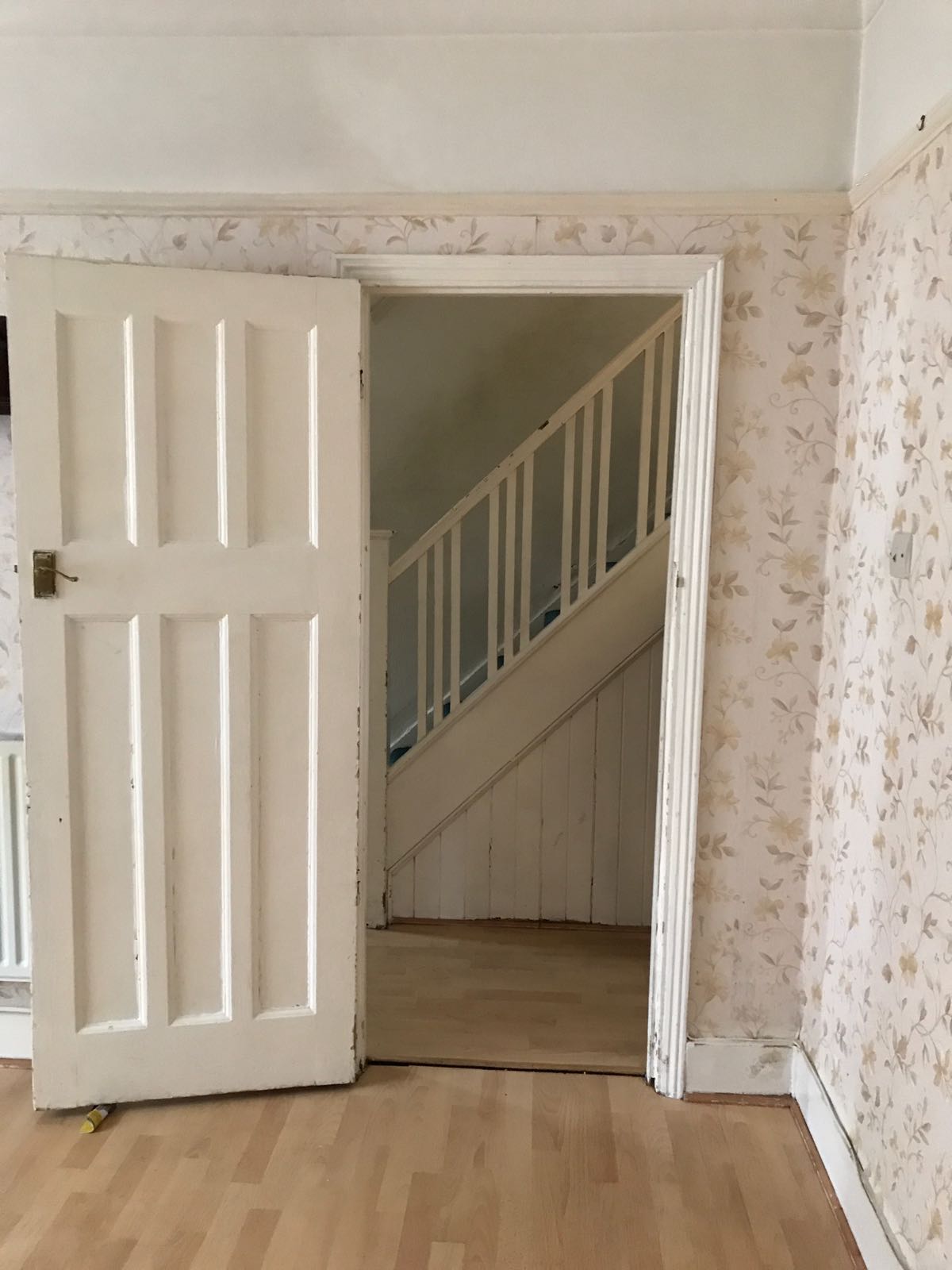
- BEFORE: With the wall separating the sitting room and dining room in tact.
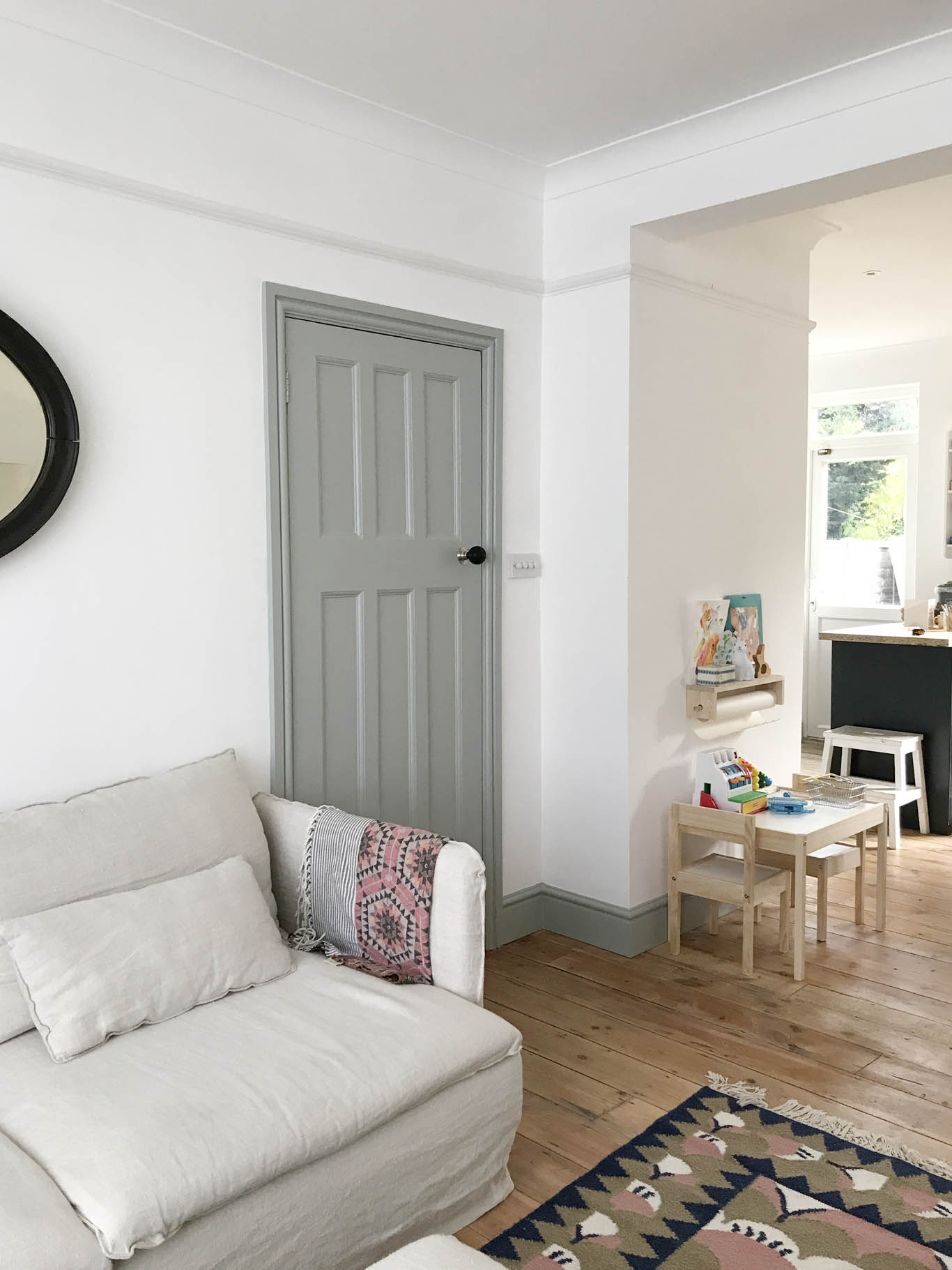
- AFTER: The position of Mimi’s play table is where the door to the dining room was and we blocked that up.
We had all the original 30s doors dipped, which our builder organised for us at a cost of about £20 per door, and then they were either oiled or painted. In the sitting room I decided to have the inside painted Light Blue and the side facing into the hallway I kept natural. The reason for this is that the Light Blue brings a nice dose of colour to the room but in the hallway there is a lot of colour so the natural wood is a nice contrast. The door handles are these ebonised beehive doorknobs, which were the cheapest of this style that I could find. I’m very happy with them so far and I know quite a few of my friends have bought them on my recommendation so fingers crossed they will last.
Before
Here are some pics of the works as they progressed to give you an idea of what the renovation involved…

This is looking into the sitting room from the dining room once the wall was removed and before the steel went in.

This is looking from the sitting room down to the dining room and the kitchen to the left to give you an idea of the whole space.

The new fire surround was installed as well as coving, picture rail and skirting to bring the period feel back to the room.

Jules started sanding the floorboards at this point. He would recommend paying someone if you can to do it as he HATED the job.
After
And here we are today…
- You can see here how the sitting room now leads to the dining/kitchen space.
- I love this fire surround.
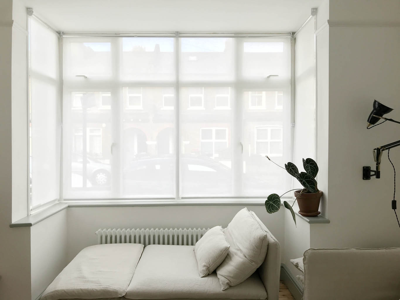
The Soderhamn chaise fits perfectly in the bay window and Jules and I fight over who is going to lie on it every evening because it is soooo comfortable.

We are still deciding on the tiles for the hearth and we hope to install a woodturner here some time in the future. We also need to figure out storage for Mimi’s toys.
- I now need to spend the next few weeks accessorising the room with more plants and pictures on the walls and so on.
- My very favourite buy for this room is this rug from the House of Rym. It’s called the Rise and Shine rug and I got in the summer sale so it is no longer available.
So there you have it. The sitting room as it looks today – nothing fancy and no styling. I look forward to keeping you up to date with changes and additions I make to this room over time. I will also do a more detailed post on the Bemz linen sofa covers that I was kindly gifted so keep an eye out for that.
Katy x
P.S. My next post will be about the hallway and I will publish it in a few days, promise!







An amazing transformation and it’s so easy to see how much work and love has gone into it to bring it back to its former glory (and yet bring it up to date with the open plan)! I love all the sympathetic details like the beautiful fire surround and the flooring. It’s such a cosy welcoming space xx
Hi Katy
What a lovely read, thank you for the tour!
I think 1930’s homes are beautiful to live in and you’re on a fun mission here- it looks so lovely!
Michelle x
Love it!!! ❤️
Beautiful! Can’t believe how different it look. Ax
Really lovely, thank you for your lovely blog! Also re the Bemz covers – I’m looking forward to your post. They are more expensive to buy than the sofas themselves I think but transform the look so… I reckon worth it probably! Last year I sent up for some swatches and was choosing the nicest with my daughters but everything takes so long and we’re not yet ready to buy! My own thirties house is currently an empty shell after the builders have been in and demolished basically everything. The house had lain empty for many years and had previously been lived in by an elderly couple who did no maintenance, so it all had to go. We’re keeping some doors and door frames to reinstall so that it has some touches of ‘old’, but it won’t have many! I am tempted by the beehive handles too, they’re lovely! Basically I follow your blog and dream, but it’s taken a long time to get to this point in my build (i.e. the beginning)…. Keep up the good work and thank you!
Genius! X
It’s all looking amazing!
I love the changes you have made to the layout and the colours you have chosen.
Such a joyful and calming space!
Such a lovely room… gentle and yet cosy. Looking forward to seeing more!
Hi,
Love your style! Where did you buy the sheer blinds from? I have similar windows to you and would like the same for mine.
Thanks,
Helen x
Author
Hi Helen,
So sorry but I missed your question until now! The blinds are from John Lewis:https: //www.johnlewis.com/house-by-john-lewis-sheer-roller-blind/p3198146
Love how you’ve taken a rug which, I’m sure would not have been an obvious and popular choice, and had the vision to put it into a room and for it to then really give a unique look. Kudos!