A bathroom refresh: tips for painting furniture

Have you ever seen a photograph of my bathroom? No, I didn’t think so. It’s the one room in our flat that I never let anyone photograph because it is dull as dishwater and worse it is now becoming quite rough round the edges after living here for six years. The bath panel and skirting boards have begun to swell with water, the white walls are scuffed and marked and there isn’t anything ‘nice’ in there – you know, no fancy bottles, candles, plants or fluffy towels. It needs a bit of a refresh, nothing major as we don’t have the time or money for that right now, but a few quick additions/changes that I can make with relatively little effort.

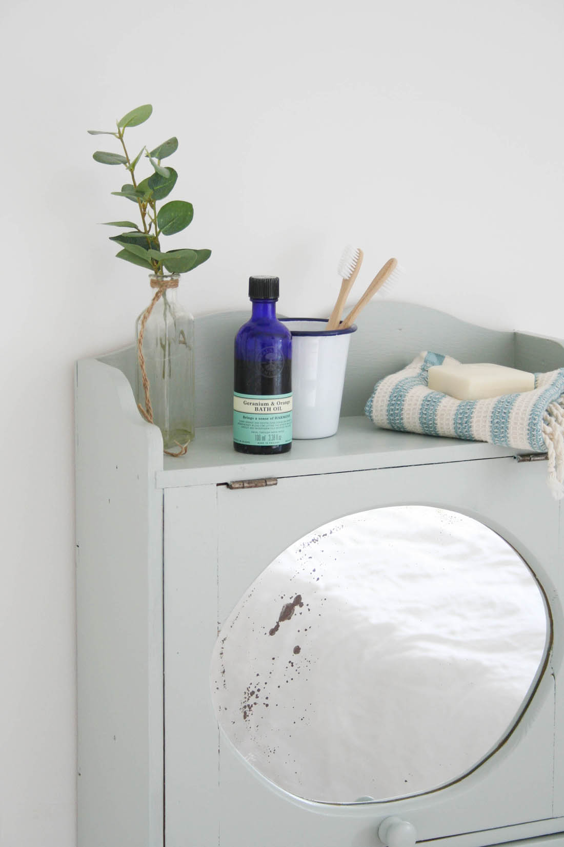
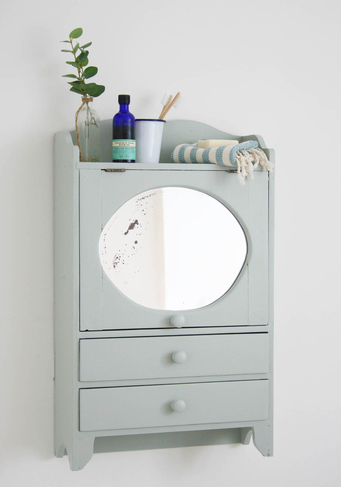
The first thing I have decided to do is paint a little cabinet I have on the wall in the bathroom. I’ll be honest with you that I pretty much hate painting furniture as it can be a real faff but I have discovered a great chalk paint from Ronseal that solves this issue. No primer is needed, just two coats of paint and no wax is necessary either and it is super quick drying too (that is very important for me as I am SO impatient when it comes to painting – you’ll often find me hanging shelves or shifting drawers back into place even though the paint is still wet!). The paint also resists knocks and scuffs, which is perfect for my bathroom cabinet as it gets a lot of wear and tear. I chose the duck egg blue to help add a bit of subtle colour to the room.

So, here are my tips for painting wooden furniture and I will be back another time with pics of my bathroom ‘refresh’ if I feel brave enough 😉
Tips for painting wooden furniture |Vintage bathroom cabinet | Apartment Apothecary

Cabinet painted in Ronseal’s Chalky Furniture Paint in duck egg blue.
Tips for painting wooden furniture |Vintage bathroom cabinet | Apartment Apothecary

I’ll show you what it looks like when it is back in the bathroom when I have made a few more changes to that room.

Tips for painting furniture

The cabinet is quite old (I bought it ten years ago from an antiques shop) but the pine isn’t a lovely aged colour, it is actually quite bright orange and it kind of stands out like a sore thumb in the bathroom. Therefore, I decided it would be an ideal candidate for a bit of an update. The wood is in a good condition with a few dents and knots here and there but I don’t want to make it look like new so I don’t bother with filling any of them. I give it a really light sand and then hoover it well so there is no dust or dirt and then I am ready to paint…

Tips for painting wooden furniture | Apartment Apothecary

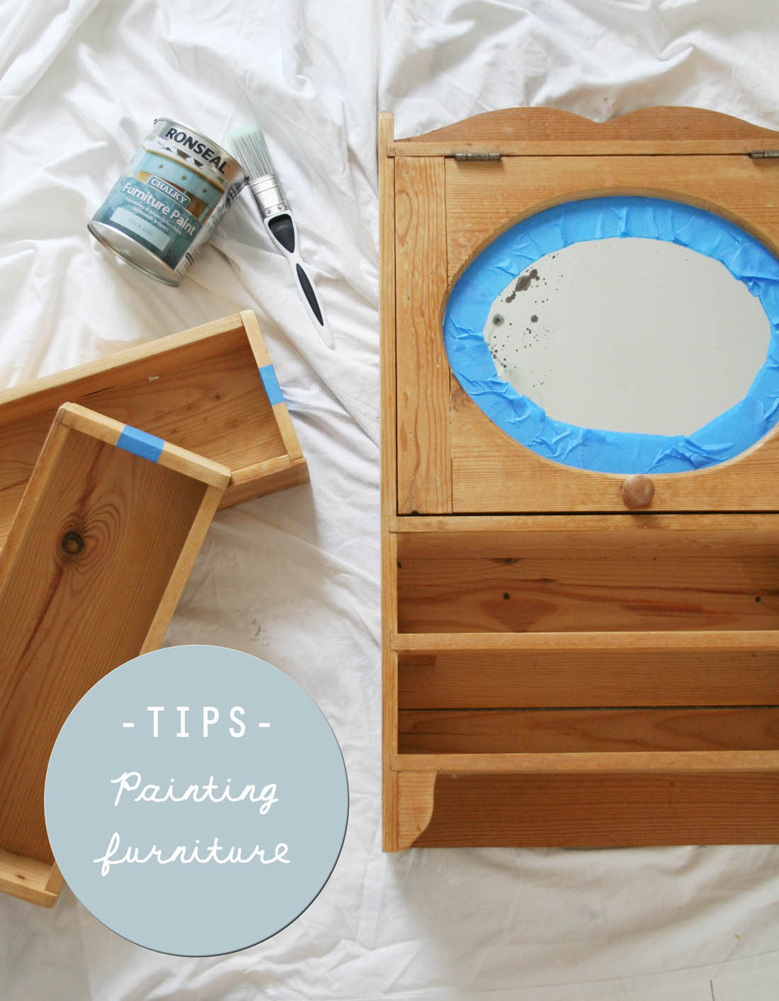
1 – Spend time taping off where you do and don’t want to paint

I like to use blue decorators’ tape as it adheres really well compared to normal masking tape. For this particular piece I spent time taping off the mirror so that I could get a really crisp finish and it saved me loads of time as I didn’t have to faff around trying not to get paint on the mirror.

2 – Only paint the outside

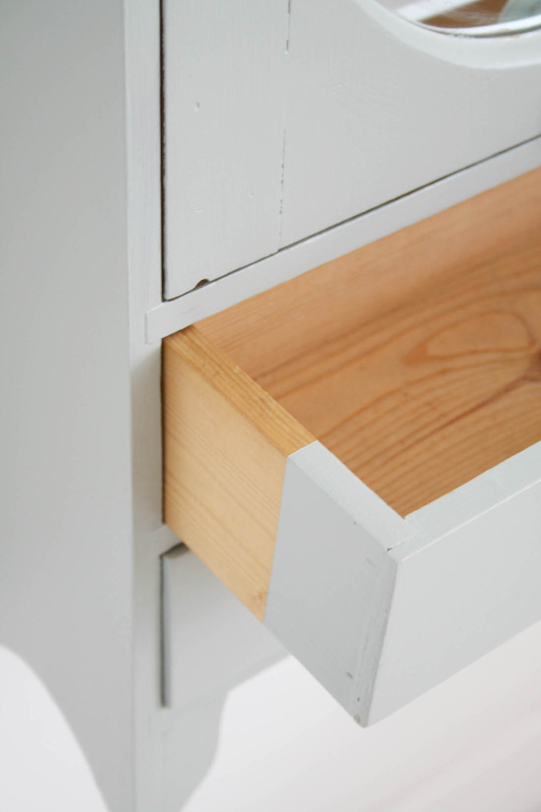
I never paint inside a piece of furniture. The main reason for this is that a couple of layers of paint can mess up how well a cupboard door closes or a drawer slides in and out – often the paint can make these things ‘stick’. Therefore, I only paint a couple of inches of the inside of a drawer, just so you don’t see any raw wood from the outside (see the outcome of this in the finished photograph above).

3 – Use the right sized brush for the job

I am famous for using a massive brush on the teeniest tiniest project or vice versa just because I’ve used the first brush I find. However, if you choose the right sized brush it will save you so much time and have a really noticeable effect on the finish.

Ronseal’s Chalky Furniture Paint is really easy to apply as it’s water based and it only requires just two coats – no primer or wax. It also drys really quickly and has no smell so it’s a great product to use at home for a quick project.

4 – Apply thin layers of paint

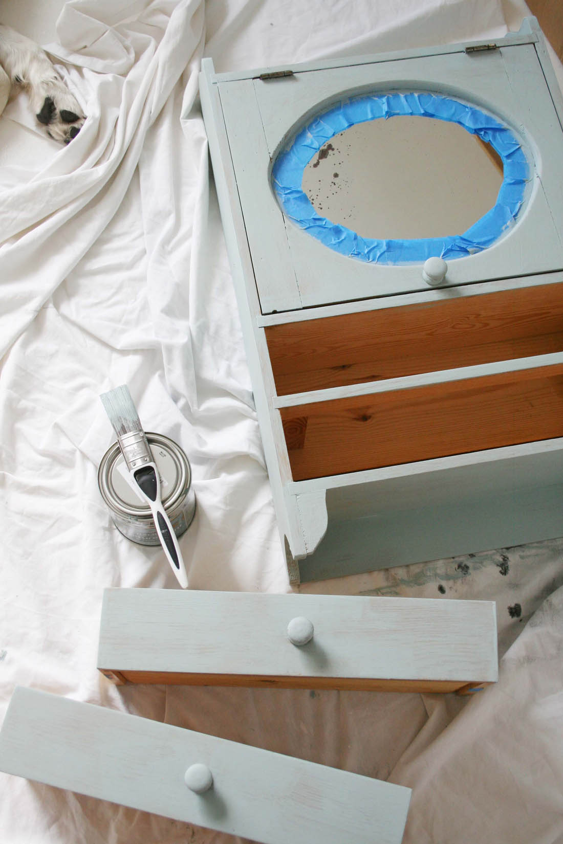
The first layer of paint (as you can see above) should be thin and you should still be able to see the grain of the wood. Don’t lather on huge amounts of paint as it will pool and drip – have faith that the second coat of paint will provide all the coverage you will need.

5 – Work with the grain

Try to apply the paint in the same direction, working with the grain of the wood. This will help create a good finish.

6 – Be patient

Make sure you follow the paint instructions and let the paint dry thoroughly between layers. Also, don’t remove the tape until the next day if you have the patience (I took mine off after a couple of hours though – I can’t help myself!).

What do you think? I hope you agree the cabinet looks better painted than it did before. Back soon with a few more bathroom updates.

Katy x

*This post was written in collaboration with Ronseal.


Friday faves

Hmmm, struggling a bit this week to think of things that have inspired me over the last few days. I kind of think that means I need a little break from my desk; I’ve worked throughout summer without a holiday so I don’t really have that feeling of being refreshed and ready for a new season. Therefore, I think I will take next week off from the blog so that I can work at a slightly slower pace and get a few of those things on my to-do list ticked off. Hopefully, this will be enough to give me a bit of extra time to think and make plans, which is usually one of my favourite things about going on holiday – I come home with a brain full of ideas after having time to laze round with nothing to do but think.

So, I will see you in a week’s time hopefully ready and raring to go for the beginning of Autumn…

Katy x

Scandi style work space | DIY home office |Photograph by katharinepeachey.co.uk | Apartment Apothecary

Photograph by Katharine Peachey.

The Autumn Fair

The Autumn Fair | Apartment Apothecary

I’ve already mentioned that I am looking forward to Autumn and that exciting ‘back to school’ feeling. It’s always a time for fresh starts and renewed inspiration, I find. For those of you who have a shop/gift/home business a good way to kick off the new season is a visit to the Autumn Fair, a gift and home trade show that takes place at Birmingham NEC from September 4th – 7th. Full of inspiration, a mix of contemporary and traditional products and a great line-up of experts to learn from, the fair is also the perfect place to help start you on a new venture if you have been thinking about starting a business – new season, new beginnings!

The Autumn Fair | Apartment Apothecary

Hübsch will be exhibiting their A/W16 collection.

There are 1,400 exhibitors to explore over the four day show with twelve different sectors, including The Light Show and The Summer House. Exhibitors range from small independents ready to be discovered to large well known brands so there is something for everyone.

The Autumn Fair | Apartment Apothecary

You can find lighting inspiration from companies such as VITA Copenhagen.

The Autumn Fair | Apartment Apothecary

Beautiful botanical accessories from Abigail Ahern.

If you want to know a bit about what to expect from the exhibitors, highlights include the cool, sleek lines of furniture by Danish company Hubsch, discover VITA Copenhagen – a place where beautiful Danish lighting design meets the Scandinavian feel, high-quality materials and a genuine care for the environment. You can also browse a selection of the stunning Abigail Ahern botanicals from the A/W16-17 collection. Ib Laursen is another designer to look out for, designing and selling home and garden decor, matching the Nordic design tradition and Le Creuset will be at the show launching their new Moorland Mist collection just in time for lots of lovely autumn and winter cooking. Plenty of gifts, gadgets, jewellery, stationery and children’s products will also feature.

The Autumn Fair | Apartment Apothecary

Nordic design from Ib Laursen.

The Autumn Fair | Apartment Apothecary

Le Creuset will be exhibiting their new ‘Moorland Mist’ collection.

The show isn’t just about unearthing new products for your business but it’s a great place to meet new people in the trade and learn from the brilliant line up of experts that are holding seminars and doing talks. Two of my favourite interiors bloggers, Kate Watson-Smyth of Mad About the House and Jen Stanbrook of Love Chic Living are speaking so make sure you check them out. You will also be treated to a seminar by the super successful Jo Malone who will be sharing her brand building story, full of invaluable insights, I’m sure. You can also book in for a one-on-one clinic with the Meet the Experts panel and discuss any issues your business is having from SEO to social media management.

So, whether you are looking for some ‘back to school’ inspiration for your existing business or you are searching out new beginnings this autumn by starting up a brand new venture, the Autumn Fair is a great place to start. Enjoy!

Katy x

*This post was written in collaboration with the Autumn Fair.


Vintage inspired sofas by G Plan

Is there anything better than choosing a new sofa? It is such an important purchase as a good one can completely transform a room – it’s as though it has magical powers. Without changing a single thing in a room if you add a new sofa the whole space feels shiny and new; a bit like new school shoes after the summer holidays (god, I used to love that feeling!).

All that being said, you need to get the choice right. The colour, style, shape, fabric and size of the sofa are all important considerations. Sofa buying can feel like a minefield; don’t panic and go for a safe, boring option that can drag a room down. Instead you need to be brave and bold, seek advice and go for something that will bring your room alive.

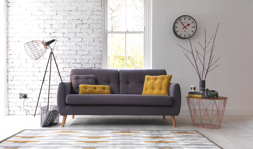
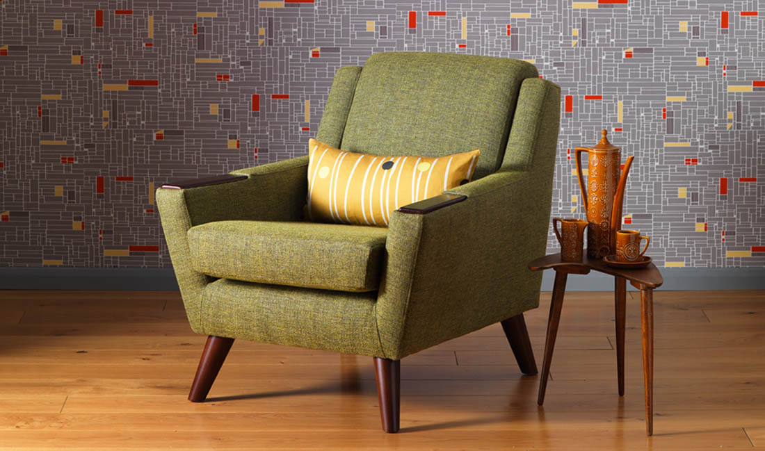
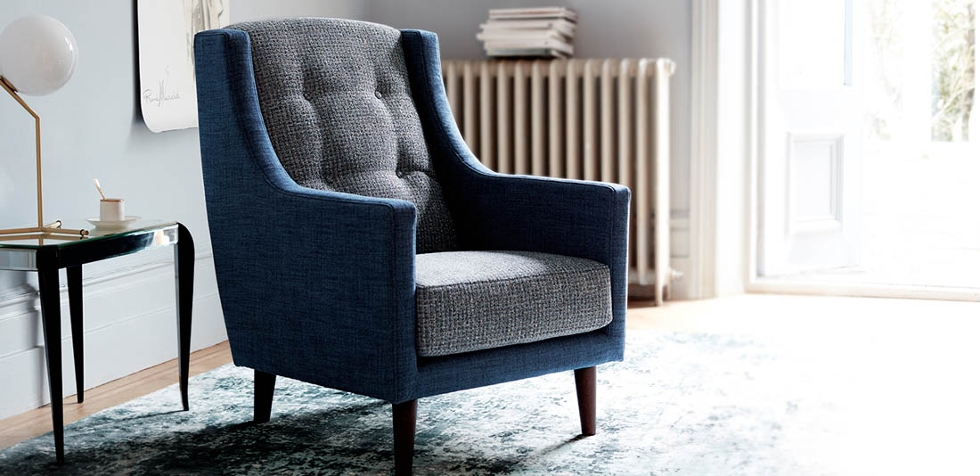
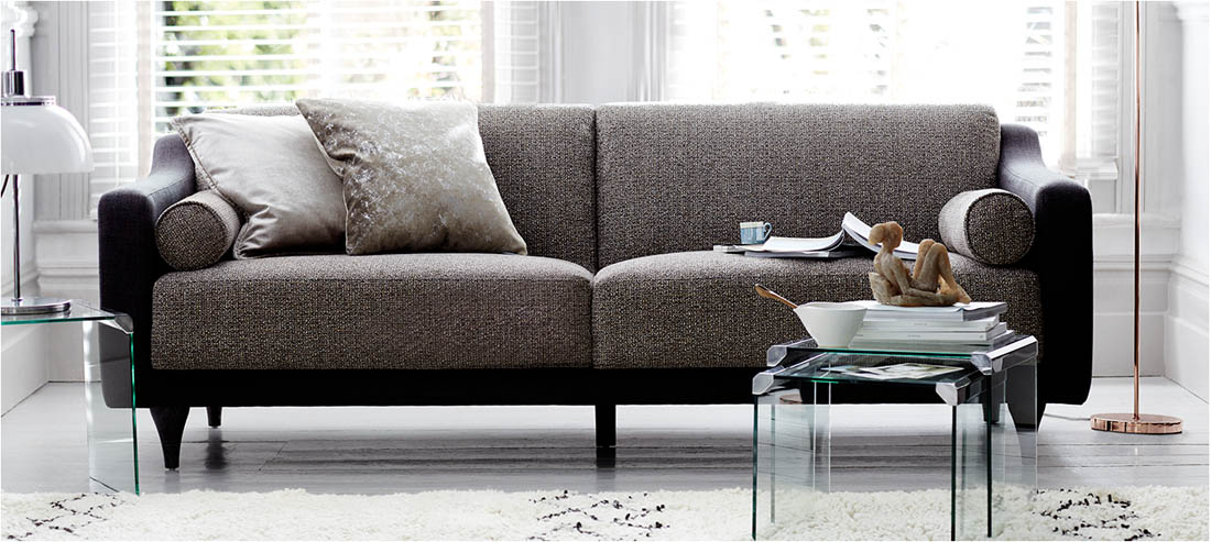
If you are currently looking for a new sofa, or can be tempted to consider one, I’m excited to introduce you to some fabulous options from G Plan. One of my favourite brands for vintage furniture (I used to have the most gorgeous 50’s G Plan sideboard) G Plan began in 1953 and is responsible for some of the most iconic furniture of the 20th century. The company has now gone on to create a stunning range of furniture inspired by their classic sofas and chairs of the 50’s and 60’s in collaboration with Hemingway Design. The G Plan Vintage collection has that elusive ‘magical power’ I referred to earlier.

63-hero-shot-2

Top: The Sixty Three Bottom left: The Fifty Five Bottom right: The Fifty Three

Turning yesterday’s classics into icons of tomorrow, each piece is handcrafted in Wiltshire from the finest materials, and each design is named after the mid-century original from the archive that inspired it.

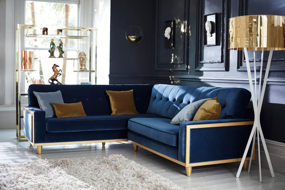
The latest addition to the G Plan Vintage collection is the stunning Fifty Nine Corner Sofa – perfect for families or hosting and definitely makes a statement. Seen here in indigo blue velvet but the colour palette for this sofa includes shades of berry, topaz, flamingo, shell, teal, copper and emerald – tempting, hey?

G Plan contemporary collection of sofas inspired by vintage archives | Apartment Apothecary

Top: Fifty Nine Corner Sofa  Bottom left: The Sixty Seven Corner Bottom right: The Sixty Seven

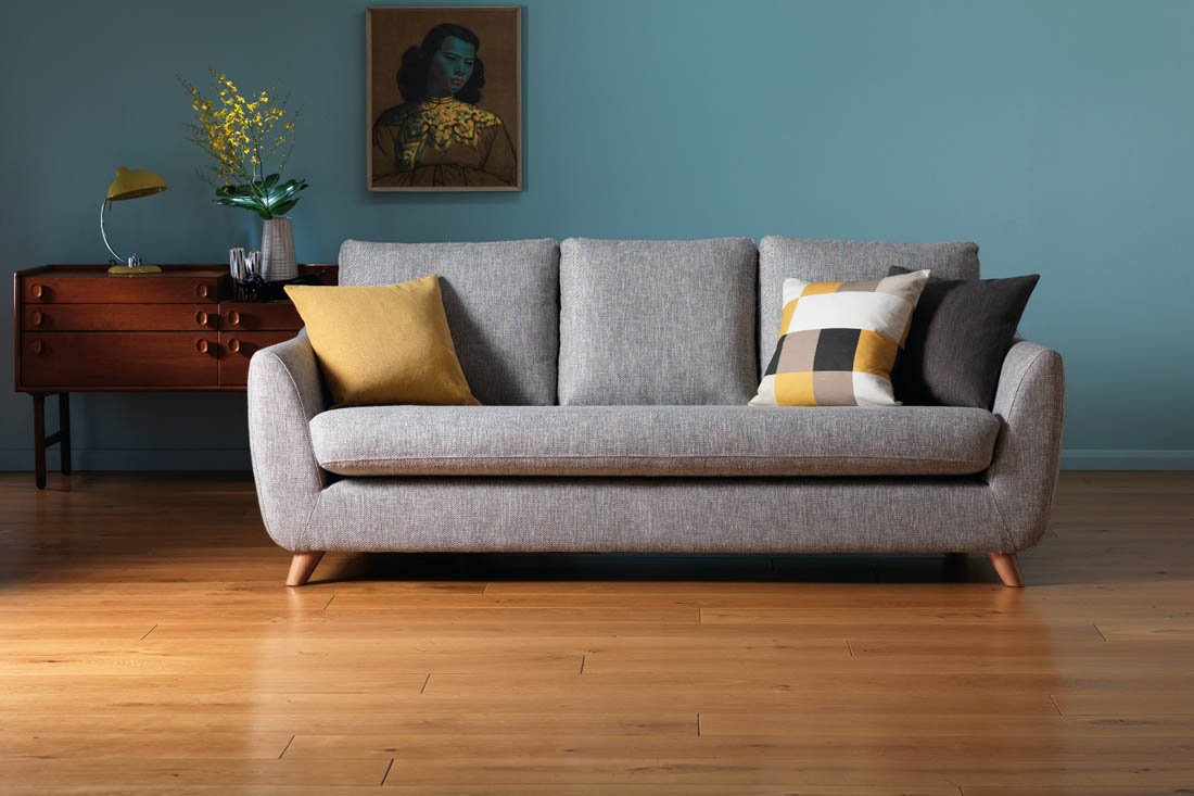
You know when you go round to a friend’s house and as you walk into their living room there is always one chair that just calls to you to sit in it ? The latest launch from G Plan, the Edit collection, is calling me through my computer screen! This is a collection inspired by the boucle fabrics of one of Italy’s finest mills and the texture of these fabrics give these pieces the wow factor. I badly want the Bowie to be mine.

G Plan contemporary collection of sofas inspired by vintage archives | Apartment Apothecary

Top: Bowie Bottom left: Hepburn Bottom right: Hockney

Have I convinced you? Don’t go for the boring sofa option, be bold and add a bit of vintage inspired magic to your living room.

Katy x

*This post was written in collaboration with G Plan.

Friday faves

I have to admit I have been a bit baby obsessed this week. We’re into week 21 now and it suddenly feels all very real with baby kicking away and we found out the gender a couple of days ago, which was almost like finding out I was pregnant all over again. Even though there were only ever going to be two options, so I thought it wouldn’t come as too much of a surprise, I was so shocked and blown away when we found out; I guess it’s finally convinced me that this is actually happening! We both kind of thought it would be a boy but we were wrong…a little girl is on its way. So exciting.

Anyhoo, the result of all this excitement has been me going on a bit of a spending spree – I couldn’t help myself! I have been thinking about making plans for the nursery so we can get that all done before the start of December as baby is due in January and I don’t want to have to worry about it over Christmas so I’ve been on the hunt for some bits and pieces for that room. I have found a few lovely independent shops that I’d love to tell you about because I have been so impressed by their products and service.

Friday faves | Nursery inspiration | Apartment Apothecary

Wallpaper: Gable BP 5406 – € 133.00 per 10m roll. Available from: Farrow & Ball 01202 876141 www.farrow-ball.com

I want the nursery to blend in well with the rest of our flat and not stick out like a bright sore thumb so I like the idea of incorporating dusty blues, greys, greens, pinks and lots of white (the pinks would have been there if it had been a boy, believe!). I found lots of lovely things from The Modern Nursery, including the hot air balloon light, and from The Tipi, including the changing basket. I like the contrast of natural baskets against soft, pale colours. I also discovered some beautifully made organic cotton and bamboo baby clothes from Baby Mori – they are soooo soft! A much more extravagant purchase that I have put on my ‘baby wishlist’ is the Sebra Kili cot (image via woonblog), which would be perfect for our flat as we don’t have much space and I just love the Danish design. I doubt there will be enough pennies for it but I can dream…

This week I was treated to a sneak peek of Farrow & Ball’s new range of wallpapers due to launch next month. I am now very torn between leaving the nursery white with painted Light Blue woodwork or using this new wallpaper, which is called Gable. I love the 1940’s inspired rural scene and the one thing I remember most from my own room as a child was the wallpaper and the stories it inspired based on the characters in the design. So, I’ll be wrangling over that decision for who knows how long – what would you do?

Hope you’ve all had a great week!

Katy x