September 2015 – a review

September has been a good month. The sun has shone, exciting opportunities have presented themselves and we managed to get away for a few precious days to catch up with life.

This month has been made even more beautiful by your stunning Styling the Seasons posts that have been in abundance this month; everyone has been revelling in the change of season it seems. However, there was only ever one post that I could pick as my favourite this month, as it made my heart sing and I loved reading every word. Thank you, Rachel, for such a beautiful and thoughtful post.

Thank you to everyone else who took part this month and hopefully refreshed a surface in your home, stopping to appreciate the change of season and how best to portray it in your home. We’ve also loved seeing your favourite vintage finds this month, as we get ready for our Vintage Jumble and Prop Sale that we are holding this Sunday, October 4th in Lindfield (more details here). If you want to come along and pick up some lovely homewares that you can use to style up your home we would love to see you there.

For more beautiful September inspiration, check out these posts…

The Ordinary Lovely | thevintagehousethatcould | Growing Spaces | A Quiet Style | Lobster and Swan | Tea with Ruby | Wild and Grizzly | Lapin Blu | Littlegreenshed | Seeds and Stitches | The Lovely Drawer | Camellia Rose  | Candy Pop | Beautiful Simplicity | Daisy Fay Interiors | The Villa on Mount Pleasant | Humphrey and Grace | Really Pretty Useful | The Cabinet Maker’s Love Tale | Janice Issitt Lifestyle | Ling Yeung B | A Quiet Corner | Owl and Accordian | Mummy Limited | Inside Out and AboutLotts and Lots | Apartment Apothecary

See you back here tomorrow for my October post.

Katy x

The best mattress in the world

Have you been looking for the best mattress in the world? Well, I think I have found it for you. Meet Bruno.

Buying a mattress can be a bit of a minefield – and an expensive one at that. Do you pick one with pocket springs, open springs, memory foam, the firm one, the soft one, the one that costs £100 more or the one that costs £1000 more? Yes, really. How many should you test and roll around on, being careful not to get your dirty shoes on, before you can agree on the right one?

The perfect mattress | Bruno mattress

Well, two guys from Berlin, Felix Baer and Andreas Bauer have made all the decisions for you by creating what they think is the best mattress in the world, Bruno. With Bruno there are no degrees of firmness, so you don’t have to choose between soft, medium or firm. Thanks to the sophisticated weight distribution formula, the Bruno mattress adapts optimally to your body as long as you weigh between 50kg and 110kg. The polyurethane layer gives you firmer support for heavier body parts and relieves your shoulders and hips, whilst still supporting your waist. Regardless of your sleeping position – the Bruno will provide you with the best support and keep your spine straight as you sleep soundly.

The magic formula

The perfect mattress | Bruno mattress

1. Velvety cotton cover
The cover is made of 100% cotton and has a discrete zipper enabling machine washing. The climate fibres provide optimal ventilation during sleep.

2. Latex layer of 100% natural rubber
Under the cotton cover there is a 3cm thick, air-permeable surface of 100% natural rubber. This layer has excellent air circulation and ensures optimum weight distribution.

3. 7-zone special cold foam core
The foam core has seven zones with height of 20 cm and is suitable for people between 50 kg and 110 kg. This high density ensures a very long lifespan of the Bruno mattress.

The perfect mattress | Bruno mattress

You can order the mattress online, it is delivered for free throughout the UK and it arrives in a box – could it get more convenient than that? Also, if you are not entirely happy with the mattress after 30 days you can return it for free and get a full refund. You can’t argue with that.

The perfect mattress | Bruno mattress

The mattress is assembled from the finest materials and each component is perfectly engineered and extensively tested, offering a superior sleeping experience. Going by the reviews, these guys are on to a winner.

Happy snoozing!

Katy x


*This post was written in collaboration with Bruno Sleep.


DIY air dry clay hanging planter

So today’s craft project wasn’t really intended for the blog (it was more of an experiment) but I took some step by step photos just in case it turned out ok. I’ve been wanting to make another hanging planter for ages and had thought about trying my hand at macrame but I got all over ambitious and decided to make my own planter instead.

I’ve been wanting to try out air dry clay since I saw this project a few years ago so I suppose this was my inspiration along with my love of a hanging planter (see my other planters here and here).

Anyhoo, I learnt a lot from this first project and although the planter did turn out ok, there are things I could improve next time – I’ll tell you about them as I go along. These are brilliant to make to brighten a corner, for herbs in the kitchen or even for lovely homemade gifts (Christmas gifts – yup, I said it).

DIY air dry clay hanging planter tutorial | Pegboard | Home office | Craft room

You will need:

FYI, I have no ‘proper’ equipment i.e. moulding knife.

Air dry clay (I used about 500g for my pot, which is £2’s worth)

– Rolling pin

– Knife

– Template (I used a plant pot)

– Ruler

– Protection for the surface you work on (parchment paper worked well)

– Bowl of water

– Cord

– Kebab stick

– Sand paper

– Scissors

– Paint ( I used white gloss spray paint but you can use any paint you have at home or just a small sample pot), decorator’s tape, cardboard box – if decorating

Step by step

Step 1 – Roll out all of your clay evenly to about 70mm thickness. Cut out a disc for the bottom of the planter using a template. I had a plant in mind for my planter so I used the top of its pot as a template, which measured 9cm in diameter.

DIY air dry clay hanging planter tutorial | Apartment Apothecary

Step 2 – Cut out a rectangular collar, which will form the sides of the pot. Mine measured 9 x 27cm. Make sure there is o.5cm overlap where the collar will join together.

DIY air dry clay hanging planter tutorial | Apartment Apothecary

Step 3 – Using your hands roll out a ‘snake’ of clay the same length as your collar and about 70mm thick.

DIY air dry clay hanging planter tutorial | Apartment Apothecary

Step 4 – Place the disc on a flat surface and wrap your collar around it (don’t place it on top of the disc).

Step 5 – Using your fingers smooth the collar together and use some water to make it stick.

Step 6 – Place the ‘snake’ of clay around the inside of the pot where the disc and collar meet.

DIY air dry clay hanging planter tutorial | Apartment Apothecary

Step 7 – Using your fingers and water (you’ll need to have short nails – this is where better crafters than I would use a moulding knife) smooth the ‘snake’ into the join. At this point the sharp, crisp lines of my pot quickly disappeared as I had to manhandle it so much – hence the need for a proper moulding knife. I should have trimmed the top of my pot at this point as they became a bit wonky, but I’ll know for next time.

DIY air dry clay hanging planter tutorial | Apartment Apothecary

Step 8 – Stick a kebab stick, or anything similar, through the four sides of the planter to create holes for the cords that it will hang from. Wiggle the stick around so that the hole is big enough for your cord.

DIY air dry clay hanging planter tutorial | Apartment Apothecary

Leave your pot to dry for 2-3 days. There really is no point rushing this stage if you want it to last.

Decorating

You can leave your pot undecorated or you can varnish it, which is advised if it is going to come into contact with water. I decided to spray paint mine with some white gloss paint that I bought for another project. I have so many beautiful half glazed pots, cups and vases so I decided to try to achieve anywhere close to that look. I’m pretty pleased with how it turned out actually, although it is pretty difficult to see in theses pics – I really like the idea of using a pastel blue, pink, green or grey, too.

Step 9 – Lightly sand your pot once it is dry to remove any bumpy edges. If you want to try the half glazed look use decorator’s tape to cover the bottom half of the bottom.

Step 10 – Place your pot in a cardboard box, if you are using spray paint, and take it outside to spray. Do many thin layers, allowing each one to dry before starting another.

Step 11 – Cut four pieces of cord of equal length.

DIY air dry clay hanging planter tutorial | Apartment Apothecary

Step 12 – Thread the cord through the holes and tie a knot on the inside of the pot. If you have difficulty getting your cord through the holes burn the ends of the cord so that it melts hard and won’t fray as you thread it. Tie all four lengths of cord into a knot at the top.

DIY air dry clay hanging planter tutorial | Apartment Apothecary

If you look really closely you can see the half glaze effect – it looks great in real life, trust me!

Half glaze

I decided to hang mine on my pegboard to brighten up my workspace.

Pegboard and planter

Pegboard

DIY air dry clay hanging planter tutorial | Pegboard | Home office | Craft room

I like this air dry clay game…I’m thinking Christmas could become air dry clay filled 😉

Katy x

P.S. If you would LOVE your own hanging planter without getting crafty I can help with that, too. Check out these beauties from my shop

INTERNI aperitivo talk with lyndon neri

During London Design Festival you will see many manic looking people dashing around between events, exhibits and installations desperately trying to squeeze in as much as possible. There really is so much to see and do – just another reason why I love my home city.

For the second year running, renowned Italian design magazine INTERNI and Salone del Mobile.Milano have teamed up to host a series of five talks during LDF hosted in the flagship stores of some of the most interesting Italian design brands. I was invited to attend last night’s talk at the Lema flagship store on King’s Road with architect Lyndon Neri of Neri&HuReflective Nostalgia: The Future of the Past. It was a wonderful coming together of brands, designers, architects and publishers, which is the driving force behind INTERNI’s support for this series of talks. As Gilda Bojardi, Editor of INTERNI, said as she introduced Neri: “We are dedicated to encouraging creative encounters.”

Picture taken at the Interni event at Lema, London. Speaker Lyndon Neri, Neri and Hu

Photograph by Ashley Bingham. Picture taken at the Interni event at Lema, London. Speaker Lyndon Neri, Neri and Hu

Picture taken at the Interni event at Lema, London. Speaker Lyndon Neri, Neri and Hu

Photograph by Ashley Bingham. Picture taken at the Interni event at Lema, London. Speaker Lyndon Neri, Neri and Hu

I nestled into one of Lema’s deep, soft sofas ready to be inspired by the charisma and talent of Neri. The topic of his talk appealed to me on a personal level because I read history at university and taught it for over ten years: cultural history being my specialist subject. I have always been fascinated by the history of architecture and the talk encouraged us all to think about the future of architecture and how to best embrace the culture and history of a building and place through design. He spoke about the development and urbanisation of many Asian metropolises and how so many tall, shiny sky scrapers are turning them into clones of one another, with no acknowledgement or appreciation of the culture that belies these diverse cities. Neri&Hu is based in Shanghai and Neri talked us through the five main principles of his practice, as well as explaining the inspiration that lies behind some of his projects in the city.

Neri&Hu architecture | Townhouse in Shanghai | LDF15 talks

Neri&Hu’s The Split House project.

I was totally engrossed not only by the stunning designs but by listening to the stories and research behind each of Neri&Hu’s projects. It’s so difficult to imagine the thought processes that go into designing a building and its interior and it was really wonderful for that firsthand insight. I particularly enjoyed discovering more about a boutique hotel, The Waterhouse, that Neri&Hu designed in Shanghai. They were faced with an almost derelict opium warehouse and the owners were in favour of knocking down the whole building and starting again. However, Neri’s firm principle that “without knowing Shanghai’s history, there is no future” meant that this was not an option for him. Instead, he wanted to embrace the rich culture of the ‘Lanes’ (rows and rows of small townhouses in Shanghai) where the warehouse is located, blurring the lines between old and new. The rooms were designed, therefore, to be open onto each other, onto the restaurant, out onto the street. When you eat in the restaurant you can see into neighbours’ house, just as though you were in a traditional townhouse in the lanes: the blurred boundaries of public and private spaces. Such beautiful, thoughtful and thought-provoking design.

Neri&Hu architecture | Boutique Hotel | Waterhouse Hotel in Shanghai | #LDF15 talks

Maintaining the cultural texture of the building and blurring the lines between public (the hotel reception) and private (the bedroom above) spaces – a nod to the culture of Shanghai’s lanes.

Neri&Hu architecture | Boutique Hotel | Waterhouse Hotel in Shanghai | #LDF15 talks

Looking into your neighbours’ rooms in the hotel, as people living in Shanghai’s lanes have done for centuries. Neri: “Do not see the negative historical architectural features as a detriment, but rather as a positive”.

I could have listened to Neri for hours more and I was just as intrigued to hear about the inspiration behind each of the products that he and his partner design. The design of their picnic basket in this film is truly beautiful.

It was an awe-inspiring talk with the stunning Lema showroom as the perfect backdrop for the evening. After the talk we were also treated to some delicious aperitivo with traditional Italian food and wine prepared by I Love Italian Food and Ristorante San Carlo Cicchetti. The perfect end to an evening dedicated to creative collaborations and INTERNI helping to open the door to inspiration.

Picture taken at the Interni event at Lema, London. Speaker Lyndon Neri, Neri and Hu

Photograph by Ashley Bingham. Picture taken at the Interni event at Lema, London. Speaker Lyndon Neri, Neri and Hu

Have you got London Design Festival plans for the weekend?

Katy x


*This post was written in collaboration with INTERNI magazine.

The Welsh House

When I was invited to stay at The Welsh House I could not have been more thrilled as we had such a dreary summer so I saw a long weekend as our chance to get a much needed break and refresh ourselves before slowly creeping into Autumn.

I was immediately drawn to Bryncyn cottage (there are three to choose from) because I was so struck by the modern extension to such a beautiful traditional Welsh cottage, achieved so skilfully by Dorian who owns the three cottages. As I said in last week’s post I am always so torn between the charm of the old and the function and design of the new so Bryncyn seemed to promise the best of both worlds.

And it did not disappoint. We really did have a magical few days in the most gorgeous house, surrounded by still, quiet countryside, sun – yes sun! – to die for, and time.

Traditional Welsh cottage | The Welsh House | Apartment Apothecary

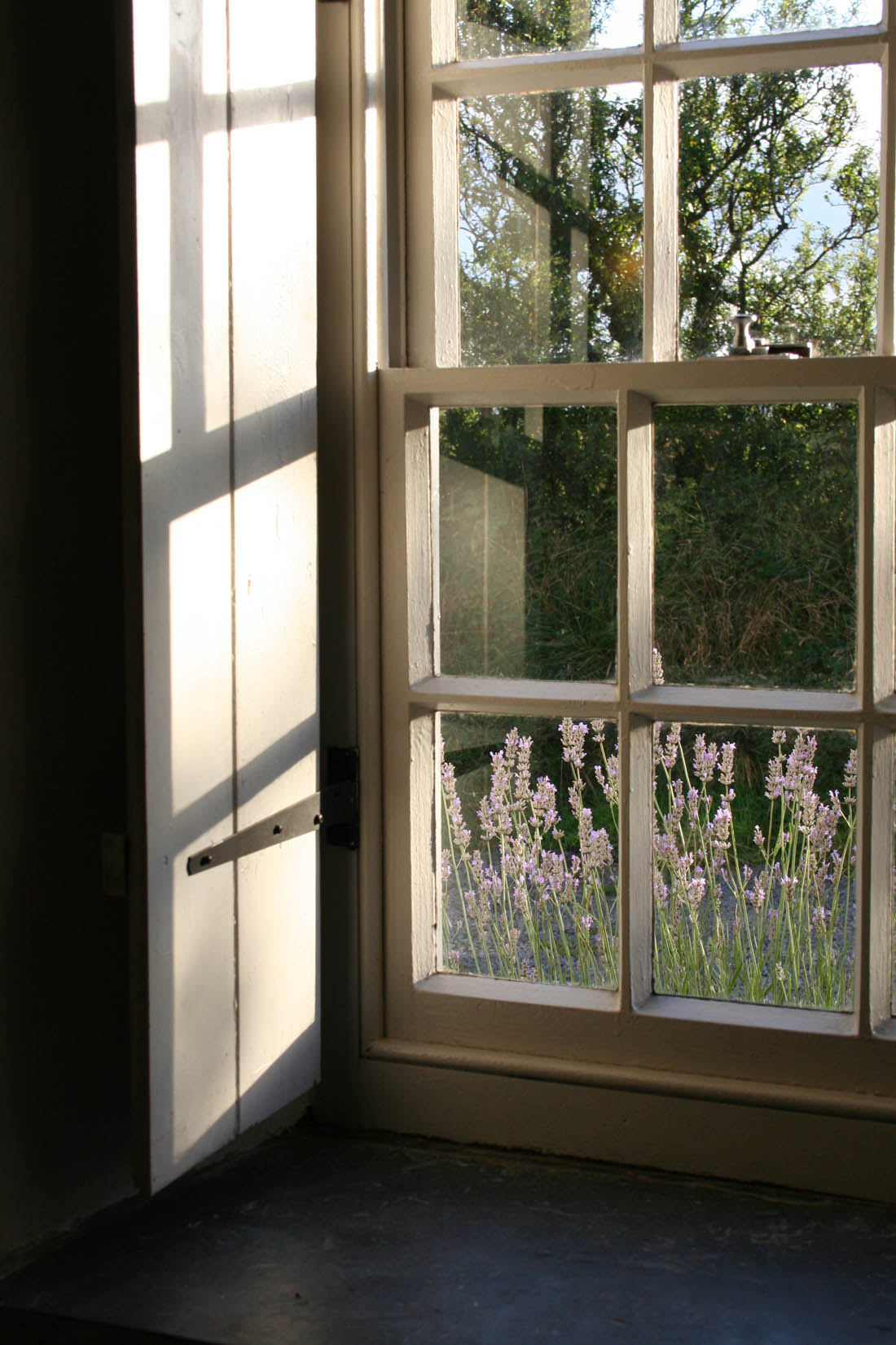
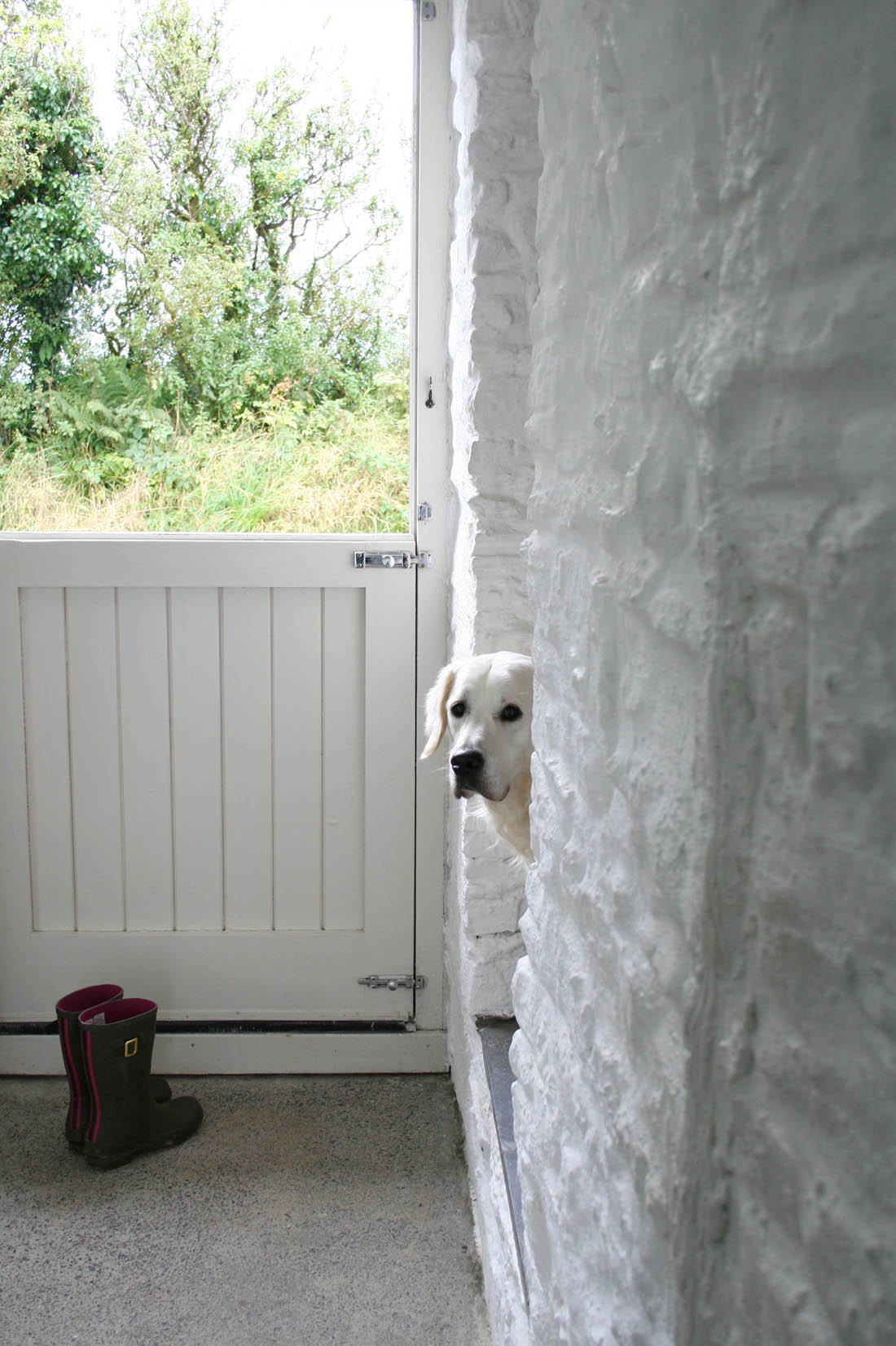
We arrived in the stunning evening light to this perfect looking cottage and the light was streaming into the sitting room from every angle – oh to have sash windows and shutters! After scoffing some Welsh cakes left for us we went for a wander to stretch our legs after a long drive and to take in the beautiful evening and peaceful countryside. Otto discovered some friendly looking cows, although he didn’t like it quite as much when he discovered the next morning that they walked up our drive past the house.

Traditional Welsh cottage | The Welsh House | Apartment Apothecary

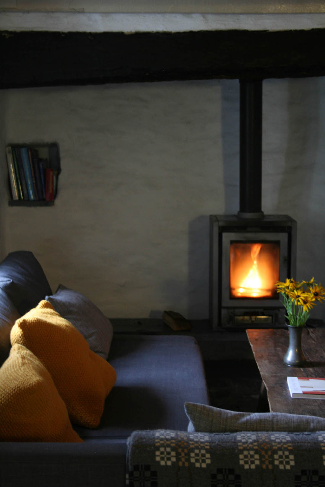
We took our time over making dinner and settled with a glass of wine in front of the wood burning stove, although actually we really didn’t need it because it was so mild. Not having a TV or wifi was replaced with chatting, listening to music and catching up, all of which has been too rare lately.

Traditional Welsh cottage | The Welsh House | Apartment Apothecary

Traditional Welsh cottage | The Welsh House | Apartment Apothecary

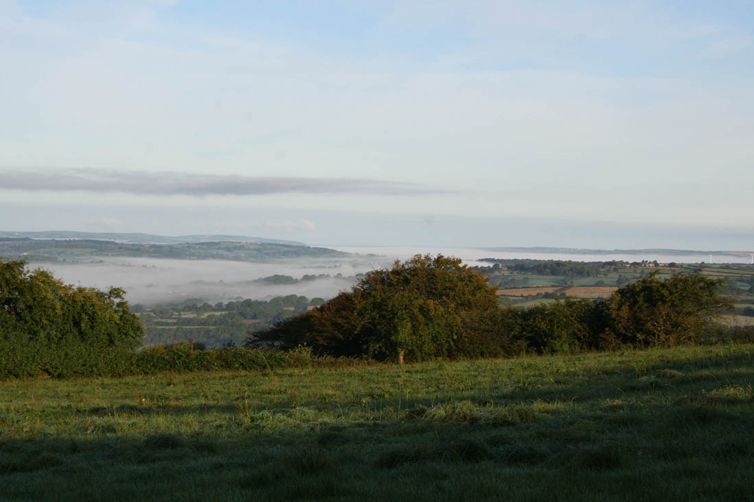
The next morning Otto and I climbed to the back of the garden with tea in hand to be greeted by the most amazing sight of what looked like a blanket of cloud covering the valley below: dragon’s breath, so I’m told.

Traditional Welsh cottage | The Welsh House | Apartment Apothecary

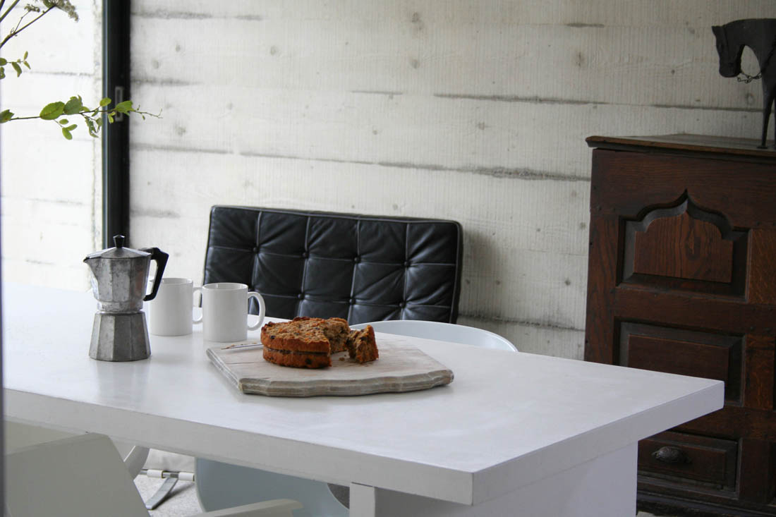
Coming down from a wonderful sleep to the modern extension, with its concrete and glass walls, absolutely filled with light was quite something. I’ve said in the past that I chose my flat because of the floor to ceiling windows and I really do believe that it makes a massive difference to my mood living in a light, bright space. The modern extension at Bryncyn is the perfect antidote to the traditional proportions and typically dark nature of cottages. I loved the contrast of the old against the new and being able to choose which space to be in according to my mood. The hard edges of the kitchen diner were softened by the pond and wild garden that lies beyond the huge sliding glass door. At night when we cooked and ate here with lights on and candles lit it transformed into a warm, cosy space and as we looked in from outside it had become an amazing lightbox in the middle of pitch black countryside (I wish we’d been able to capture this!). Did I mention that there is a hot tub on the terrace? We were so lucky to have a completely clear night on Saturday so we spent part of it in the hot tub star-gazing and I finally managed to see the Milky Way.

Traditional Welsh cottage | The Welsh House | Apartment Apothecary

I love the functionality and space of modern design and it provided just the right balance of ease and convenience for a long weekend away from home. We wanted to spend time cooking good meals so the modern kitchen was perfect.

Traditional Welsh cottage | The Welsh House | Apartment Apothecary

Traditional Welsh cottage | The Welsh House | Apartment Apothecary

Traditional Welsh cottage | The Welsh House | Apartment Apothecary

Traditional Welsh cottage | The Welsh House | Apartment Apothecary

Traditional Welsh cottage | The Welsh House | Apartment Apothecary

I loved the mix of furniture chosen by Dorian that worked so harmoniously together, along with traditional Welsh woollen cushions and blankets.

Traditional Welsh cottage | The Welsh House | Apartment Apothecary

Traditional Welsh cottage | The Welsh House | Apartment Apothecary

The bathroom is also in the modern extension, which worked perfectly for me because I have a thing about needing a good shower.

Traditional Welsh cottage | The Welsh House | Apartment Apothecary

Dorian has opened up the whole top floor of the cottage to make one big bedroom, which was wonderfully simple and spacious, with loads of light and a very comfy bed. Loved the hanging pendants too.

Traditional Welsh cottage | The Welsh House | Apartment Apothecary

The sitting room is so cosy and reading on the big chaise sofa in front of the wood burning stove could not have been more relaxing.

Traditional Welsh cottage | The Welsh House | Apartment Apothecary

Traditional Welsh cottage | The Welsh House | Apartment Apothecary

Traditional Welsh cottage | The Welsh House | Apartment Apothecary

Traditional Welsh cottage | The Welsh House | Apartment Apothecary

I will write another post with some pics of what we got up to during our stay as we had such a great day at the beach. I hope you have enjoyed a little tour of the house and do pop over to Dorian’s site to take a look at the other two cottages. As well as that, take a look at Sara’s beautiful film she made of her stay here – it really is something.

Thank you, Dorian, for creating and sharing this little pocket of heaven.

Katy x