Kitchen makeover reveal

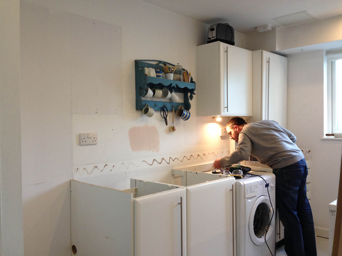
I can honestly say that my ‘new’ kitchen looks and feels like a totally new space compared to before. We didn’t have the budget to make drastic changes and we had to do everything ourselves but a few subtle changes have made a big difference.

Kitchen makeover |Photograph by katharinepeachey.co.uk | Apartment Apothecary

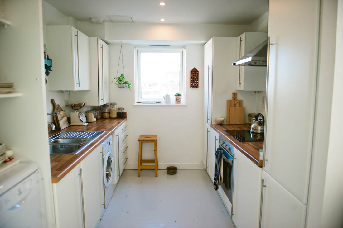
Our kitchen cupboards were fine so we kept a lot of them but just by removing a few of the wall cupboards made the space feel instantly bigger and quite a few friends have asked whether we moved a wall to make the room larger so that’s a good sign of success. By painting the walls Pink Ground, adding leather door handles, metro tiles, a solid beech worktop, a quartz sink and a couple of open shelves I feel much more at home in this kitchen and it works a lot better on a practical level, too.

Here’s a bit more detail of the changes we made…

Kitchen makeover |Photograph by katharinepeachey.co.uk | Apartment Apothecary

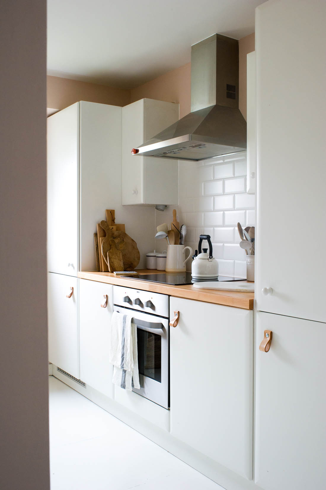
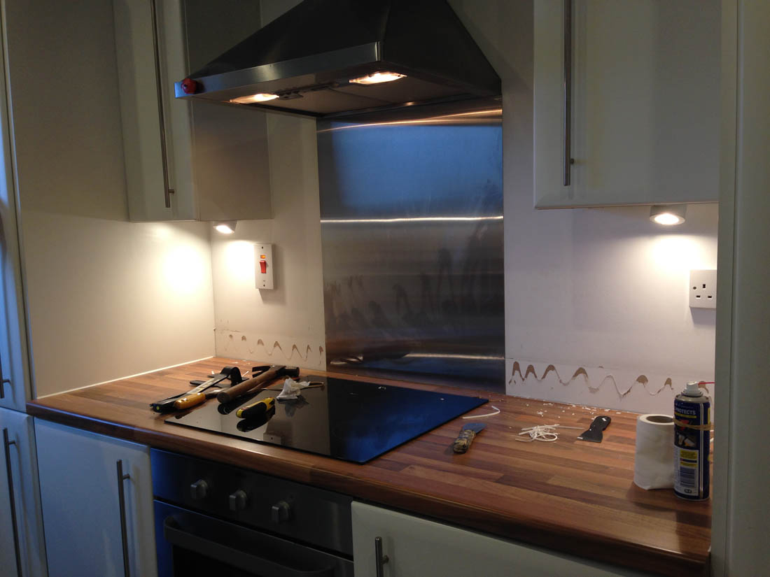
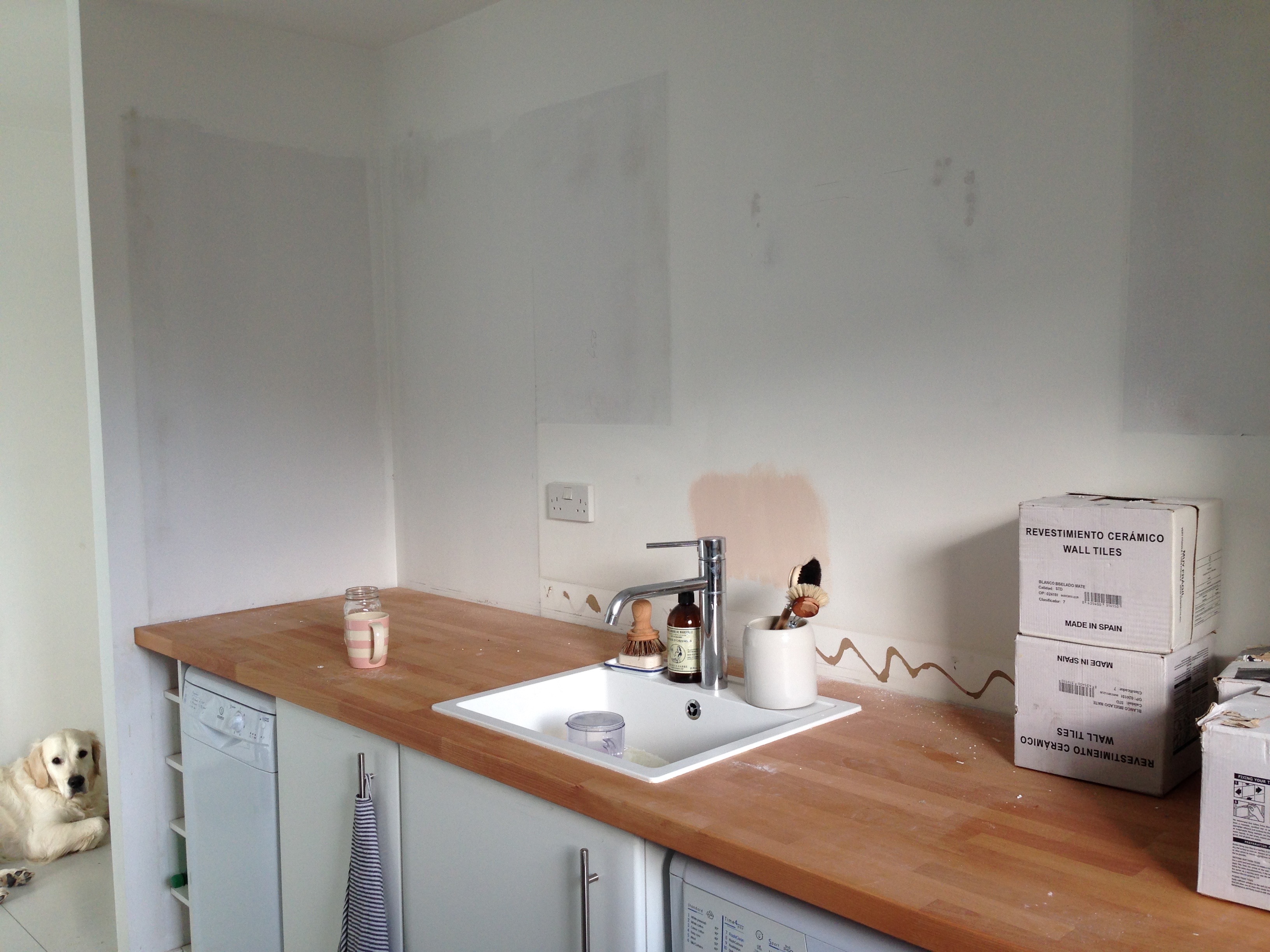
I removed the stainless steel splash back from behind the hob and replaced it with matt white metro tiles from Tile Giant. I added leather handles to the bottom cupboards and ceramic white knobs to the top cupboards (I didn’t want the leather handles to be overpowering). The worktop on this side of the kitchen was also replaced with solid beech.

The right side of the kitchen above has remained the same in structure but the new solid wood worktop and metro tiles have lightened and brightened this side of the kitchen.

In an ideal world I would have removed all the wall cupboards on the left side of the kitchen but the boiler is in that end cupboard so it had to stay.

Kitchen makeover |Photograph by katharinepeachey.co.uk | Apartment Apothecary

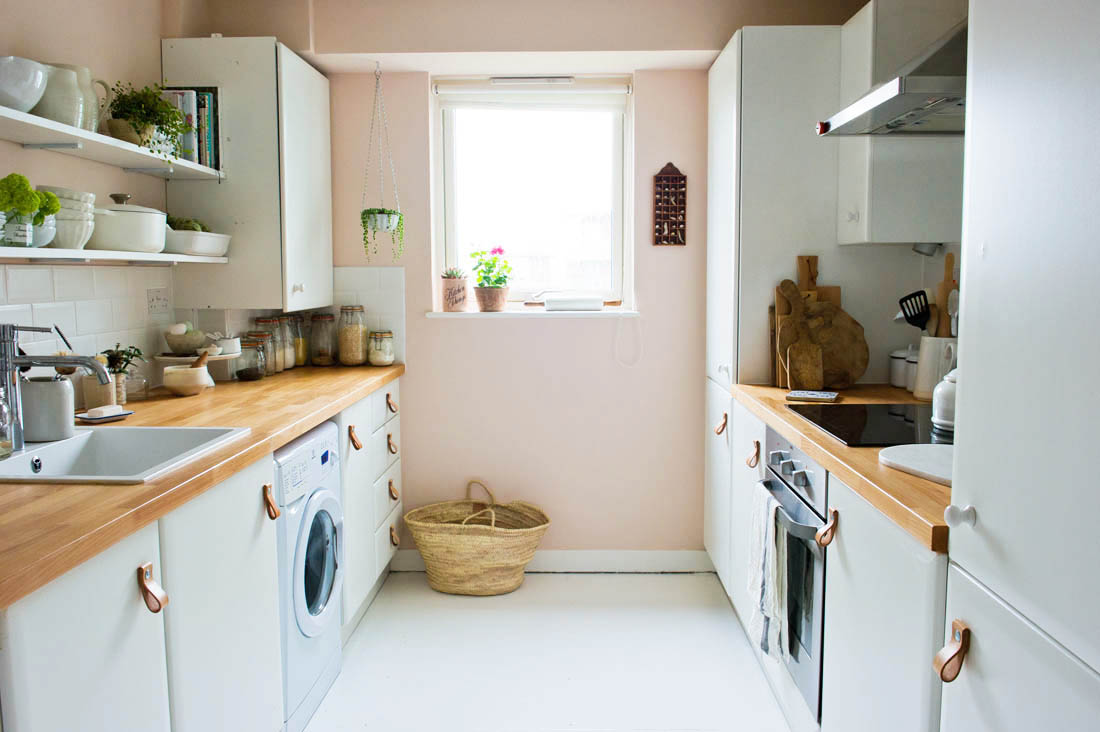
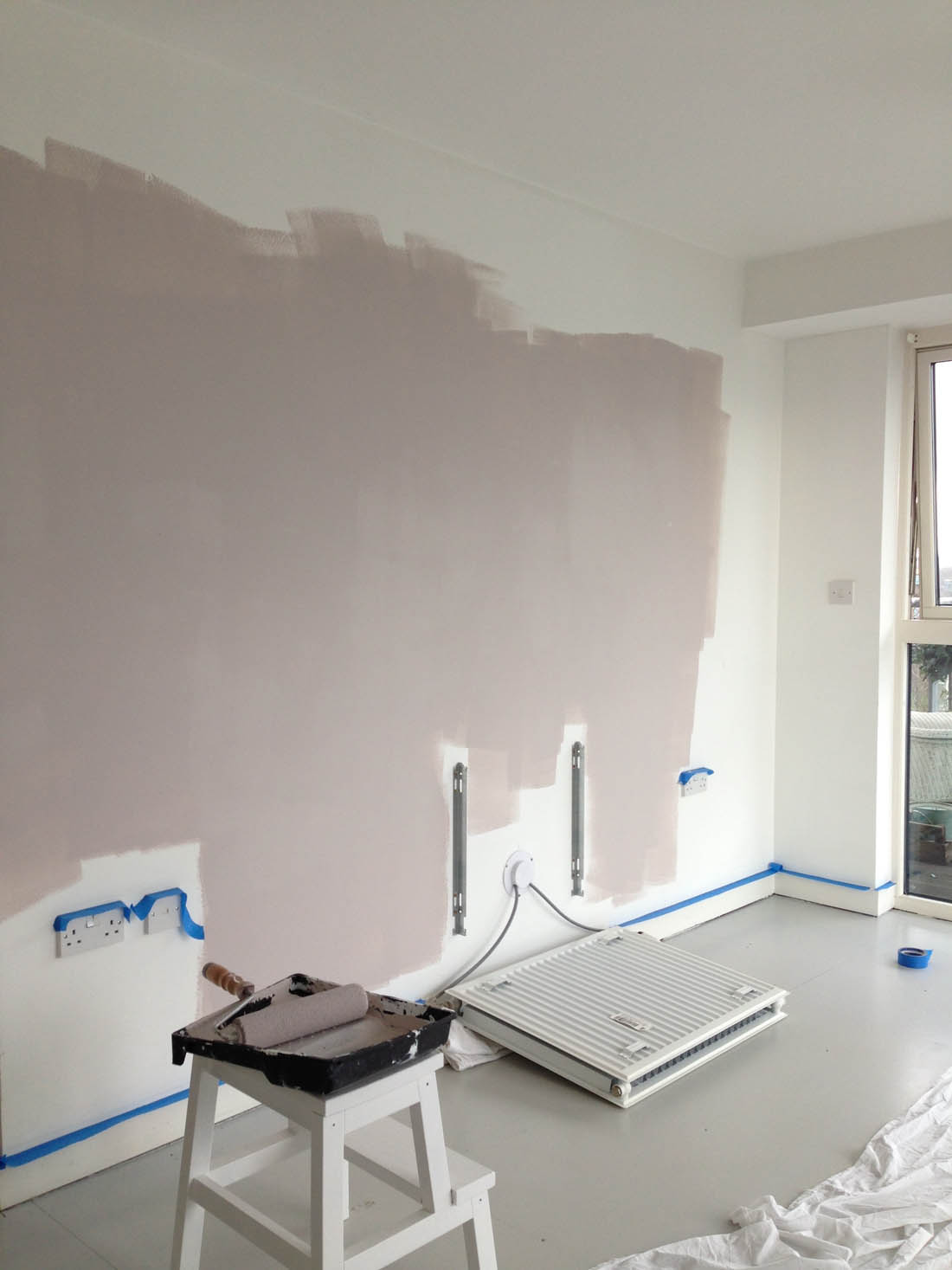
The left hand side of the kitchen is now a lot more open. The Pink Ground wall paint has added warmth and the white painted floor makes it look a lot more contemporary and bright (it used to be dark faux wood vinyl).

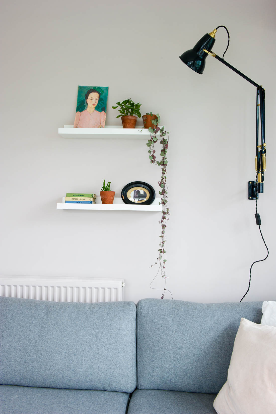
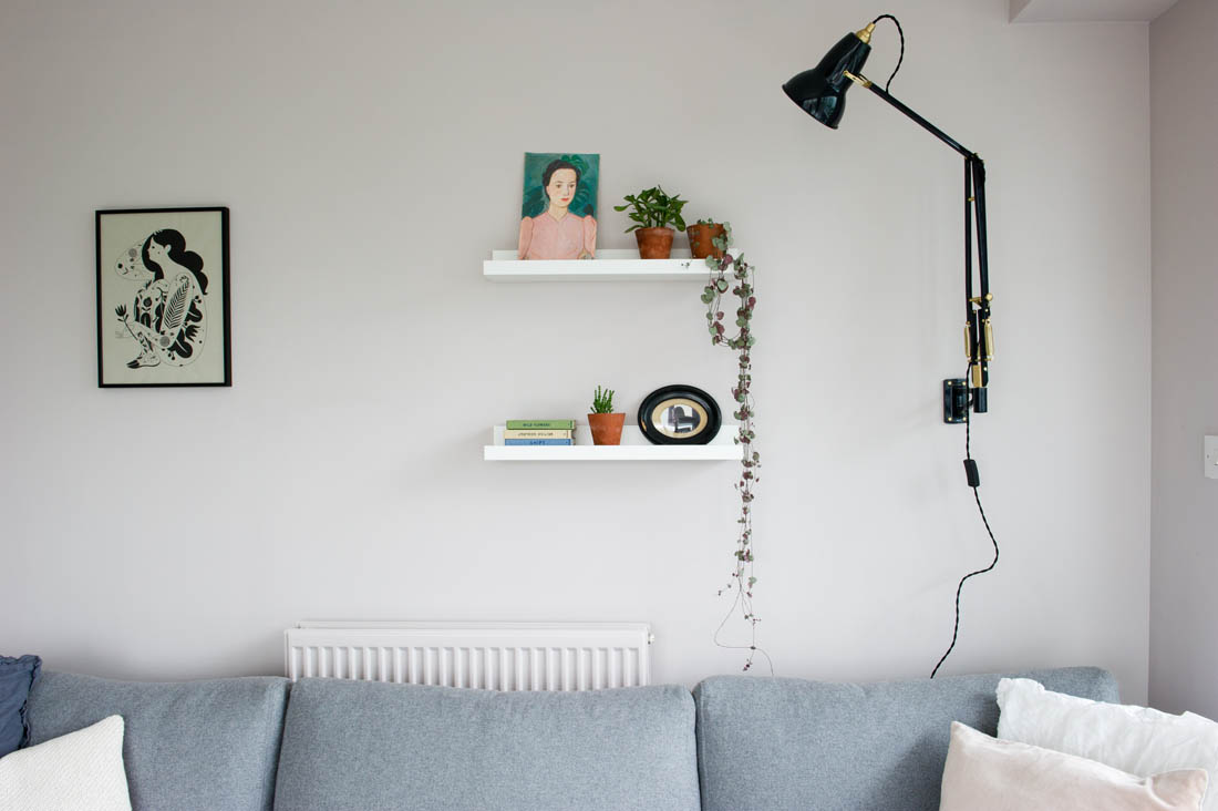
The open shelves are my favourite addition to the kitchen. The space feels a lot more open without the wall cupboards and to help retain that feeling of space and light everything on the shelves is white, which creates a nice unified look. Plants dotted around the shelves help to adda bit of contrast and interest.

Kitchen makeover |Photograph by katharinepeachey.co.uk | Apartment Apothecary

I love being able to display all my white crockery and my cotton white Le Creuset pans.

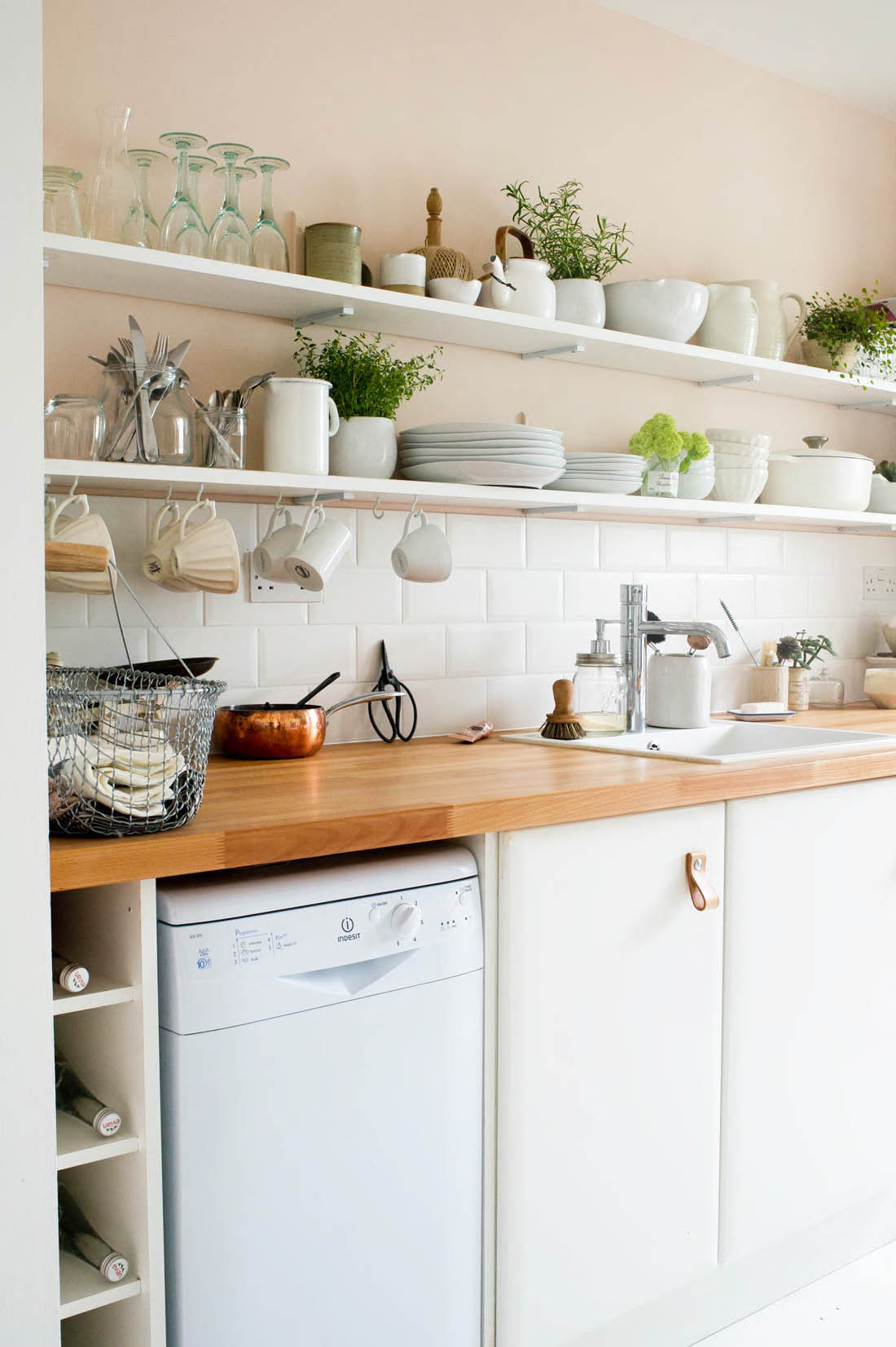
Jules came up with the clever idea of mounting the shelf brackets upside down, creating a notch in the back of the shelf so that they sit flush to the wall. This way the vertical strut can’t really be seen as I painted them the same colour as the wall and the objects on the shelves cover them. We bought lengths of pine (8.5 inch wide, 1 inch thick) from the timber yard for the shelves that I painted white and we spaced the brackets 50cm apart . So far they are holding up brilliantly.

Kitchen makeover |Photograph by katharinepeachey.co.uk | Apartment Apothecary

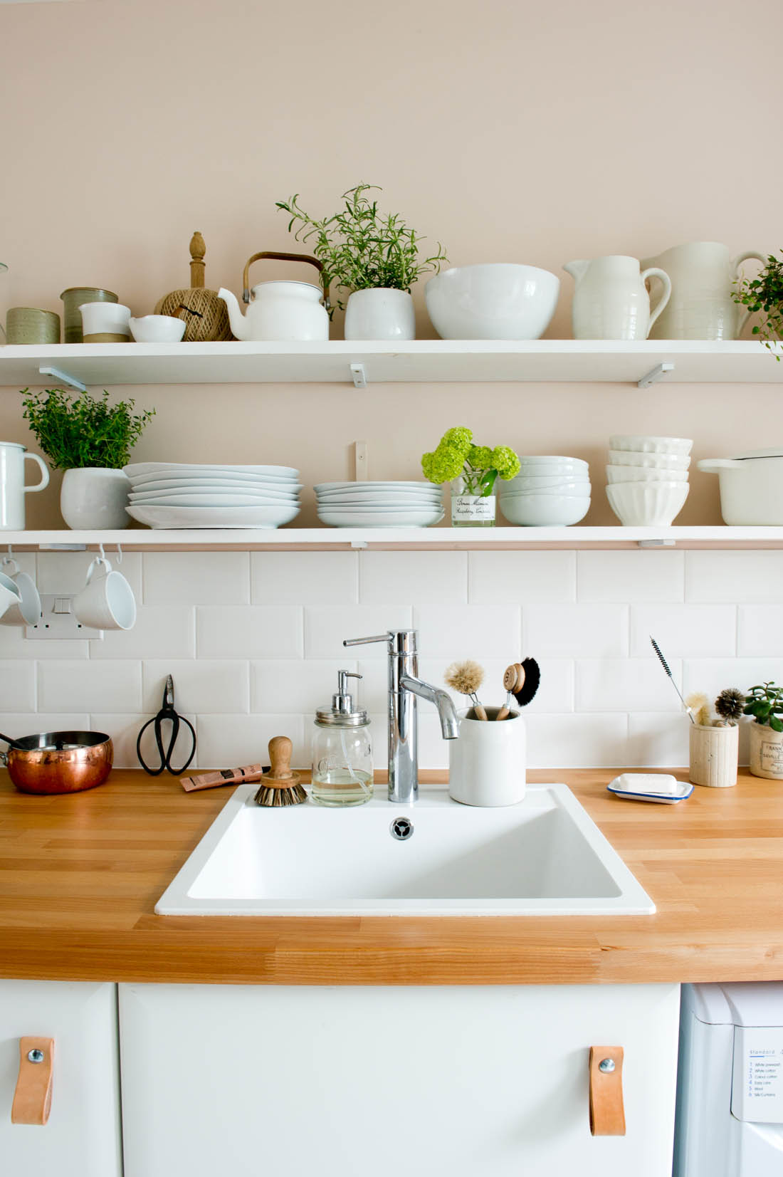
The new sink ties together the white cupboards, tiles and shelves and the wall colour, work top and leather handles tone in well with each other too.

I am so please that I suddenly woke up one morning and decided we needed to have a white sink as it looks so much better than the stainless steel one we had. It is also so much easier to keep clean although this model doesn’t have a draining board, which wouldn’t suit everyone. As it is just the two of us and we have a dish washer we tend not to do much washing up so I decided to save the space on an inbuilt draining board. I have a small cutlery drainer that sits in the corner of the sink and if we do wash up something large I just pop a tea towel down on the worktop and place it on that or dry it up immediately. I like the combination of the white sink and white metro tiles.

Kitchen makeover |Photograph by katharinepeachey.co.uk | Apartment Apothecary

I did a massive decluttering spree before we did the kitchen and got rid of loads of unnecessary kitchen stuff. I chose the crockery and cutlery that we use on a daily basis to place on the first shelf and then glassware and a few bits of pottery that we use less often on the top shelf. Everything is within arm’s reach so no step stool is needed. We hung mugs below the bottom shelf to save space and for ease of access.

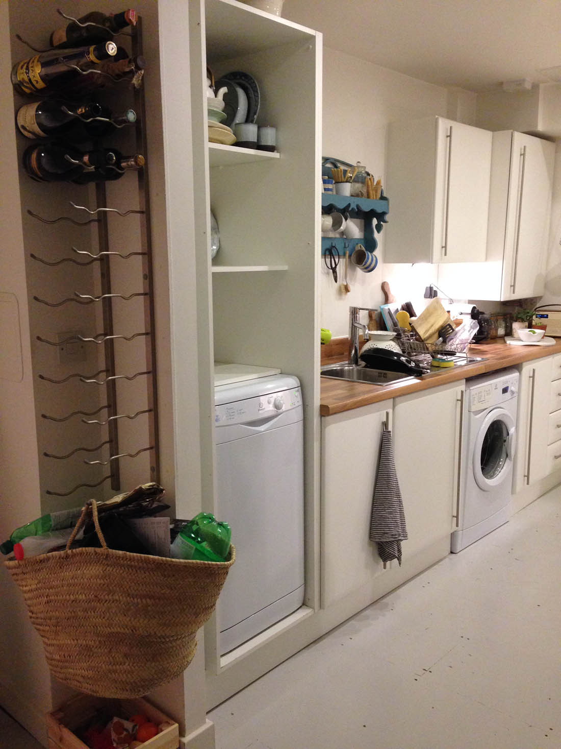
There used to be a full height cupboard at the entrance to the kitchen but removing that made the biggest difference to the feel of the kitchen. Without that cupboard we could lengthen the worktop and place the dishwasher underneath it and there was enough space for Jules to build a bottle holder in the gap that was left.

Kitchen makeover |Photograph by katharinepeachey.co.uk | Apartment Apothecary

As you entered the kitchen from this side you were faced with a full height cupboard and a horrible metal wine rack. Both of those things have gone so the room feels bigger and wider.

At the other end of the kitchen there used to be a radiator, which prevented us from making the most of this passageway from the hallway that leads into he living room. We decided to remove the radiator altogether (we live in a very well insulated new build so we definitely won’t miss it) and that way we could mount these BESTA cupboards from Ikea. This has worked amazingly well – and everyone has commented on it – as it extends the living space and helps to connect the living room with the kitchen. It makes the absolute most of the space but doesn’t make it feel smaller because they are so sleek and float above the floor.

Kitchen makeover |Photograph by katharinepeachey.co.uk | Apartment Apothecary

Removing the radiator and adding these cabinets at the end of the kitchen has worked brilliantly.

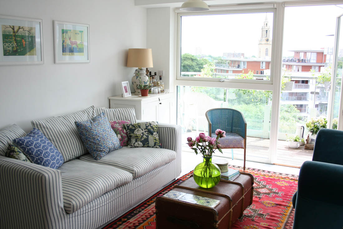
The new cabinets lead into the living room (you can just see the corner of it on the right). To see my living room makeover take a look over here.

Living room makeover reveal - home of Katy Orme | Photography by katharinepeachey.co.uk | Apartment Apothecary

It was worth the hard slog in the end and we are both enjoying the kitchen so much more than I thought possible. I hope Ive proved with a small budget and a bit of hard work you can make a big difference to a room.

Katy x

*All photography by Katharine Peachey.

Sources:

Paint – Pink Ground c/o Farrow & Ball

Tiles – matt metro tiles c/o Tile Giant

Worktop – solid beech worktop custom made from Ikea

Sink – quartz sink from Ikea

Door handles – leather handles made by me on the bottom cupboards and ceramic handles from John Lewis on the wall cupboards

Sideboard – BESTA cabinets from Ikea

Styling the Seasons – June | Holly’s House giveaway

We are very excited about this month’s Styling the Seasons as we have teamed up with one of my absolute favourite shops, Holly’s House, who are offering our favourite June styled surface an amazing prize of this beautiful copper table! I will explain more about how to take part at the end of this post.

I am also feeling very excited about June as we have lots of nice plans this month including a holiday with friends and my little sister’s hen do. I’m hoping it will be a month full of sun (even though this week is disastrous!) and fun time spent with family and friends. For me, May and June are the best months to spend outside in the UK; the grass is lush and green, the flowers are in bloom and everything looks and feels so verdant and alive. Therefore, we chose to take a little Norfolk holiday during this month and we are staying in a forest cabin amongst the green trees and a wild flower meadow – bliss! I wanted to try and show the ‘green’ that I associate with this time of year in my styling by adding a few new plants to my bedroom, particularly on top of my wardrobe. I have found that this is a great surface to keep plants and I love the way they look instead of the normal rubbish that can build up on top of cupboards. I’m also super proud that my home, as well as this part of my bedroom, features in the newly launched book Botanical Style by Selina Lake so this seemed the perfect surface to spruce up this month.

Styling the Seasons - June | Apartment Apothecary | Plants in the bedroom | Wardrobe plants | Antique nursing chair

I will ashamedly admit that the plant that I had in this brass planter had died so I found this wondrous plant called Muehlenbeckia, which is so easy to care for and can live happily indoors or outdoors. It’s a more delicate (and prettier, in my mind) alternative to Ivy.

Styling the Seasons - June | Apartment Apothecary | Plants in the bedroom | Wardrobe plants  | Antique nursing chair

I also bought a Pilea (second from left) and an Anthurium Clarinervium (second from right), which both have the most beautiful striking leaves.

Styling the Seasons - June | Apartment Apothecary | Plants in the bedroom | Wardrobe plants  | Antique nursing chair

Our favourite styled surface this month will win this stunning copper table from Holly’s House. All you have to do is style any surface in your home – window sill, hallway table, wall, dining table, sideboard – to represent what June means to you. Either blog about your styled surface or post a shot of it on Facebook, Instagram or twitter and tag me, Lotts and Lots and Holly’s House using the hashtag #stylingtheseasons.

Copper hexagonal table | Holly's House

Copper hexagonal table from Holly’s House.

We can’t wait to see your June styling and fingers crossed you could be styling this gorgeous table in July!

Katy x

T&C’s: Giveaway closes at midnight on Wednesday 29th June 2016; Winner will be announce on Thursday 30th June 2016; You must be a UK resident to be eligible for this giveaway; This prize is non-transferable and cannot be exchanged for monetary value; No cash alternatives to the stated prize will be offered.

Kitchen before makeover

My kitchen has always been the room in my flat that I like least: boring, generic and lacking any character. When I decided to tackle the kitchen I knew it wasn’t going to be as simple as a lick of paint and a few nice new accessories so I had to spend a while persuading Jules to help me for this project. I also had to spend a while saving up for the work as it wasn’t going to be cheap.

Before

What I didn’t like:

– I HATED the cheap laminate work tops as they were dark and a bit too ‘shiny’. None of my nice kitchen stuff looked nice on this surface! It absorbed all of the light and energy in this space.

– The door handles have always offended me a disproportionate amount; I don’t like how big they are.

– There is no big expanse of work surface

– The stainless steel sink is a nightmare to keep looking clean and it looks dull.

– Even though it is a large galley kitchen the wall cupboards and the full height cupboards at the entrance to the kitchen encroach on the space a lot.

– The kitchen felt very generic and lacked any character or felt like ‘me’.

Here’s a hotch potch selection of ‘before’ pics – I NEVER remember to take proper before pics!

Kitchen makeover before | DIY room makeover | Apartment Apothecary

Lots of cupboards made the space feel small.

Kitchen makeover before | DIY room makeover | Apartment Apothecary

At the entrance to the kitchen was this HORRIBLE wine rack (Jules loved it because it was so practical) and this HORRIBLE open full height cupboard that always looked a bit of a mess and disjointed.

Kitchen makeover before | DIY room makeover | Apartment Apothecary

During the project

I have to say that Jules did the majority of the hard graft for this DIY project. We spent all four weekends of January getting it done and it was a complete mess. We couldn’t afford to take time off during the week to do it so it dragged on and on and one weekend we didn’t finish installing the new sink so we spent that week washing up in the bath – oh the fun! I’m not going to lie, it was a slog.

We made the massive mistake of getting over excited when we first started and didn’t pack up everything from the kitchen, which added so much chaos to the mix…

Kitchen makeover before | DIY room makeover | Apartment Apothecary

What were we thinking?!

We started by replacing the work tops for real wood and Jules had to cut them to size and cut out the holes for the hob and sink using a jigsaw – I think I’m still finding saw dust in cracks around the house and Jules’s laptop packed up as it was so full of it! It was a really difficult job because the new worktops weighed a tonne and the one for the left side of the kitchen measures over 3m so manoeuvring it in our small flat was like a Crystal Maze challenge.

Kitchen makeover before | DIY room makeover | Apartment Apothecary

Kitchen makeover before | DIY room makeover | Apartment Apothecary

I also decided to remove the stainless steel panel behind the hob because I hate how difficult it is to polish and it feels quite heavy. In the future we will change the hob to a gas one but we didn’t have the budget for that this time round.

IMG_8825

On the other side of the kitchen we had much more to do as I decided pretty early on that I wanted to remove the full height cupboard and the wall cupboards to be replaced by open shelving.

Kitchen makeover before | DIY room makeover | Apartment Apothecary

Kitchen makeover before | DIY room makeover | Apartment Apothecary

As soon as the full height cupboard came down the kitchen instantly looked twice as big!

Kitchen makeover before | DIY room makeover | Apartment Apothecary

Without that cupboard we could have a much longer work surface, which makes such a big difference.

Kitchen makeover before | DIY room makeover | Apartment Apothecary

Without the full height cupboard the dishwasher could sit underneath the work top and there was a gap so Jules made a wine rack to fit the space perfectly, which also meant we could get rid of the horrible metal wine rack.

Kitchen makeover before | DIY room makeover | Apartment Apothecary

We installed and plumbed in a new sink.

Kitchen makeover before | DIY room makeover | Apartment Apothecary

And then I painted. I chose Farrow & Ball’s Pink Ground (it took a bit of convincing – Jules was not a fan of having a pink kitchen) but he now really likes it because it is such a brilliant neutral and adds a soft warm glow to the kitchen. Definitely no sugary candy pink present here!

Kitchen makeover before | DIY room makeover | Apartment Apothecary

One of the last jobs was tiling both sides of the kitchen and I chose these white metro tiles from Tile Giant, which add a fresh contemporary feel to the space.

IMG_9008

I changed the door handles – did you see the DIY leather handles I made? – and then we put up the open shelves on the left hand side of the kitchen. You will have to pop back next to see the full reveal!

Katy x


Living room makeover reveal

Enough of the teasing – my living room is finally ready to share with you, beautifully photographed by Katharine Peachey. It took a lot longer than expected as the sofa was very delayed so I couldn’t pull the room together without that but I hope you’ll agree that it was was worth it in the end (we definitely think so and it has made not only this room but the whole flat feel completely different). If you didn’t catch my ‘before’ post last week head over to read it here and see what the room looked like before I redecorated and a bit of the decorating process.

Living room makeover reveal - home of Katy Orme | Photography by katharinepeachey.co.uk | Apartment Apothecary

I wanted this space to feel lighter, fresher, simpler and more cohesive, as well as working better on a more practical level (it had to be dog friendly and allow Jules and I to use the room in the evenings and for eating without being squished on a sofa that was too small or perched at a table shoved against the wall). I also wanted this room to tie in more with the style of our home office and bedroom to make the whole flat flow better. As i explained in last week’s ‘before’ post, the first thing I did was to paint the room in one of Farrow & Ball’s new colours. I chose Peignoir, which is pink with a big dose of grey and it changes colour from the softest of blush pinks, to dark grey to mauve depending on the light and weather. It is a wonderfully calm feeling colour and I decided to base the colour scheme around its two components of grey and pink.

So, here’s how the room looks now…

Living room makeover reveal | Photography by katharinepeachey.co.uk | Apartment Apothecary

I simply turned the dining table around and installed a hanging pendant over it and both of these changes have made it feel 100% more inviting and conducive to sitting and chatting after dinner.

The two wishbone chairs in front of the window are perfect as they don’t block any light and are super comfy if we have a few people over or they can double up as extra dining chairs. I made a pink linen cushion for one of the chairs and have a gorgeous grey cashmere blanket on the other so that there are dots of soft pink and grey on all sides of the room.

Living room makeover reveal - home of Katy Orme | Photography by katharinepeachey.co.uk | Apartment Apothecary

I kept this white cupboard, which used to be on the other side of the room, as it is great for storage and isn’t too big or heavy, which was the problem with the G-plan sideboard that used to be in this position.

Living room makeover reveal - home of Katy Orme | Photography by katharinepeachey.co.uk | Apartment Apothecary

The new sofa is a revelation as we can all be comfortable sitting/lying down together (I get the chaise bit, natch!). The grey wool is perfect as it repels dirt when Otto brushes up against it after a muddy walk and it really brings out the grey in the Peignoir wall colour. I love the mid-century style feet and the fact it sits off the ground helps to keep the light flowing around the room. It is long enough to stretch the length of the wall now so makes better use of the space. The jute rug is ideal for Otto as it shows no dirt or hair and does not move an inch even without underlay, which is really important as he is constantly rolling around on the floor.


This Anglepoise wall mounted lamp is completely perfect for this space as there wasn’t room for a floor lamp. We can easily move it around to make it a reading lamp or an uplighter for soft even light. I really love it.

Living room makeover reveal - home of Katy Orme | Photography by katharinepeachey.co.uk | Apartment Apothecary

The new Ercol coffee table is one of my favourite additions to this room. As well as being a very practical size, shape and design, it is beautifully made and works perfectly with the colour tones in this room.

I bought the Eucalyptus tree because I love the silvery colour of the leaves, which complements the greys and pinks.

Living room makeover reveal - home of Katy Orme | Photography by katharinepeachey.co.uk | Apartment Apothecary

The touches of black around the room from the lamp, mirror and this beautiful print from The Future Kept help to ground the scheme and add some contrast.

Living room makeover reveal - home of Katy Orme | Photography by katharinepeachey.co.uk | Apartment Apothecary

I repainted the floor with Farrow & Ball’s All White floor paint, which helps to keep the Peignoir feeling fresh and modern, whilst the jute rug adds some warmth.

Living room makeover reveal - home of Katy Orme | Photography by katharinepeachey.co.uk | Apartment Apothecary

I really hope you like what I’ve done to the room; the changes have made the room work so much better than it used to, which is the main thing. Everybody who has visited have said that they love how calm the room feels now and I really feel that on a daily basis.

I will show you the kitchen later this week!

Katy x


Source list

Peignoir wall paint – c/o Farrow & Ball

Ercol coffee table (with clear lacquer) – c/o Houseology

Tivoli sofa (in light grey wool) – Swoon Editions with press dicount

Spring Goddess print – The Future Kept

Anglepoise wall mounted lamp (deep slate) – c/o Houseology

Grey cable blanket – c/o Dot and Tom

Linen cushions and Muuto cushion in rose on sofa – c/o Houseology

Wishbone chairs – Swivel

Jute rug – B&Q

Original BTC ceramic hanging pendant – The White Company

Eucalyptus tree – The Fresh Flower Company

Vintage wall mirror – eBay

Living room before makeover

I started a living room and kitchen makeover waaaay back in January. Whilst most of the big stuff was done by February, after a few crazy DIY weekend sessions, everything started to drag after that due to delays in furniture deliveries, which meant I couldn’t pull the whole room together until last month. However, it is finally done and I love it, which is the main thing. The flat as a whole feels so much more cohesive and fresh now and even more importantly, the room works so much better on a practical level, which makes Jules very happy.

Today, I just wanted to remind you of what the room was like ‘before’ and show you a few snaps mid-decorating and then I will share the full room reveal later on this week, so keep your eyes peeled.

Before

What I didn’t like:

– I didn’t buy any of the furniture for this room; it was all stuff from my previous flat. Therefore, it never felt like it quite fitted and a few of the pieces were too big for this space.

– I got tired of the mish-mash style and craved simplicity and a calmer vibe.

– The teal blue loveseat blocked out too much light from the south facing floor to ceiling window, which always felt a bit criminal.

– From a practical point of view the room did not work. The sofa was too small for all of us (including Otto) to sit on together comfortably (I like to lie out). The rug was being destroyed by Otto as it is so thin and delicate and it showed up his hair really badly. Also, the position of the dining table didn’t quite work because  I would sit at one end and Jules would sit in the middle and because we weren’t directly facing each other it wasn’t very conducive to chatting or lingering after eating.

– There was very little storage.

What I sold:

– Teal loveseat

– Sofa

– G-plan sideboard

– Hanging pendants

– Wall mirror

– Lloyd Loom chair

– Large ceramic table lamp

– Retro yellow table lamp

– Gave back my mum’s school trunk to her and kept the kilim rug for the future when I have a house big enough for a dog-free room 😉

IMG_3678

1

IMG_1608

Open plan dining_sitting room

During decorating

I packed Jules and Otto off for a week to stay with his mum so that I could paint the living room, kitchen and re-paint the floors white (they were pale grey). Big clumsy dogs and paint don’t mix very well so I had to get it all done before they came back. By this point I had sold most of the furniture, which made it so much easier on a practical level, but once I had cleared out the remaining few bits I had a blank canvas to get started on the paint job.

After attending the preview for the nine new Farrow & Ball colours I fell in love with Peignoir and decided that it would be the perfect colour for the living room. I have to say, after using quite a few different brands of paint, that using Farrow & Ball paint is a completely different league. The ease with which if goes onto the walls and how smoothly it dries is something else. I really believe it is worth every penny, especially if, like me, you do the decorating yourself. I only had to do two coats and even Jules was pleasantly surprised at how professional the finish was when he returned (I am a bit notorious for rushing jobs like these so he was anxious that I wasn’t going to do a good job of it!).

IMG_8837

Normally, I would have started by ‘cutting in’ but for some very good reason, which escapes me right now, I had to start by rollering the walls. It all worked out well in the end though. These are terrible snaps that I kept on sending Jules as he was anxious about Peignoir being too pink. It is very grey a lot of the time so he really likes the colour.

IMG_8855

IMG_8845

IMG_8906

Once I had finished the walls I re-painted the floors white as grey floors with Peignoir felt a bit muddy and crisp white woodwork and floors helps to keep it feeling fresh and modern.

So, I will be back later on this week with the final reveal of the room and the new furniture and accessories that I have chosen for this space. The week after that I’ll show you the kitchen makeover, which goes off the living room to the right (as you can see in that picture above).

Katy x